4 Attribute Charts
Learning Objectives
After completing this chapter, you will be able to:
- Understand the fundamental difference between variable and attribute data
- Create p-charts for monitoring proportion defective with variable sample sizes
- Construct np-charts for counting nonconforming units with constant sample sizes
- Apply c-charts for defect counts with constant inspection units
- Use u-charts for defect rates with variable inspection units
- Select the appropriate attribute chart based on your data type and sampling situation
- Interpret out-of-control signals in attribute charts
- Understand the underlying statistical distributions (binomial and Poisson)
- Handle the unique challenges of attribute data analysis
This chapter introduces attribute control charts, which are fundamentally different from the variable charts we studied in Chapter 3. While variable charts monitor measurable characteristics like length or weight, attribute charts monitor countable characteristics8 like defects, nonconformities, or pass/fail results.
4.1 Understanding Attribute Data
4.1.1 What Makes Attribute Data Different?
Attribute data represents characteristics that can be counted rather than measured. Instead of asking “How much?” or “What value?”, we ask questions like:
- “How many items are defective?”
- “What proportion fails the test?”
- “How many defects are on this surface?”
- “Does this item pass or fail inspection?”
4.1.1.1 Examples of Attribute Data
Manufacturing:
- Number of defective parts in a batch
- Proportion of assemblies that pass final inspection
- Count of scratches on a painted surface
- Number of assembly errors per unit
Service Industries:
- Proportion of customers satisfied with service
- Number of billing errors per 1000 invoices
- Count of website crashes per day
- Percentage of on-time deliveries
Healthcare:
- Proportion of procedures completed without complications
- Number of medication errors per shift
- Count of patient falls per month
- Percentage of appointments kept
4.1.2 The Mathematics Behind Attribute Charts
Attribute charts are based on different statistical distributions9 than variable charts:
4.1.2.1 Binomial Distribution (for p and np charts):
When we’re counting nonconforming units (items that fail inspection):
\[\begin{equation} P(X = x) = \binom{n}{x} p^x (1-p)^{n-x} \tag{4.1} \end{equation}\]
Where:
- \(n\) = sample size (number of items inspected)
- \(x\) = number of nonconforming items found
- \(p\) = true proportion defective
- \(\binom{n}{x}\) = binomial coefficient10
4.1.2.2 Poisson Distribution (for c and u charts):
When we’re counting defects or nonconformities (multiple defects can occur on one item):
\[\begin{equation} P(X = x) = \frac{\lambda^x e^{-\lambda}}{x!} \tag{4.2} \end{equation}\]
Where:
- \(x\) = number of defects observed
- \(\lambda\) = average number of defects per unit
- \(e\) = mathematical constant (≈ 2.718)
4.1.3 Key Distinctions in Attribute Data
4.1.3.1 Nonconforming vs. Nonconformity
This distinction is crucial for choosing the right chart:
Nonconforming Unit (Defective Item):
- An item that fails to meet specifications
- Can only be counted as 0 (good) or 1 (defective)
- Use p-charts or np-charts
- Examples: A part that doesn’t fit, a test tube that leaks
Nonconformity (Defect):
- A specific failure to meet a requirement
- Multiple nonconformities can exist on one item
- Use c-charts or u-charts
- Examples: Scratches on a surface, errors in a document
Critical Distinction
Nonconforming Unit: The entire item is classified as good or bad
Nonconformity: Count the number of specific defects, regardless of how many items they’re on
A single circuit board (one unit) might have 3 soldering defects (3 nonconformities).
4.1.3.2 Sample Size Considerations
| Chart Type | Sample Size | What You Count | Example |
|---|---|---|---|
| p-chart | Variable | Proportion defective | 15 defective out of 100 inspected (today), 12 out of 80 (tomorrow) |
| np-chart | Constant | Number defective | 15 defective out of 100 inspected (every day) |
| c-chart | Constant area/time | Total defects | 8 scratches on each 1m² panel |
| u-chart | Variable area/time | Defects per unit | 8 scratches per m² (panels vary in size) |
4.2 p-Charts: Proportion Defective
4.2.1 Understanding p-Charts
The p-chart monitors the proportion (or percentage) of nonconforming units in samples of varying sizes. It’s the most flexible attribute chart because it can handle different sample sizes from period to period.
4.2.1.1 When to Use p-Charts
Perfect for:
- Variable sample sizes: When you can’t inspect the same number of items each time
- Proportion data: When you want percentages rather than counts
- Pass/fail testing: When items are classified as conforming or nonconforming
- Comparison purposes: When different areas have different production volumes
4.2.1.2 The Mathematics of p-Charts
Sample proportion:
\[\begin{equation}
p_i = \frac{\text{Number of nonconforming units in sample i}}{\text{Sample size i}} = \frac{x_i}{n_i}
\tag{4.3}
\end{equation}\]
Center line (average proportion):
\[\begin{equation}
\bar{p} = \frac{\sum_{i=1}^{k} x_i}{\sum_{i=1}^{k} n_i}
\tag{4.4}
\end{equation}\]
Control limits (for sample i):
\[\begin{equation}
UCL_i = \bar{p} + 3\sqrt{\frac{\bar{p}(1-\bar{p})}{n_i}}
\tag{4.5}
\end{equation}\]
\[\begin{equation} LCL_i = \bar{p} - 3\sqrt{\frac{\bar{p}(1-\bar{p})}{n_i}} \tag{4.6} \end{equation}\]
Variable Control Limits
Notice that each sample can have different control limits based on its sample size \(n_i\). Smaller samples have wider limits; larger samples have tighter limits.
4.2.2 Creating p-Charts in R
Let’s create p-charts using the orange juice data from qcc, which tracks defective cans in production.
4.2.2.1 Step 1: Load and Explore the Data
# Load required packages and data
library(qcc)
data(orangejuice)

# Examine the data structure
head(orangejuice)
## sample D size trial
## 1 1 12 50 TRUE
## 2 2 15 50 TRUE
## 3 3 8 50 TRUE
## 4 4 10 50 TRUE
## 5 5 4 50 TRUE
## 6 6 7 50 TRUE
str(orangejuice)## 'data.frame': 54 obs. of 4 variables:
## $ sample: int 1 2 3 4 5 6 7 8 9 10 ...
## $ D : int 12 15 8 10 4 7 16 9 14 10 ...
## $ size : int 50 50 50 50 50 50 50 50 50 50 ...
## $ trial : logi TRUE TRUE TRUE TRUE TRUE TRUE ...
# Understand what each variable represents
summary(orangejuice)
## sample D size trial
## Min. : 1.00 Min. : 2.000 Min. :50 Mode :logical
## 1st Qu.:14.25 1st Qu.: 5.000 1st Qu.:50 FALSE:24
## Median :27.50 Median : 7.000 Median :50 TRUE :30
## Mean :27.50 Mean : 8.889 Mean :50
## 3rd Qu.:40.75 3rd Qu.:12.000 3rd Qu.:50
## Max. :54.00 Max. :24.000 Max. :50Let’s understand what we’re looking at:
# Look at the data by trial status
aggregate(cbind(D, size) ~ trial, data = orangejuice, FUN = function(x) c(
  n = length(x),
  mean = mean(x),
  sum = sum(x),
  min = min(x),
  max = max(x)
))
## trial D.n D.mean D.sum D.min D.max size.n size.mean
## 1 FALSE 24.000000 5.541667 133.000000 2.000000 12.000000 24 50
## 2 TRUE 30.000000 11.566667 347.000000 4.000000 24.000000 30 50
## size.sum size.min size.max
## 1 1200 50 50
## 2 1500 50 50Understanding Orange Juice Data
- D: Number of defective cans found in each sample
-
size: Number of cans inspected in each sample (varies from 50-100)
- trial: TRUE = data used to establish control limits, FALSE = new production data
- sample: Sample number (time sequence)
This represents a canning operation where quality inspectors check variable numbers of cans and count how many are defective.
4.2.2.2 Step 2: Create a Basic p-Chart (Phase I)
# Create p-chart using trial data to establish control limits
p_chart1 <- with(orangejuice, qcc(D[trial], sizes = size[trial], type = "p"))
Figure 4.1: Basic p-Chart for Orange Juice Defective Proportion
# Display the chart information
p_chart1
## List of 11
## $ call : language qcc(data = D[trial], type = "p", sizes = size[trial])
## $ type : chr "p"
## $ data.name : chr "D[trial]"
## $ data : int [1:30, 1] 12 15 8 10 4 7 16 9 14 10 ...
## ..- attr(*, "dimnames")=List of 2
## $ statistics: Named num [1:30] 0.24 0.3 0.16 0.2 0.08 0.14 0.32 0.18 0.28 0.2 ...
## ..- attr(*, "names")= chr [1:30] "1" "2" "3" "4" ...
## $ sizes : int [1:30] 50 50 50 50 50 50 50 50 50 50 ...
## $ center : num 0.231
## $ std.dev : num 0.422
## $ nsigmas : num 3
## $ limits : num [1:30, 1:2] 0.0524 0.0524 0.0524 0.0524 0.0524 ...
## ..- attr(*, "dimnames")=List of 2
## $ violations:List of 2
## - attr(*, "class")= chr "qcc"Let’s interpret what qcc is telling us:
Interpreting p-Chart Output
-
Chart type: “p” confirms we’re monitoring proportions
-
Number of groups: 30 sample groups used to establish limits
-
Group sample size: “variable” because sample sizes change
-
Center of group statistics: 0.1190 (about 11.9% defective on average)
-
Standard deviation: Varies by sample size
-
Control limits: Different for each sample based on its size
4.2.2.3 Step 3: Plot the p-Chart
# Plot the chart
plot(p_chart1)
Figure 4.2: p-Chart with Variable Control Limits
Notice how the control limits vary based on sample size - this is normal and expected for p-charts!
4.2.2.4 Step 4: Phase II Monitoring
# Add new production data for monitoring
p_chart2 <- with(orangejuice, qcc(D[trial], sizes = size[trial], type = "p",
                                  newdata = D[!trial], newsizes = size[!trial]))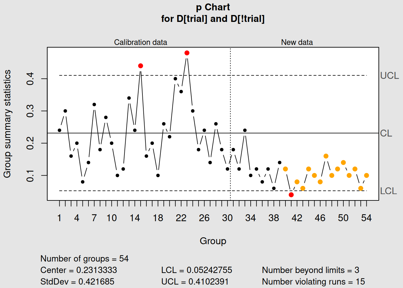
Figure 4.3: p-Chart with Phase I and Phase II Data
# Display and plot
p_chart2
## List of 15
## $ call : language qcc(data = D[trial], type = "p", sizes = size[trial], newdata = D[!trial], newsizes = size[!trial])
## $ type : chr "p"
## $ data.name : chr "D[trial]"
## $ data : int [1:30, 1] 12 15 8 10 4 7 16 9 14 10 ...
## ..- attr(*, "dimnames")=List of 2
## $ statistics : Named num [1:30] 0.24 0.3 0.16 0.2 0.08 0.14 0.32 0.18 0.28 0.2 ...
## ..- attr(*, "names")= chr [1:30] "1" "2" "3" "4" ...
## $ sizes : int [1:30] 50 50 50 50 50 50 50 50 50 50 ...
## $ center : num 0.231
## $ std.dev : num 0.422
## $ newstats : Named num [1:24] 0.18 0.12 0.24 0.1 0.12 0.08 0.12 0.06 0.14 0.12 ...
## ..- attr(*, "names")= chr [1:24] "31" "32" "33" "34" ...
## $ newdata : int [1:24, 1] 9 6 12 5 6 4 6 3 7 6 ...
## $ newsizes : int [1:24] 50 50 50 50 50 50 50 50 50 50 ...
## $ newdata.name: chr "D[!trial]"
## $ nsigmas : num 3
## $ limits : num [1:54, 1:2] 0.0524 0.0524 0.0524 0.0524 0.0524 ...
## ..- attr(*, "dimnames")=List of 2
## $ violations :List of 2
## - attr(*, "class")= chr "qcc"
plot(p_chart2)4.2.3 Interpreting p-Charts
4.2.3.1 What to Look for in p-Charts
1. Points Outside Control Limits
- Any point above UCL indicates higher than expected defect rate
- Points below LCL might indicate improvement or inspection problems
2. Patterns and Trends
- Upward trends: Process deteriorating
- Downward trends: Process improving
- Cycles: Systematic variations (shift changes, material lots)
3. Variable Control Limits
- Wider limits: Smaller sample sizes (less precision)
- Narrower limits: Larger sample sizes (more precision)
- Normal variation: Due to sample size differences
4.2.3.2 Statistical Considerations
Sample Size Effects:
# Show how sample size affects control limits
sample_sizes <- c(25, 50, 100, 200)
p_bar <- 0.10  # 10% defective

# Calculate control limits for different sample sizes
ucl_values <- p_bar + 3 * sqrt(p_bar * (1 - p_bar) / sample_sizes)
lcl_values <- p_bar - 3 * sqrt(p_bar * (1 - p_bar) / sample_sizes)

# Create a summary table
limits_table <- data.frame(
  Sample_Size = sample_sizes,
  UCL = round(ucl_values, 4),
  Center = p_bar,
  LCL = round(pmax(lcl_values, 0), 4)  # LCL can't be negative
)

print("How Sample Size Affects Control Limits:")
## [1] "How Sample Size Affects Control Limits:"
print(limits_table)## Sample_Size UCL Center LCL
## 1 25 0.2800 0.1 0.0000
## 2 50 0.2273 0.1 0.0000
## 3 100 0.1900 0.1 0.0100
## 4 200 0.1636 0.1 0.0364Practical Insight
Larger sample sizes give you more precise estimates of the process proportion, resulting in tighter control limits. This is why quality professionals often prefer larger, consistent sample sizes when possible.
4.2.4 Real-World p-Chart Applications
Manufacturing Examples:
- Final inspection pass rates
- First-pass yield in assembly
- Supplier quality performance
- Customer return rates
Service Examples:
- Customer satisfaction surveys
- Error rates in data entry
- On-time delivery performance
- Call resolution rates
# Apply Western Electric rules for enhanced detection
p_chart_rules <- with(orangejuice, qcc(D[trial], sizes = size[trial], type = "p",
                                       newdata = D[!trial], newsizes = size[!trial],
                                       rules = 1:4))
Figure 4.4: p-Chart Analysis with Control Rules
plot(p_chart_rules)4.3 np-Charts: Number Nonconforming
4.3.1 Understanding np-Charts
The np-chart monitors the number (count) of nonconforming units when sample sizes are constant. It’s essentially a p-chart for situations where you always inspect the same number of items.
4.3.1.1 When to Use np-Charts
Perfect for:
- Constant sample sizes: When you inspect exactly the same number every time
- Count data: When you prefer counts over proportions
- Operator simplicity: Easier for shop floor personnel to understand
- Traditional applications: Many established quality systems use np-charts
4.3.1.2 np-Charts vs. p-Charts
| Aspect | p-Chart | np-Chart |
|---|---|---|
| Sample Size | Variable | Constant |
| Y-axis | Proportion (0 to 1) | Count (0 to n) |
| Control Limits | Variable | Constant |
| Ease of Understanding | Requires proportion thinking | Direct count interpretation |
| Flexibility | Handles size changes | Requires consistent sampling |
4.3.1.3 The Mathematics of np-Charts
For constant sample size n:
Center line: \[\begin{equation} \overline{np} = n \times \bar{p} \tag{4.7} \end{equation}\]
Control limits: \[\begin{equation} UCL = \overline{np} + 3\sqrt{\overline{np}(1-\bar{p})} \tag{4.8} \end{equation}\]
\[\begin{equation} LCL = \overline{np} - 3\sqrt{\overline{np}(1-\bar{p})} \tag{4.9} \end{equation}\]
Where \(\bar{p} = \overline{np}/n\) (the average proportion defective).
4.3.2 Creating np-Charts in R
We’ll use the same orange juice data, but only use samples with the same size to demonstrate np-charts.
4.3.2.1 Step 1: Prepare Data for np-Charts
# Check sample sizes in orange juice data
table(orangejuice$size)
##
## 50
## 54
# For np-chart, we need constant sample sizes
# Let's use only samples of size 50
orangejuice_constant <- orangejuice[orangejuice$size == 50, ]

print("Data prepared for np-chart (constant sample size = 50):")
## [1] "Data prepared for np-chart (constant sample size = 50):"## [1] "Number of samples: 54"
head(orangejuice_constant)## sample D size trial
## 1 1 12 50 TRUE
## 2 2 15 50 TRUE
## 3 3 8 50 TRUE
## 4 4 10 50 TRUE
## 5 5 4 50 TRUE
## 6 6 7 50 TRUE4.3.2.2 Step 2: Create an np-Chart
# Create np-chart using constant sample size data
np_chart1 <- with(orangejuice_constant,
                  qcc(D[trial], sizes = size[trial], type = "np"))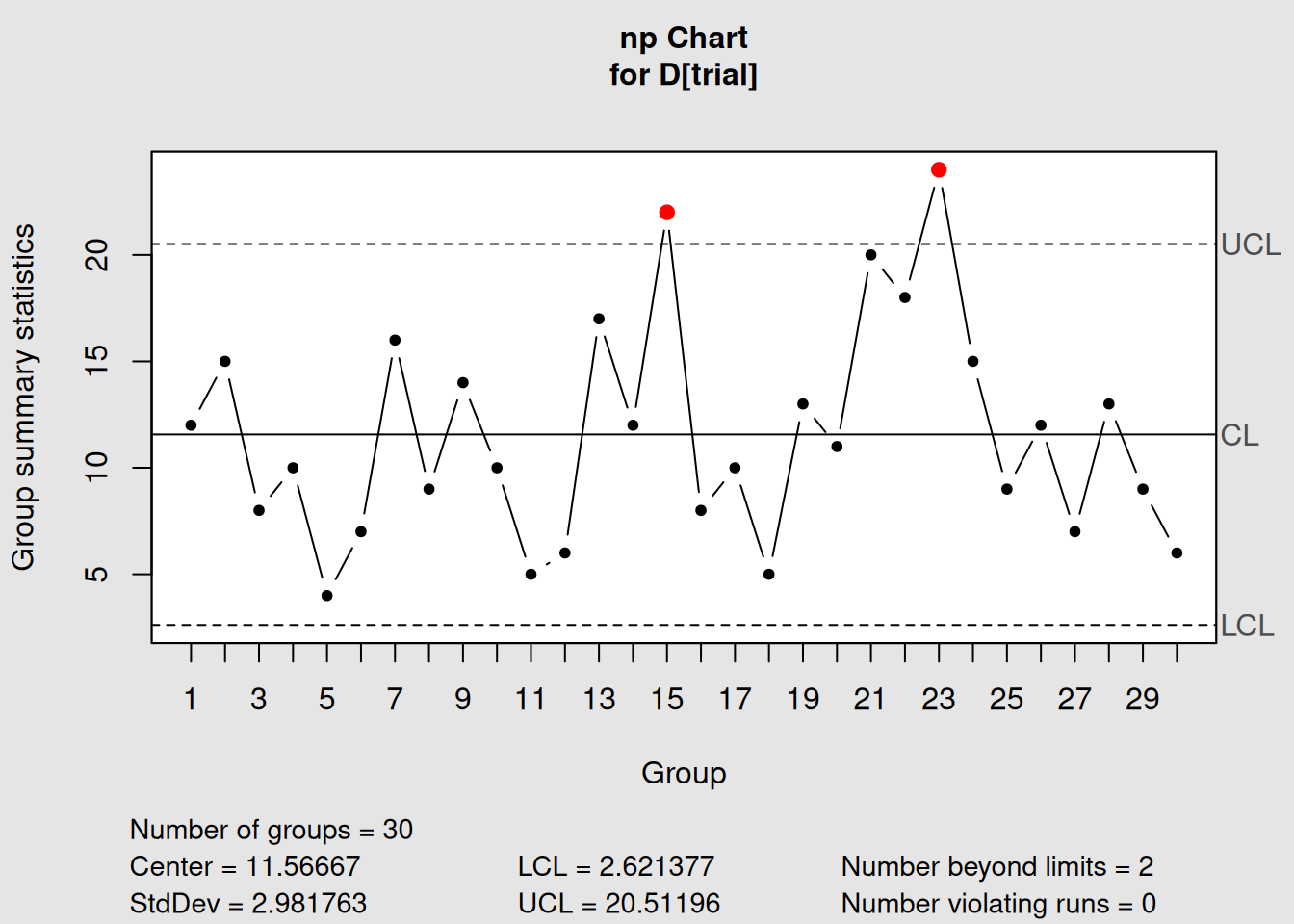
Figure 4.5: np-Chart for Constant Sample Size Data
# Display information
np_chart1
## List of 11
## $ call : language qcc(data = D[trial], type = "np", sizes = size[trial])
## $ type : chr "np"
## $ data.name : chr "D[trial]"
## $ data : int [1:30, 1] 12 15 8 10 4 7 16 9 14 10 ...
## ..- attr(*, "dimnames")=List of 2
## $ statistics: Named int [1:30] 12 15 8 10 4 7 16 9 14 10 ...
## ..- attr(*, "names")= chr [1:30] "1" "2" "3" "4" ...
## $ sizes : int [1:30] 50 50 50 50 50 50 50 50 50 50 ...
## $ center : num 11.6
## $ std.dev : num 2.98
## $ nsigmas : num 3
## $ limits : num [1, 1:2] 2.62 20.51
## ..- attr(*, "dimnames")=List of 2
## $ violations:List of 2
## - attr(*, "class")= chr "qcc"
# Plot the chart
plot(np_chart1)
Interpreting np-Chart Output
- Chart type: “np” confirms we’re monitoring counts
- Group sample size: 50 (constant for all samples)
- Center of group statistics: Average number of defective items
- Control limits: Constant (unlike p-charts with variable limits)
- Y-axis: Shows actual counts, not proportions
4.3.2.3 Step 3: Comparing p-Chart vs. np-Chart
Let’s create both charts with the same data to see the differences:
# p-chart version (proportion scale)
p_version <- with(orangejuice_constant,
                  qcc(D[trial], sizes = size[trial], type = "p"))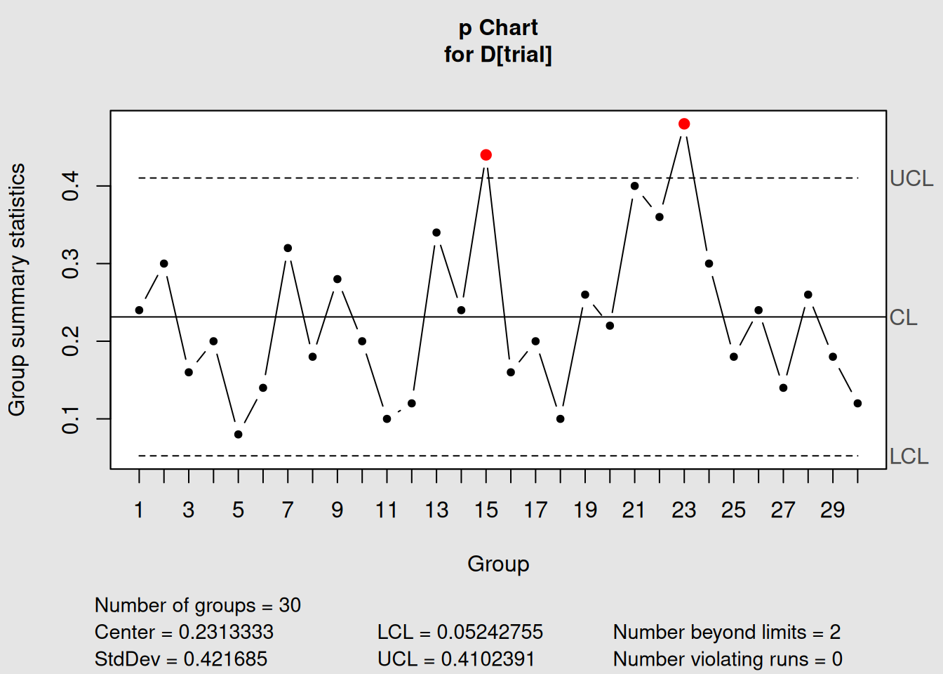
Figure 4.6: p-Chart: Proportion Scale
plot(p_version, main = "p-Chart: Proportion Defective")
# np-chart version (count scale)
np_version <- with(orangejuice_constant,
                   qcc(D[trial], sizes = size[trial], type = "np"))
Figure 4.7: np-Chart: Count Scale
plot(np_version, main = "np-Chart: Number Defective")4.3.2.4 Mathematical Relationship
# Show the mathematical relationship between p and np charts
cat("Relationship between p-chart and np-chart:\n")
## Relationship between p-chart and np-chart:## Sample size (n): 50## p-chart center line: 0.2313## np-chart center line: 11.5667
cat("Verification: n × p =", unique(orangejuice_constant$size[orangejuice_constant$trial]) * p_version$center, "\n")## Verification: n × p = 11.56667
# Control limits relationship
cat("\nControl Limits Comparison:\n")
##
## Control Limits Comparison:## p-chart UCL: 0.0524## np-chart UCL: 20.512
cat("Verification: n × p-UCL =", unique(orangejuice_constant$size[orangejuice_constant$trial]) * p_version$limits[2], "\n")## Verification: n × p-UCL = 2.6213774.3.3 Advantages and Disadvantages
4.3.3.1 np-Chart Advantages
1. Easier Interpretation
- Shop floor workers understand “5 defective items” better than “0.10 proportion defective”
- Direct counting is intuitive
- No percentage calculations needed
2. Constant Control Limits
- Same limits apply to all samples
- Easier to memorize critical values
- Simpler chart appearance
3. Historical Preference
- Many established quality systems use np-charts
- Familiar to experienced quality professionals
- Standardized procedures often specify np-charts
4.3.3.2 np-Chart Disadvantages
1. Inflexibility
- Requires constant sample sizes
- Cannot easily compare different production areas
- Difficult to adapt when sampling procedures change
2. Less Information
- Doesn’t directly show defect rate
- Harder to benchmark against industry standards (usually given as percentages)
- More difficult to communicate to management
4.3.4 Choosing Between p and np Charts
Decision Framework
Use p-charts when:
- Sample sizes vary (most common situation)
- You need to compare different areas/shifts
- Management prefers percentage reporting
- Flexibility is important
Use np-charts when:
- Sample sizes are always constant
- Operators prefer counting over percentages
- Established procedures specify np-charts
- Simplicity is more important than flexibility
4.4 c-Charts: Count of Defects
4.4.1 Understanding c-Charts
The c-chart monitors the count of defects (nonconformities) in samples of constant size or constant inspection area. Unlike p and np charts that count defective units, c-charts count the total number of defects.
4.4.1.1 Key Concept: Area of Opportunity
The “c” in c-chart stands for “count,” but the critical concept is area of opportunity11. This could be:
- Physical area: Square meters of painted surface
- Time period: Eight-hour shifts
-
Volume: Liters of liquid
- Units: Number of documents, circuit boards, etc.
4.4.1.2 When to Use c-Charts
Perfect for:
- Constant inspection area:
Same size panels, sheets, or surfaces
- Multiple defects per unit:
One item can have several defects
- Rare events:
Defects are relatively uncommon
- Poisson-distributed data:
Random, independent occurrences
Examples:
- Scratches on painted car panels (per panel)
- Errors in documents (per 100 pages)
- Defects on circuit boards (per board)
- Accidents per month (per facility)
4.4.1.3 The Mathematics of c-Charts
c-Charts are based on the Poisson distribution12, which assumes:
- Independence: Defects occur independently
-
Constant rate: Average defect rate is stable
- Rare events: Defects are uncommon relative to opportunities
Center line: \[\begin{equation} \bar{c} = \frac{\sum_{i=1}^{k} c_i}{k} \tag{4.10} \end{equation}\]
Control limits: \[\begin{equation} UCL = \bar{c} + 3\sqrt{\bar{c}} \tag{4.11} \end{equation}\]
\[\begin{equation} LCL = \bar{c} - 3\sqrt{\bar{c}} \tag{4.12} \end{equation}\]
Where \(c_i\) = count of defects in sample \(i\).
Poisson Property
In the Poisson distribution, the variance equals the mean. This is why the standard deviation is \(\sqrt{\bar{c}}\) - the square root of the average count.
4.4.2 Creating c-Charts in R
We’ll use the circuit board data from qcc, which counts defects on printed circuit boards.
4.4.2.1 Step 1: Load and Explore the Data
##    x size trial
## 1 21  100  TRUE
## 2 24  100  TRUE
## 3 16  100  TRUE
## 4 12  100  TRUE
## 5 15  100  TRUE
## 6  5  100  TRUE
str(circuit)## 'data.frame': 46 obs. of 3 variables:
## $ x : int 21 24 16 12 15 5 28 20 31 25 ...
## $ size : int 100 100 100 100 100 100 100 100 100 100 ...
## $ trial: logi TRUE TRUE TRUE TRUE TRUE TRUE ...
# Get summary statistics
summary(circuit)
## x size trial
## Min. : 5.00 Min. :100 Mode :logical
## 1st Qu.:16.00 1st Qu.:100 FALSE:20
## Median :19.00 Median :100 TRUE :26
## Mean :19.17 Mean :100
## 3rd Qu.:22.00 3rd Qu.:100
## Max. :39.00 Max. :100
# Look at the data by trial status
aggregate(cbind(x, size) ~ trial, data = circuit, FUN = function(x) c(
  n = length(x),
  mean = mean(x),
  sum = sum(x),
  min = min(x),
  max = max(x)
))
## trial x.n x.mean x.sum x.min x.max size.n size.mean
## 1 FALSE 20.00000 18.30000 366.00000 9.00000 28.00000 20 100
## 2 TRUE 26.00000 19.84615 516.00000 5.00000 39.00000 26 100
## size.sum size.min size.max
## 1 2000 100 100
## 2 2600 100 100Understanding Circuit Board Data
- x: Number of defects found on each circuit board
- size: Inspection area (constant at 100 - representing standardized board area)
-
trial: TRUE = baseline data, FALSE = new production data
- sample: Board number (time sequence)
This represents counting defects like poor solder joints, missing components, or shorts on standardized circuit boards.
4.4.2.2 Step 2: Create a Basic c-Chart
# Create c-chart using trial data
c_chart1 <- with(circuit, qcc(x[trial], sizes = size[trial], type = "c"))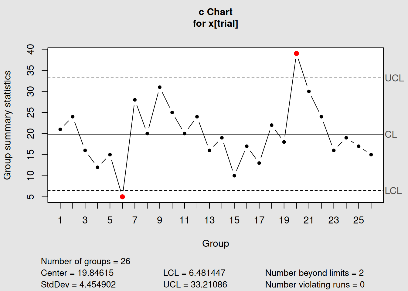
Figure 4.8: c-Chart for Circuit Board Defect Counts
# Display information
c_chart1
## List of 11
## $ call : language qcc(data = x[trial], type = "c", sizes = size[trial])
## $ type : chr "c"
## $ data.name : chr "x[trial]"
## $ data : int [1:26, 1] 21 24 16 12 15 5 28 20 31 25 ...
## ..- attr(*, "dimnames")=List of 2
## $ statistics: Named int [1:26] 21 24 16 12 15 5 28 20 31 25 ...
## ..- attr(*, "names")= chr [1:26] "1" "2" "3" "4" ...
## $ sizes : int [1:26] 100 100 100 100 100 100 100 100 100 100 ...
## $ center : num 19.8
## $ std.dev : num 4.45
## $ nsigmas : num 3
## $ limits : num [1, 1:2] 6.48 33.21
## ..- attr(*, "dimnames")=List of 2
## $ violations:List of 2
## - attr(*, "class")= chr "qcc"
# Plot the chart
plot(c_chart1)
4.4.2.3 Step 3: c-Chart with Phase II Monitoring
# Add new production data
c_chart2 <- with(circuit, qcc(x[trial], sizes = size[trial], type = "c",
                              newdata = x[!trial], newsizes = size[!trial]))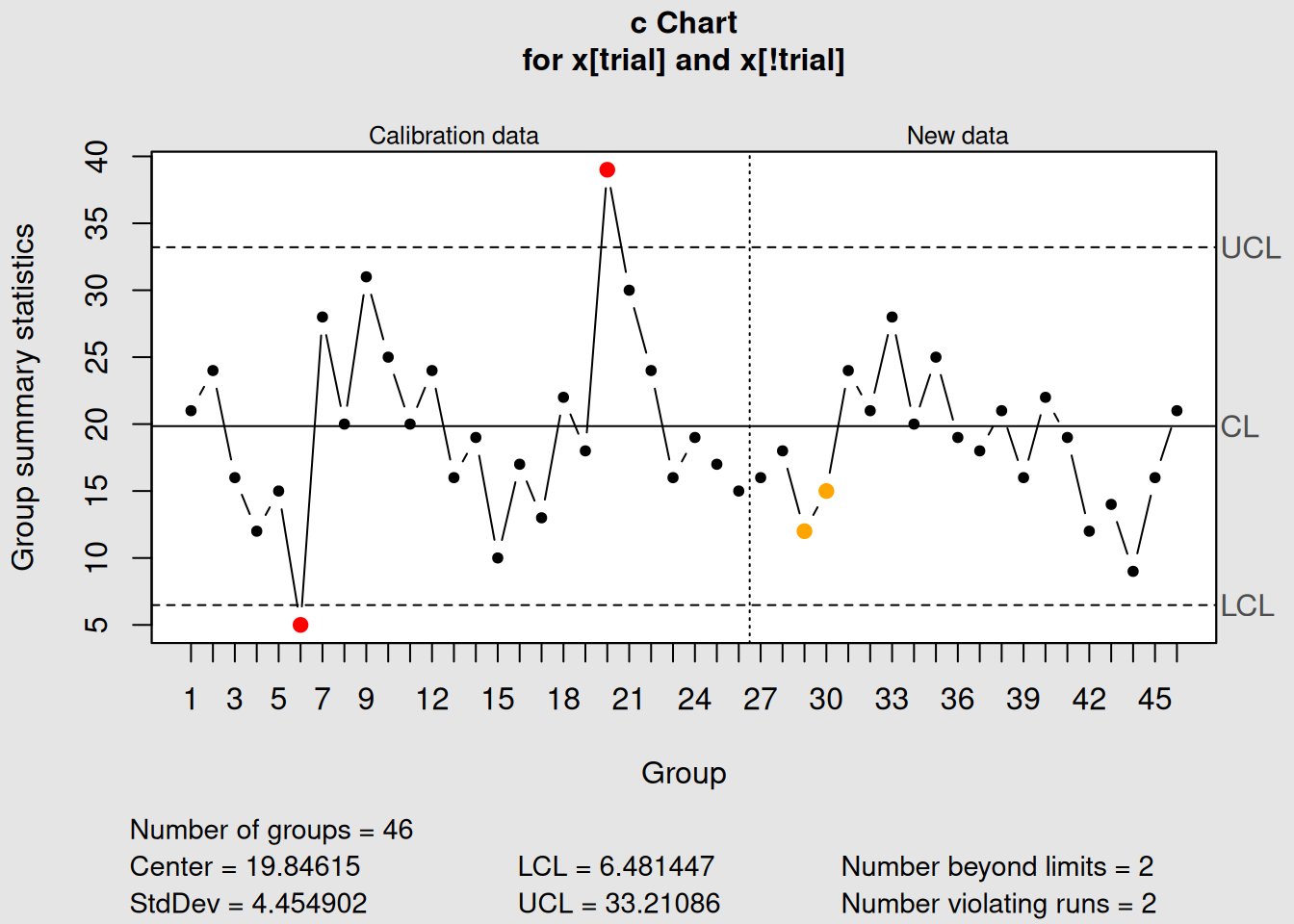
Figure 4.9: c-Chart with Phase I and Phase II Data
# Display and plot
c_chart2
## List of 15
## $ call : language qcc(data = x[trial], type = "c", sizes = size[trial], newdata = x[!trial], newsizes = size[!trial])
## $ type : chr "c"
## $ data.name : chr "x[trial]"
## $ data : int [1:26, 1] 21 24 16 12 15 5 28 20 31 25 ...
## ..- attr(*, "dimnames")=List of 2
## $ statistics : Named int [1:26] 21 24 16 12 15 5 28 20 31 25 ...
## ..- attr(*, "names")= chr [1:26] "1" "2" "3" "4" ...
## $ sizes : int [1:26] 100 100 100 100 100 100 100 100 100 100 ...
## $ center : num 19.8
## $ std.dev : num 4.45
## $ newstats : Named int [1:20] 16 18 12 15 24 21 28 20 25 19 ...
## ..- attr(*, "names")= chr [1:20] "27" "28" "29" "30" ...
## $ newdata : int [1:20, 1] 16 18 12 15 24 21 28 20 25 19 ...
## $ newsizes : int [1:20] 100 100 100 100 100 100 100 100 100 100 ...
## $ newdata.name: chr "x[!trial]"
## $ nsigmas : num 3
## $ limits : num [1, 1:2] 6.48 33.21
## ..- attr(*, "dimnames")=List of 2
## $ violations :List of 2
## - attr(*, "class")= chr "qcc"
plot(c_chart2)4.4.3 Interpreting c-Charts
4.4.3.1 What c-Charts Tell You
1. Process Consistency
- Stable count: Process is in control
- Increasing trend: Process degrading
- Decreasing trend: Process improving
2. Special Events
- High counts: Equipment problems, material issues, operator errors
- Low counts: Process improvements, better training, new procedures
3. Poisson Assumptions
# Check if our data follows Poisson distribution
trial_defects <- circuit$x[circuit$trial]

cat("Poisson Distribution Check:\n")
## Poisson Distribution Check:## Mean defects per board: 19.85## Variance of defects: 51.34## Ratio (should ≈ 1 for Poisson): 2.59
# Visual check - histogram vs Poisson
hist(trial_defects, breaks = seq(-0.5, max(trial_defects) + 0.5, 1),
     main = "Distribution of Defect Counts",
     xlab = "Number of Defects per Board",
     ylab = "Frequency",
     col = "lightblue")

# Overlay theoretical Poisson distribution
lambda_est <- mean(trial_defects)
x_vals <- 0:max(trial_defects)
poisson_probs <- dpois(x_vals, lambda_est) * length(trial_defects)
points(x_vals, poisson_probs, col = "red", pch = 16, type = "b")
legend("topright", c("Observed", "Poisson"), col = c("lightblue", "red"), pch = c(15, 16))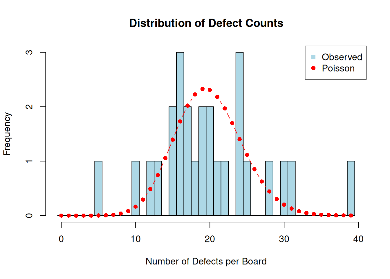
4.4.3.2 Real-World c-Chart Applications
Manufacturing:
- Weld defects per meter of seam
- Surface defects per square meter of material
- Assembly errors per unit produced
- Test failures per batch
Service Industries:
- Billing errors per 1000 invoices
- Website crashes per day
- Customer complaints per shift
- Safety incidents per month
4.4.4 Handling Special Situations
4.4.4.1 What if LCL is Negative?
# Demonstrate when LCL becomes negative
low_defect_scenario <- c(1, 0, 2, 1, 0, 1, 2, 0, 1, 1)

cat("Scenario with low defect counts:\n")
## Scenario with low defect counts:
cat("Defect counts:", low_defect_scenario, "\n")## Defect counts: 1 0 2 1 0 1 2 0 1 1## Average (c-bar): 0.9## Calculated LCL: -1.94605
cat("\nSince LCL cannot be negative, it's set to 0\n")##
## Since LCL cannot be negative, it's set to 0Negative Control Limits
When \(\bar{c} < 9\), the calculated LCL becomes negative. Since you can’t have negative defects, LCL is set to 0. This is normal and expected for processes with low defect rates.
4.5 u-Charts: Defects per Unit
4.5.1 Understanding u-Charts
The u-chart monitors the rate of defects per unit when the area of opportunity varies between samples. It’s the most flexible defect-counting chart because it can handle varying sample sizes, inspection areas, or time periods.
4.5.1.1 When to Use u-Charts
Perfect for:
- Variable inspection areas: Different sized panels, sheets, or batches
- Variable time periods: Different shift lengths or inspection durations
- Defect rates: When you want defects per unit rather than total counts
- Comparison purposes: When you need to compare different sized areas
4.5.1.2 u-Charts vs. c-Charts
| Aspect | c-Chart | u-Chart |
|---|---|---|
| Inspection Area | Constant | Variable |
| Y-axis | Total count | Rate (defects per unit) |
| Control Limits | Constant | Variable |
| Use Case | Standardized inspection | Flexible inspection |
| Interpretation | Total defects | Defect density |
4.5.1.3 The Mathematics of u-Charts
Defect rate for sample i: \[\begin{equation} u_i = \frac{c_i}{n_i} \tag{4.13} \end{equation}\]
Where \(c_i\) = defects in sample \(i\), \(n_i\) = inspection area for sample \(i\).
Center line: \[\begin{equation} \bar{u} = \frac{\sum_{i=1}^{k} c_i}{\sum_{i=1}^{k} n_i} \tag{4.14} \end{equation}\]
Control limits for sample i: \[\begin{equation} UCL_i = \bar{u} + 3\sqrt{\frac{\bar{u}}{n_i}} \tag{4.15} \end{equation}\]
\[\begin{equation} LCL_i = \bar{u} - 3\sqrt{\frac{\bar{u}}{n_i}} \tag{4.16} \end{equation}\]
4.5.2 Creating u-Charts in R
We’ll use the PC manufacturing data, which counts nonconformities on computer units of different sizes.
4.5.2.1 Step 1: Load and Explore the Data
##    x size
## 1 10    5
## 2 12    5
## 3  8    5
## 4 14    5
## 5 10    5
## 6 16    5
str(pcmanufact)## 'data.frame': 20 obs. of 2 variables:
## $ x : int 10 12 8 14 10 16 11 7 10 15 ...
## $ size: int 5 5 5 5 5 5 5 5 5 5 ...
# Get summary statistics
summary(pcmanufact)
## x size
## Min. : 5.00 Min. :5
## 1st Qu.: 7.00 1st Qu.:5
## Median :10.00 Median :5
## Mean : 9.65 Mean :5
## 3rd Qu.:11.25 3rd Qu.:5
## Max. :16.00 Max. :5
# Check for variable inspection areas
print("Inspection areas (size variable):")
## [1] "Inspection areas (size variable):"
table(pcmanufact$size)##
## 5
## 20Understanding PC Manufacturing Data
- x: Number of nonconformities found on each computer
- size: Number of computers inspected (varies from 5-5, but represents inspection intensity)
This data represents quality inspection of personal computers where inspectors count various nonconformities like cosmetic defects, missing labels, or assembly issues.
4.5.2.2 Step 2: Create a u-Chart
# Create u-chart using all data (no trial distinction in this dataset)
u_chart1 <- with(pcmanufact, qcc(x, sizes = size, type = "u"))
Figure 4.10: u-Chart for PC Manufacturing Defects per Unit
# Display information
u_chart1
## List of 11
## $ call : language qcc(data = x, type = "u", sizes = size)
## $ type : chr "u"
## $ data.name : chr "x"
## $ data : int [1:20, 1] 10 12 8 14 10 16 11 7 10 15 ...
## ..- attr(*, "dimnames")=List of 2
## $ statistics: Named num [1:20] 2 2.4 1.6 2.8 2 3.2 2.2 1.4 2 3 ...
## ..- attr(*, "names")= chr [1:20] "1" "2" "3" "4" ...
## $ sizes : int [1:20] 5 5 5 5 5 5 5 5 5 5 ...
## $ center : num 1.93
## $ std.dev : num 1.39
## $ nsigmas : num 3
## $ limits : num [1, 1:2] 0.0661 3.7939
## ..- attr(*, "dimnames")=List of 2
## $ violations:List of 2
## - attr(*, "class")= chr "qcc"
# Plot the chart
plot(u_chart1)
4.5.2.3 Step 3: Demonstrate Variable Control Limits
Let’s create a scenario with more variable inspection areas to show how u-charts handle this:
# Create example data with variable inspection areas
set.seed(123)
inspection_areas <- c(rep(5, 5), rep(10, 5), rep(15, 5), rep(8, 5))
# Simulate defects with constant rate of 2 defects per unit
defect_counts <- rpois(length(inspection_areas), lambda = 2 * inspection_areas)

# Create u-chart
u_variable <- qcc(defect_counts, sizes = inspection_areas, type = "u")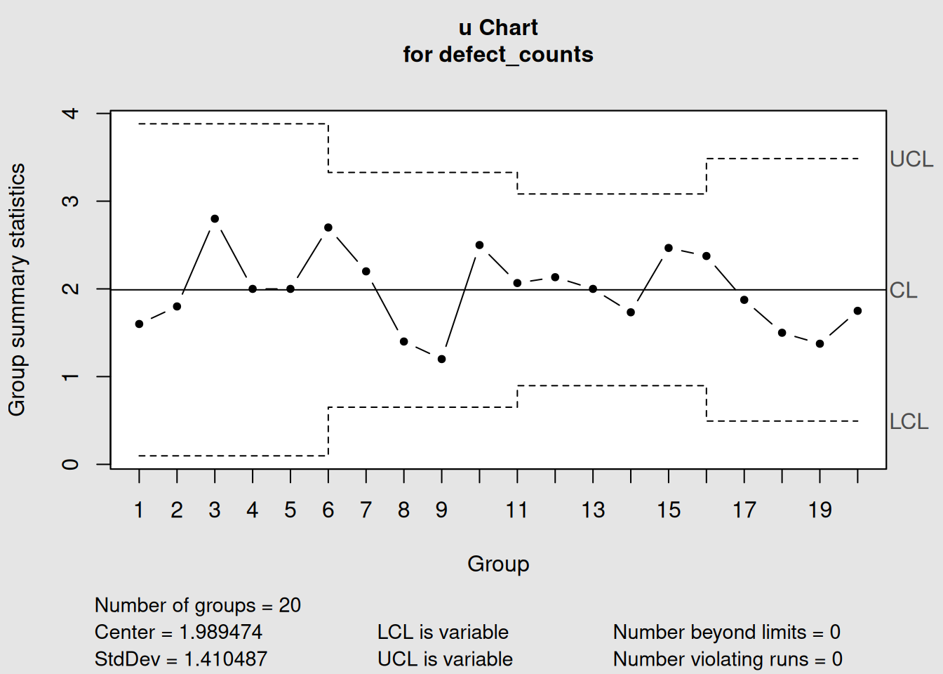
Figure 4.11: u-Chart with Highly Variable Inspection Areas
plot(u_variable, main = "u-Chart with Variable Inspection Areas")

# Show the data
variable_data <- data.frame(
  Sample = 1:length(inspection_areas),
  Area = inspection_areas,
  Defects = defect_counts,
  Rate = round(defect_counts / inspection_areas, 3)
)
print("Sample data showing variable inspection areas:")
## [1] "Sample data showing variable inspection areas:"
print(variable_data)## Sample Area Defects Rate
## 1 1 5 8 1.600
## 2 2 5 9 1.800
## 3 3 5 14 2.800
## 4 4 5 10 2.000
## 5 5 5 10 2.000
## 6 6 10 27 2.700
## 7 7 10 22 2.200
## 8 8 10 14 1.400
## 9 9 10 12 1.200
## 10 10 10 25 2.500
## 11 11 15 31 2.067
## 12 12 15 32 2.133
## 13 13 15 30 2.000
## 14 14 15 26 1.733
## 15 15 15 37 2.467
## 16 16 8 19 2.375
## 17 17 8 15 1.875
## 18 18 8 12 1.500
## 19 19 8 11 1.375
## 20 20 8 14 1.7504.5.3 Interpreting u-Charts
4.5.3.1 Variable Control Limits in u-Charts
Just like p-charts, u-charts have variable control limits based on the inspection area:
# Show how inspection area affects control limits
areas <- c(1, 5, 10, 20, 50)
u_bar <- 2.0  # 2 defects per unit

ucl_values <- u_bar + 3 * sqrt(u_bar / areas)
lcl_values <- pmax(0, u_bar - 3 * sqrt(u_bar / areas))

limits_table <- data.frame(
  Inspection_Area = areas,
  UCL = round(ucl_values, 3),
  Center = u_bar,
  LCL = round(lcl_values, 3)
)

print("How Inspection Area Affects u-Chart Control Limits:")
## [1] "How Inspection Area Affects u-Chart Control Limits:"
print(limits_table)## Inspection_Area UCL Center LCL
## 1 1 6.243 2 0.000
## 2 5 3.897 2 0.103
## 3 10 3.342 2 0.658
## 4 20 2.949 2 1.051
## 5 50 2.600 2 1.400Control Limit Pattern
- Smaller areas: Wider control limits (less precision)
-
Larger areas: Narrower control limits (more precision)
- Same pattern as p-charts: More data = better precision
4.5.3.2 Real-World u-Chart Applications
Manufacturing:
- Defects per square meter of fabric
- Weld defects per meter of pipe
- Surface flaws per unit area of coating
- Assembly errors per vehicle (different complexity)
Service Industries:
- Errors per 1000 transactions (variable transaction volumes)
- Defects per hour of operation (variable operating times)
- Complaints per customer interaction (variable interaction complexity)
Software Development:
- Bugs per 1000 lines of code (variable module sizes)
- User interface defects per screen (variable screen complexity)
- Security vulnerabilities per system component
4.6 Chart Selection for Attribute Data
4.6.1 Comprehensive Decision Framework
Choosing the right attribute chart depends on several factors. Here’s a systematic approach:
4.6.1.1 Step 1: Identify Your Data Type
First Question: What are you counting?
# Create a visual decision aid
decision_tree <- data.frame(
  Question = c("What are you counting?", "What are you counting?"),
  Answer = c("Units (items that pass/fail)", "Defects (problems on items)"),
  Next_Step = c("Go to Step 2a", "Go to Step 2b"),
  Chart_Family = c("p/np charts", "c/u charts")
)

print("Step 1: Data Type Classification")
## [1] "Step 1: Data Type Classification"
print(decision_tree)## Question Answer Next_Step
## 1 What are you counting? Units (items that pass/fail) Go to Step 2a
## 2 What are you counting? Defects (problems on items) Go to Step 2b
## Chart_Family
## 1 p/np charts
## 2 c/u charts4.6.2 Practical Selection Examples
Let’s work through some real-world scenarios:
# Example scenarios for chart selection
scenarios <- data.frame(
  Scenario = c(
    "Final inspection: Pass/fail testing of products",
    "Paint defects on car panels (same size panels)",
    "Document errors in reports (different page counts)",
    "Customer satisfaction surveys (variable respondents)",
    "Website crashes per day (24-hour periods)",
    "Defects on circuit boards (different board sizes)"
  ),
  Data_Type = c("Units", "Defects", "Defects", "Units", "Defects", "Defects"),
  Sample_Size = c("Variable", "Constant", "Variable", "Variable", "Constant", "Variable"),
  Recommended_Chart = c("p-chart", "c-chart", "u-chart", "p-chart", "c-chart", "u-chart"),
  Reason = c(
    "Units with variable batch sizes",
    "Defects with constant inspection area",
    "Defects with variable document sizes",
    "Units with variable survey sizes",
    "Defects with constant time periods",
    "Defects with variable board sizes"
  )
)

print("Chart Selection Examples:")
## [1] "Chart Selection Examples:"
print(scenarios)## Scenario Data_Type Sample_Size
## 1 Final inspection: Pass/fail testing of products Units Variable
## 2 Paint defects on car panels (same size panels) Defects Constant
## 3 Document errors in reports (different page counts) Defects Variable
## 4 Customer satisfaction surveys (variable respondents) Units Variable
## 5 Website crashes per day (24-hour periods) Defects Constant
## 6 Defects on circuit boards (different board sizes) Defects Variable
## Recommended_Chart Reason
## 1 p-chart Units with variable batch sizes
## 2 c-chart Defects with constant inspection area
## 3 u-chart Defects with variable document sizes
## 4 p-chart Units with variable survey sizes
## 5 c-chart Defects with constant time periods
## 6 u-chart Defects with variable board sizes4.6.3 Advanced Considerations
4.6.3.1 Sample Size Guidelines
Minimum Sample Size Recommendations:
# Calculate minimum sample sizes for different defect rates
defect_rates <- c(0.01, 0.05, 0.10, 0.20)
min_samples <- ceiling(300 / defect_rates)  # Rule of thumb: expect at least 5 defects

guidelines <- data.frame(
  Defect_Rate = paste0(defect_rates * 100, "%"),
  Min_Sample_Size = min_samples,
  Expected_Defects = defect_rates * min_samples,
  Chart_Suitability = c("Marginal", "Good", "Very Good", "Excellent")
)

print("Sample Size Guidelines for Attribute Charts:")
## [1] "Sample Size Guidelines for Attribute Charts:"
print(guidelines)## Defect_Rate Min_Sample_Size Expected_Defects Chart_Suitability
## 1 1% 30000 300 Marginal
## 2 5% 6000 300 Good
## 3 10% 3000 300 Very Good
## 4 20% 1500 300 ExcellentSample Size Rule
For reliable attribute charts, aim for at least 5 expected defects in your average sample. If defect rates are very low, you need larger sample sizes.
4.6.3.2 Data Collection Planning
Before implementing attribute charts, consider:
-
Sampling Strategy
- Random sampling vs. systematic sampling
- Frequency of inspection
- Cost of inspection vs. information gained
-
Operational Definitions13
- What exactly counts as a “defect”?
- Clear pass/fail criteria
- Training for inspectors
-
Data Recording
- Consistent data collection procedures
- Traceability to specific times, operators, materials
- Documentation of special causes
4.6.4 Software Implementation Comparison
# Create demonstration charts for comparison

# p-chart example
p_demo <- with(orangejuice[orangejuice$trial,],
               qcc(D, sizes = size, type = "p"))
Figure 4.12: Comparison of All Four Attribute Chart Types
plot(p_demo, main = "p-Chart: Proportion Defective (Variable Sample Sizes)")
# np-chart example (using constant size subset)
np_demo <- with(orangejuice_constant[orangejuice_constant$trial,],
                qcc(D, sizes = size, type = "np"))
Figure 4.13: np-Chart Example
plot(np_demo, main = "np-Chart: Number Defective (Constant Sample Size)")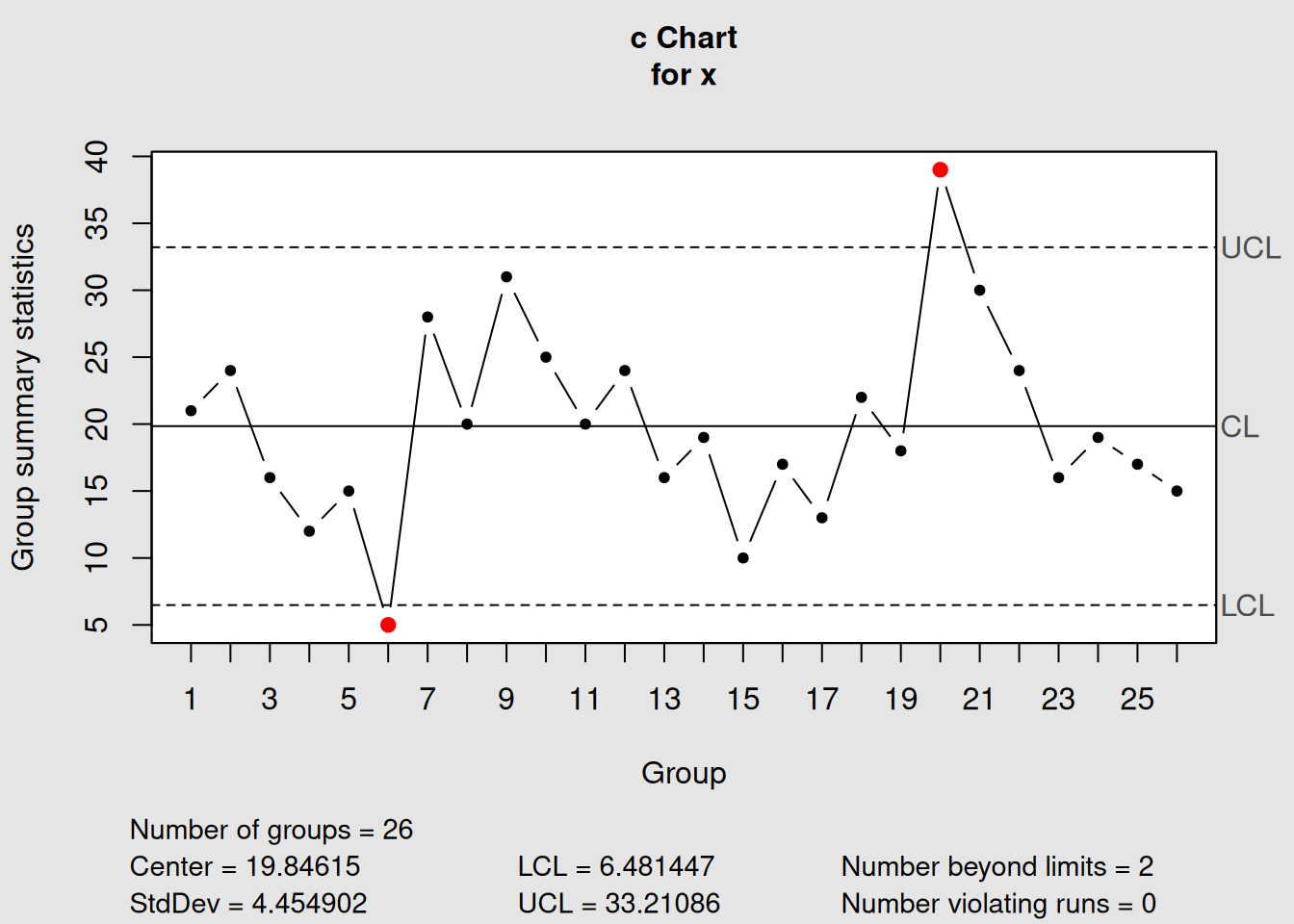
Figure 4.14: c-Chart Example
plot(c_demo, main = "c-Chart: Count of Defects (Constant Area)")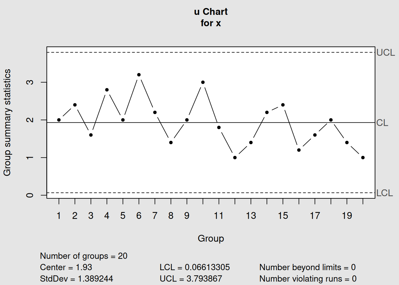
Figure 4.15: u-Chart Example
plot(u_demo, main = "u-Chart: Defects per Unit (Variable Area)")4.7 Chapter Summary
This chapter provided comprehensive coverage of attribute control charts, which handle categorical and count data rather than continuous measurements.
4.7.1 Key Concepts Mastered
1. Fundamental Distinctions
- Variable vs. Attribute Data: Measured vs. counted characteristics
- Nonconforming vs. Nonconformity: Defective units vs. individual defects
- Binomial vs. Poisson: Different statistical foundations
2. Chart Types and Applications
| Chart | Data Type | Sample Size | Best For |
|---|---|---|---|
| p-chart | Proportion defective | Variable | Flexible sampling, percentage reporting |
| np-chart | Number defective | Constant | Simple counting, shop floor use |
| c-chart | Count of defects | Constant area | Standardized inspection areas |
| u-chart | Defects per unit | Variable area | Flexible inspection, rate comparison |
3. Statistical Foundations
- Binomial distribution: For counting nonconforming units (p, np charts)
- Poisson distribution: For counting defects (c, u charts)
- Variable control limits: Common in p and u charts due to sample size effects
4. Practical Implementation
- Sample size planning: Larger samples for rare events
- Operational definitions: Critical for consistent classification
- Phase I vs. Phase II: Same principles as variable charts
4.7.2 Decision Framework Summary
Quick Chart Selection Guide
Step 1: What are you counting?
- Units (pass/fail) → p or np chart
- Defects (problems) → c or u chart
Step 2: Is your sample size constant?
- Yes → np or c chart (simpler)
- No → p or u chart (more flexible)
Step 3: Consider practical factors
- Shop floor simplicity → Prefer np and c charts
- Management reporting → Prefer p and u charts (rates/percentages)
- Comparison needs → Prefer p and u charts (normalized)
4.7.3 Real-World Applications
Manufacturing Quality Control:
- Incoming inspection (supplier quality)
- In-process monitoring (assembly defects)
- Final inspection (customer-ready products)
- Field failure tracking (warranty returns)
Service Quality Monitoring:
- Customer satisfaction metrics
- Error rate tracking
- Compliance monitoring
- Performance benchmarking
4.7.4 What’s Next?
In Chapter 5, we’ll explore Process Capability Studies, which use the control charts we’ve learned to assess whether processes can consistently meet customer specifications. We’ll learn to calculate capability indices and understand the relationship between process control and process capability.
4.7.5 Quick Reference: R Code for Attribute Charts
# Essential workflow for attribute control charts

# 1. Load your data and identify chart type
library(qcc)
# Determine: Units or defects? Constant or variable sample size?

# 2. p-chart (proportion defective, variable sample size)
p_chart <- qcc(defective_counts, sizes = sample_sizes, type = "p")
plot(p_chart)

# 3. np-chart (number defective, constant sample size)
np_chart <- qcc(defective_counts, sizes = constant_size, type = "np")
plot(np_chart)

# 4. c-chart (defect count, constant area)
c_chart <- qcc(defect_counts, sizes = constant_area, type = "c")
plot(c_chart)

# 5. u-chart (defects per unit, variable area)
u_chart <- qcc(defect_counts, sizes = variable_areas, type = "u")
plot(u_chart)

# 6. Phase II monitoring (any chart type)
chart_phase2 <- qcc(baseline_data, sizes = baseline_sizes, type = "chart_type",
                    newdata = new_data, newsizes = new_sizes)
plot(chart_phase2)
You now have complete mastery of both variable and attribute control charts - the fundamental tools of statistical process control!