3 Basic Control Charts
Learning Objectives
After completing this chapter, you will be able to:
- Understand the theory behind X-bar, R, and S control charts
- Create X-bar charts for process mean monitoring
- Construct R charts for process variability control
- Use S charts as alternatives to R charts
- Combine X-bar and R charts for complete process analysis
- Distinguish between Phase I and Phase II analysis
- Select appropriate chart types based on sample size
- Interpret out-of-control signals and patterns
In this chapter, we dive into the most fundamental and widely used control charts in statistical process control. These variable control charts1 monitor processes where we can measure actual values rather than just counting defects or nonconformities.
3.1 X-bar Charts: Process Mean Monitoring
3.1.1 Understanding the Theory
The X-bar chart (pronounced “X-bar chart”) is the cornerstone of statistical process control.
It monitors the average (mean) of sample groups over time to detect shifts in the process center.
3.1.1.1 What is an X-bar Chart?
An X-bar chart plots the average of each sample group against time or sample number.
Think of it this way:
instead of plotting individual measurements (which can be quite variable), we plot the average of small groups of measurements. This averaging effect makes it much easier to detect meaningful changes in the process.
Why Average Instead of Individual Values?
By averaging measurements within each sample group:
- Random variation is reduced: Individual measurements vary randomly, but averages are more stable
- Process shifts become visible: Systematic changes in the process mean become easier to detect
- Statistical power increases: We can detect smaller shifts in the process with greater confidence
3.1.1.2 The Mathematics Behind X-bar Charts
The X-bar chart is based on the Central Limit Theorem2, one of the most important concepts in statistics.
Key Formulas:
For each sample group \(i\): \[\begin{equation} \bar{X}_i = \frac{X_{i1} + X_{i2} + ... + X_{in}}{n} \tag{3.1} \end{equation}\]
Where:
- \(\bar{X}_i\) = average of sample group \(i\)
- \(X_{ij}\) = individual measurement \(j\) in group \(i\)
- \(n\) = sample size (number of measurements per group)
Control Limits: \[\begin{equation} UCL = \bar{\bar{X}} + A_2 \bar{R} \tag{3.2} \end{equation}\]
\[\begin{equation} CL = \bar{\bar{X}} \tag{3.3} \end{equation}\]
\[\begin{equation} LCL = \bar{\bar{X}} - A_2 \bar{R} \tag{3.4} \end{equation}\]
Where:
- \(\bar{\bar{X}}\) = grand average (average of all sample averages)
- \(\bar{R}\) = average range
- \(A_2\) = control chart constant3 (depends on sample size)
3.1.2 Creating X-bar Charts in R
Now let’s see how to create X-bar charts using the qcc package. We’ll use the piston ring data that we prepared in Chapter 2.
3.1.2.1 Step 1: Load and Prepare the Data
# Load required packages
library(qcc)

# Load the pistonrings dataset
data(pistonrings)

# Examine the structure
head(pistonrings, 10)
## diameter sample trial
## 1 74.030 1 TRUE
## 2 74.002 1 TRUE
## 3 74.019 1 TRUE
## 4 73.992 1 TRUE
## 5 74.008 1 TRUE
## 6 73.995 2 TRUE
## 7 73.992 2 TRUE
## 8 74.001 2 TRUE
## 9 74.011 2 TRUE
## 10 74.004 2 TRUE
# Organize data into sample groups (as we learned in Chapter 2)
diameter_list <- split(pistonrings$diameter, pistonrings$sample)
max_obs <- max(lengths(diameter_list))
diameter <- t(sapply(diameter_list, function(x) c(x, rep(NA, max_obs - length(x)))))

# Check our grouped data
dim(diameter)
## [1] 40 5
head(diameter)## [,1] [,2] [,3] [,4] [,5]
## 1 74.030 74.002 74.019 73.992 74.008
## 2 73.995 73.992 74.001 74.011 74.004
## 3 73.988 74.024 74.021 74.005 74.002
## 4 74.002 73.996 73.993 74.015 74.009
## 5 73.992 74.007 74.015 73.989 74.014
## 6 74.009 73.994 73.997 73.985 73.9933.1.2.2 Step 2: Create a Basic X-bar Chart (Phase I)
# Create X-bar chart using first 25 sample groups for Phase I
q1 <- qcc(diameter[1:25,], type = "xbar")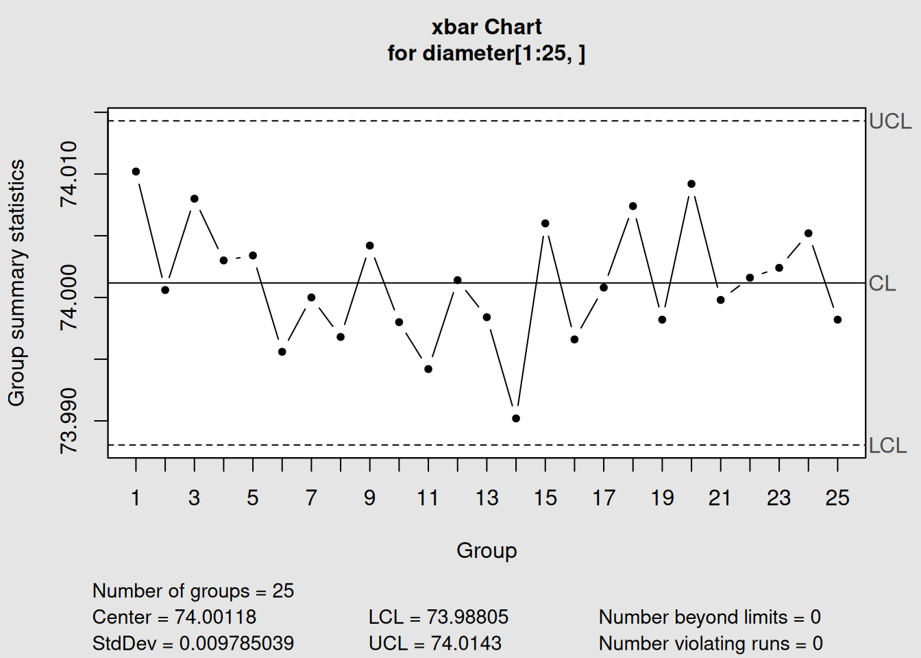
Figure 3.1: Basic X-bar Chart for Piston Ring Diameter
# Display the chart object information
q1
## List of 11
## $ call : language qcc(data = diameter[1:25, ], type = "xbar")
## $ type : chr "xbar"
## $ data.name : chr "diameter[1:25, ]"
## $ data : num [1:25, 1:5] 74 74 74 74 74 ...
## ..- attr(*, "dimnames")=List of 2
## $ statistics: Named num [1:25] 74 74 74 74 74 ...
## ..- attr(*, "names")= chr [1:25] "1" "2" "3" "4" ...
## $ sizes : Named int [1:25] 5 5 5 5 5 5 5 5 5 5 ...
## ..- attr(*, "names")= chr [1:25] "1" "2" "3" "4" ...
## $ center : num 74
## $ std.dev : num 0.00979
## $ nsigmas : num 3
## $ limits : num [1, 1:2] 74 74
## ..- attr(*, "dimnames")=List of 2
## $ violations:List of 2
## - attr(*, "class")= chr "qcc"Let’s understand what qcc is telling us:
Interpreting X-bar Chart Output
- Chart type: “xbar” confirms we’re monitoring sample averages
- Number of groups: 25 sample groups used to establish control limits
- Group sample size: 5 measurements per group
- Center of group statistics: 74.00118 (this is \(\bar{\bar{X}}\), the grand average)
- Standard deviation: 0.009785 (estimated from the data)
- Control limits: Lower = 73.988, Upper = 74.014 (in mm)
3.1.2.3 Step 3: Plot the X-bar Chart
# Plot the chart
plot(q1)
Figure 3.2: X-bar Control Chart with Interpretation
3.1.2.4 Step 4: Phase II Monitoring (Adding New Data)
In real-world applications, we first establish control limits using historical data (Phase I), then monitor new production using those limits (Phase II).
# Add new data (samples 26-40) for Phase II monitoring
q2 <- qcc(diameter[1:25,], type = "xbar", newdata = diameter[26:40,])
Figure 3.3: X-bar Chart with Phase I and Phase II Data
# Display the updated information
q2
## List of 15
## $ call : language qcc(data = diameter[1:25, ], type = "xbar", newdata = diameter[26:40, ])
## $ type : chr "xbar"
## $ data.name : chr "diameter[1:25, ]"
## $ data : num [1:25, 1:5] 74 74 74 74 74 ...
## ..- attr(*, "dimnames")=List of 2
## $ statistics : Named num [1:25] 74 74 74 74 74 ...
## ..- attr(*, "names")= chr [1:25] "1" "2" "3" "4" ...
## $ sizes : Named int [1:25] 5 5 5 5 5 5 5 5 5 5 ...
## ..- attr(*, "names")= chr [1:25] "1" "2" "3" "4" ...
## $ center : num 74
## $ std.dev : num 0.00979
## $ newstats : Named num [1:15] 74 74 74 74 74 ...
## ..- attr(*, "names")= chr [1:15] "26" "27" "28" "29" ...
## $ newdata : num [1:15, 1:5] 74 74 74 74 74 ...
## ..- attr(*, "dimnames")=List of 2
## $ newsizes : Named int [1:15] 5 5 5 5 5 5 5 5 5 5 ...
## ..- attr(*, "names")= chr [1:15] "26" "27" "28" "29" ...
## $ newdata.name: chr "diameter[26:40, ]"
## $ nsigmas : num 3
## $ limits : num [1, 1:2] 74 74
## ..- attr(*, "dimnames")=List of 2
## $ violations :List of 2
## - attr(*, "class")= chr "qcc"
# Plot both phases
plot(q2)
3.1.3 Interpreting X-bar Charts
3.1.3.1 What to Look For
1. Points Outside Control Limits
- Any point above the UCL or below the LCL indicates the process average has shifted
- This suggests a special cause4 is affecting the process
2. Patterns Within Control Limits
Even when all points are within limits, certain patterns can indicate problems:
- Trends: 7 or more consecutive points trending up or down
- Shifts: 8 or more consecutive points on one side of the center line
- Cycles: Regular up-and-down patterns
# Apply Western Electric Rules for pattern detection
q3 <- qcc(diameter[1:25,], type = "xbar", newdata = diameter[26:40,], rules = 1:4)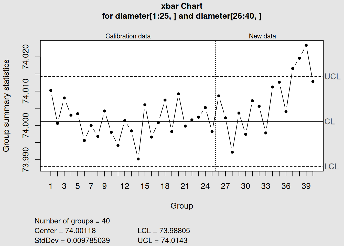
Figure 3.4: X-bar Chart with Control Rules Applied
plot(q3)3.1.3.2 Real-World Example Interpretation
Looking at our piston ring data:
- Process appears stable: All points are within control limits
- No obvious patterns: Points seem randomly distributed around the center line
- Process average: Approximately 74.00 mm diameter
- Process capability: The variation is small relative to the mean
Practical Insight
If this were a real manufacturing process, we could conclude that the piston ring machining process is in statistical control for the time period monitored. The process is producing rings with an average diameter of 74.00 mm with predictable variation.
3.2 R Charts: Range/Variability Control
3.2.1 Understanding the Theory
While X-bar charts monitor the process average, R charts monitor the process variability or spread. The “R” stands for “Range,” which is the difference between the largest and smallest values in each sample group.
3.2.1.1 Why Monitor Variability?
Process variability is just as important as the process average because:
- Consistency matters: A process might have the right average but be too variable
- Capability depends on variation: Lower variation means better capability to meet specifications
- Early warning system: Changes in variation often precede changes in the average
- Complete picture: Together, X-bar and R charts provide complete process monitoring
3.2.1.2 The Mathematics Behind R Charts
For each sample group \(i\): \[\begin{equation} R_i = X_{max,i} - X_{min,i} \tag{3.5} \end{equation}\]
Control Limits for R Charts: \[\begin{equation} UCL_R = D_4 \bar{R} \tag{3.6} \end{equation}\]
\[\begin{equation} CL_R = \bar{R} \tag{3.7} \end{equation}\]
\[\begin{equation} LCL_R = D_3 \bar{R} \tag{3.8} \end{equation}\]
Where:
- \(\bar{R}\) = average range across all sample groups
- \(D_3, D_4\) = control chart constants5 (depend on sample size)
3.2.1.3 When Ranges Are Used vs. Not Used
Use R charts when:
- Sample sizes are 2-10 (typically ≤ 8)
- You want a simple measure of variability
- Operators need easy calculation methods
- You’re following traditional SPC approaches
Consider alternatives when:
- Sample sizes are > 10 (use S charts instead)
- You need more sensitive variation detection
- Outliers frequently affect ranges
3.2.2 Creating R Charts in R
R charts are almost always paired with X-bar charts because they monitor different aspects of the same process.
3.2.2.1 Step 1: Create an R Chart (Phase I)
# Create R chart using the same data
r1 <- qcc(diameter[1:25,], type = "R")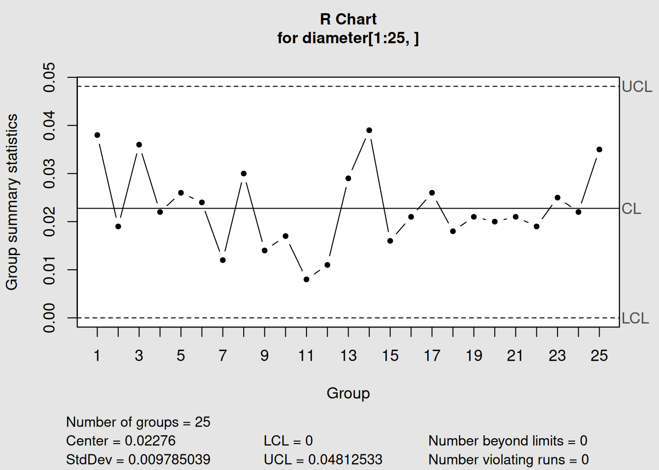
Figure 3.5: R Chart for Piston Ring Diameter Variability
# Display information
r1
## List of 11
## $ call : language qcc(data = diameter[1:25, ], type = "R")
## $ type : chr "R"
## $ data.name : chr "diameter[1:25, ]"
## $ data : num [1:25, 1:5] 74 74 74 74 74 ...
## ..- attr(*, "dimnames")=List of 2
## $ statistics: Named num [1:25] 0.038 0.019 0.036 0.022 0.026 ...
## ..- attr(*, "names")= chr [1:25] "1" "2" "3" "4" ...
## $ sizes : Named int [1:25] 5 5 5 5 5 5 5 5 5 5 ...
## ..- attr(*, "names")= chr [1:25] "1" "2" "3" "4" ...
## $ center : num 0.0228
## $ std.dev : num 0.00979
## $ nsigmas : num 3
## $ limits : num [1, 1:2] 0 0.0481
## ..- attr(*, "dimnames")=List of 2
## $ violations:List of 2
## - attr(*, "class")= chr "qcc"
# Plot the R chart
plot(r1)
Interpreting R Chart Output
- Chart type: “R” confirms we’re monitoring sample ranges
- Center of group statistics: 0.0213 mm (average range)
- Control limits: Notice there’s no LCL (common for small sample sizes)
- UCL: 0.0451 mm (maximum expected range)
3.2.2.2 Step 2: R Chart with Phase II Data
# Add Phase II data
r2 <- qcc(diameter[1:25,], type = "R", newdata = diameter[26:40,])
Figure 3.6: R Chart with Phase I and Phase II Monitoring
# Display and plot
r2
## List of 15
## $ call : language qcc(data = diameter[1:25, ], type = "R", newdata = diameter[26:40, ])
## $ type : chr "R"
## $ data.name : chr "diameter[1:25, ]"
## $ data : num [1:25, 1:5] 74 74 74 74 74 ...
## ..- attr(*, "dimnames")=List of 2
## $ statistics : Named num [1:25] 0.038 0.019 0.036 0.022 0.026 ...
## ..- attr(*, "names")= chr [1:25] "1" "2" "3" "4" ...
## $ sizes : Named int [1:25] 5 5 5 5 5 5 5 5 5 5 ...
## ..- attr(*, "names")= chr [1:25] "1" "2" "3" "4" ...
## $ center : num 0.0228
## $ std.dev : num 0.00979
## $ newstats : Named num [1:15] 0.044 0.025 0.015 0.019 0.017 ...
## ..- attr(*, "names")= chr [1:15] "26" "27" "28" "29" ...
## $ newdata : num [1:15, 1:5] 74 74 74 74 74 ...
## ..- attr(*, "dimnames")=List of 2
## $ newsizes : Named int [1:15] 5 5 5 5 5 5 5 5 5 5 ...
## ..- attr(*, "names")= chr [1:15] "26" "27" "28" "29" ...
## $ newdata.name: chr "diameter[26:40, ]"
## $ nsigmas : num 3
## $ limits : num [1, 1:2] 0 0.0481
## ..- attr(*, "dimnames")=List of 2
## $ violations :List of 2
## - attr(*, "class")= chr "qcc"
plot(r2)3.2.2.3 Step 3: Combined Analysis (X-bar and R Charts Together)
In practice, you always analyze X-bar and R charts together. Let’s create both charts and analyze them sequentially:
# X-bar chart analysis
xbar_combined <- qcc(diameter[1:25,], type = "xbar", newdata = diameter[26:40,])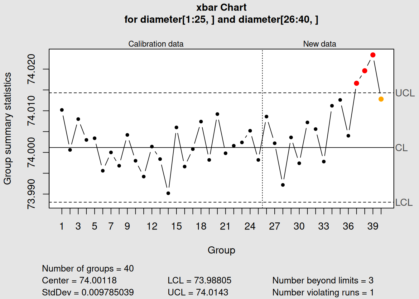
Figure 3.7: X-bar Chart: Process Average
plot(xbar_combined, main = "X-bar Chart: Process Average")
# R chart analysis
r_combined <- qcc(diameter[1:25,], type = "R", newdata = diameter[26:40,])
Figure 3.8: R Chart: Process Variability
plot(r_combined, main = "R Chart: Process Variability")3.2.3 Interpreting R Charts
3.2.3.1 What R Charts Tell You
1. Process Consistency
- Low, stable ranges = consistent process
- High or variable ranges = inconsistent process
2. Special Causes in Variation
- Points above UCL = excessive variation (something caused unusually high spread)
- Trends upward = process variation is increasing over time
- Patterns = systematic changes in process consistency
3. Relationship to Process Capability
- Lower average range = better process capability
- Stable range = predictable process performance
3.2.3.2 Decision Rules for R Charts
Process is in control when:
- All ranges are below the UCL
- No patterns or trends are evident
- Ranges appear randomly distributed
Investigate when:
- Any range exceeds the UCL
- 7+ consecutive ranges trending up or down
- Unusual patterns appear
Important Rule: Analyze R Chart First!
Always interpret the R chart before the X-bar chart because:
- If variability is out of control, X-bar chart control limits are invalid
- You must achieve variability control before trusting average control
- Changes in variation often precede changes in the average
3.2.4 Real-World Example: What the Charts Tell Us
Looking at our piston ring data:
R Chart Analysis:
- All ranges are within control limits ✓
- No trends or patterns visible ✓
- Average range is 0.0213 mm ✓
- Conclusion: Process variability is stable and in control
X-bar Chart Analysis (now that we know variation is stable):
- All averages within control limits ✓
- No patterns or shifts ✓
- Process centered at 74.00 mm ✓
- Conclusion: Process average is stable and in control
Overall Assessment:
This machining process is performing well with both stable average and stable variability.
3.3 S Charts: Standard Deviation Control
3.3.1 Understanding the Theory
S charts (Standard Deviation charts) are an alternative to R charts for monitoring process variability.
Instead of using the range, they use the sample standard deviation6, which is a more comprehensive measure of variation.
3.3.1.1 When to Use S Charts vs. R Charts
Use S charts when:
- Sample sizes are > 10 (S charts are more efficient)
- You want more sensitive detection of variation changes
- All data points should influence the variability measure (not just min/max)
- You’re working with modern software that calculates standard deviations easily
Use R charts when:
- Sample sizes are ≤ 10
- You want simple, manual calculations
- Following traditional SPC practices
- Operators need to calculate by hand
3.3.1.2 The Mathematics Behind S Charts
For each sample group \(i\): \[\begin{equation} S_i = \sqrt{\frac{\sum_{j=1}^{n}(X_{ij} - \bar{X}_i)^2}{n-1}} \tag{3.9} \end{equation}\]
Control Limits for S Charts:
\[\begin{equation}
UCL_S = B_4 \bar{S}
\tag{3.10}
\end{equation}\]
\[\begin{equation} CL_S = \bar{S} \tag{3.11} \end{equation}\]
\[\begin{equation} LCL_S = B_3 \bar{S} \tag{3.12} \end{equation}\]
Where:
- \(\bar{S}\) = average standard deviation across all sample groups
- \(B_3, B_4\) = control chart constants for S charts
3.3.1.3 Advantages of S Charts Over R Charts
1. Statistical Efficiency
- Uses all data points, not just extreme values
- More sensitive to changes in variation
- Better estimate of true process standard deviation
2. Robustness
- Less affected by outliers (compared to range)
- More stable control limits
- Better for larger sample sizes
3. Modern Relevance
- Easy calculation with computers
- Preferred in ISO standards
- Better foundation for process capability calculations
3.3.2 Creating S Charts in R
Let’s create S charts using the same piston ring data:
3.3.2.1 Step 1: Create an S Chart (Phase I)
# Create S chart using Phase I data
s1 <- qcc(diameter[1:25,], type = "S")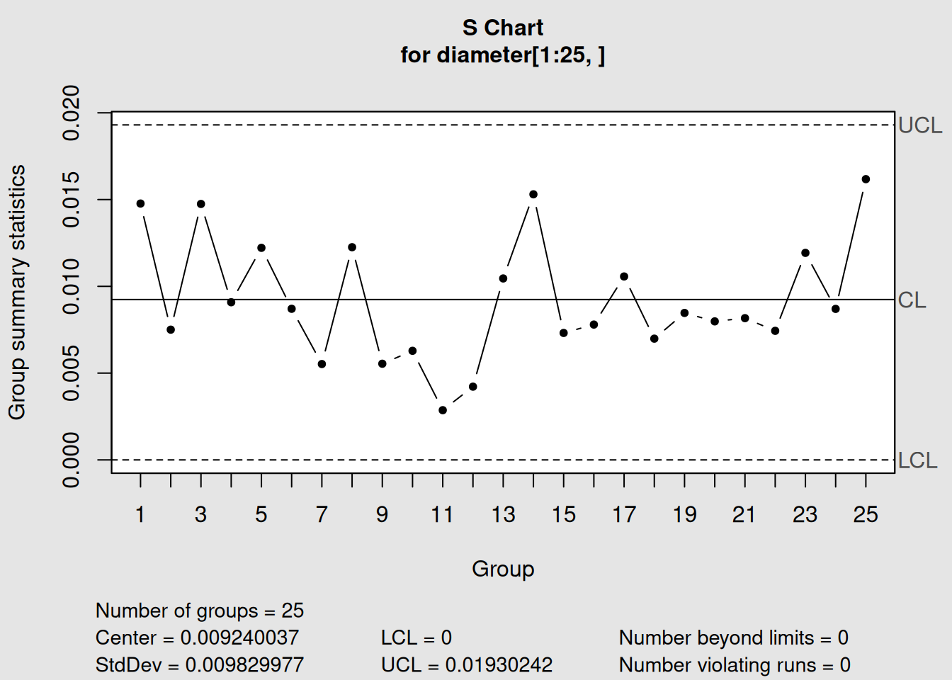
Figure 3.9: S Chart for Piston Ring Diameter Variability
# Display information
s1
## List of 11
## $ call : language qcc(data = diameter[1:25, ], type = "S")
## $ type : chr "S"
## $ data.name : chr "diameter[1:25, ]"
## $ data : num [1:25, 1:5] 74 74 74 74 74 ...
## ..- attr(*, "dimnames")=List of 2
## $ statistics: Named num [1:25] 0.01477 0.0075 0.01475 0.00908 0.01222 ...
## ..- attr(*, "names")= chr [1:25] "1" "2" "3" "4" ...
## $ sizes : Named int [1:25] 5 5 5 5 5 5 5 5 5 5 ...
## ..- attr(*, "names")= chr [1:25] "1" "2" "3" "4" ...
## $ center : num 0.00924
## $ std.dev : num 0.00983
## $ nsigmas : num 3
## $ limits : num [1, 1:2] 0 0.0193
## ..- attr(*, "dimnames")=List of 2
## $ violations:List of 2
## - attr(*, "class")= chr "qcc"
# Plot the S chart
plot(s1)
3.3.2.2 Step 2: S Chart with Phase II Data
# Add Phase II data
s2 <- qcc(diameter[1:25,], type = "S", newdata = diameter[26:40,])
Figure 3.10: S Chart with Phase I and Phase II Monitoring
# Display and plot
s2
## List of 15
## $ call : language qcc(data = diameter[1:25, ], type = "S", newdata = diameter[26:40, ])
## $ type : chr "S"
## $ data.name : chr "diameter[1:25, ]"
## $ data : num [1:25, 1:5] 74 74 74 74 74 ...
## ..- attr(*, "dimnames")=List of 2
## $ statistics : Named num [1:25] 0.01477 0.0075 0.01475 0.00908 0.01222 ...
## ..- attr(*, "names")= chr [1:25] "1" "2" "3" "4" ...
## $ sizes : Named int [1:25] 5 5 5 5 5 5 5 5 5 5 ...
## ..- attr(*, "names")= chr [1:25] "1" "2" "3" "4" ...
## $ center : num 0.00924
## $ std.dev : num 0.00983
## $ newstats : Named num [1:15] 0.01655 0.01033 0.00691 0.0075 0.00673 ...
## ..- attr(*, "names")= chr [1:15] "26" "27" "28" "29" ...
## $ newdata : num [1:15, 1:5] 74 74 74 74 74 ...
## ..- attr(*, "dimnames")=List of 2
## $ newsizes : Named int [1:15] 5 5 5 5 5 5 5 5 5 5 ...
## ..- attr(*, "names")= chr [1:15] "26" "27" "28" "29" ...
## $ newdata.name: chr "diameter[26:40, ]"
## $ nsigmas : num 3
## $ limits : num [1, 1:2] 0 0.0193
## ..- attr(*, "dimnames")=List of 2
## $ violations :List of 2
## - attr(*, "class")= chr "qcc"
plot(s2)3.3.2.3 Step 3: Understanding R vs. S Chart Differences
Let’s examine both chart types to understand their differences:
# R chart analysis
r_comparison <- qcc(diameter[1:25,], type = "R", newdata = diameter[26:40,])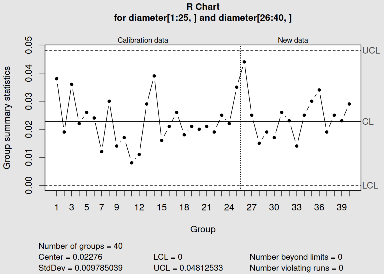
Figure 3.11: R Chart: Using Sample Ranges
plot(r_comparison, main = "R Chart: Using Sample Ranges")
# S chart analysis
s_comparison <- qcc(diameter[1:25,], type = "S", newdata = diameter[26:40,])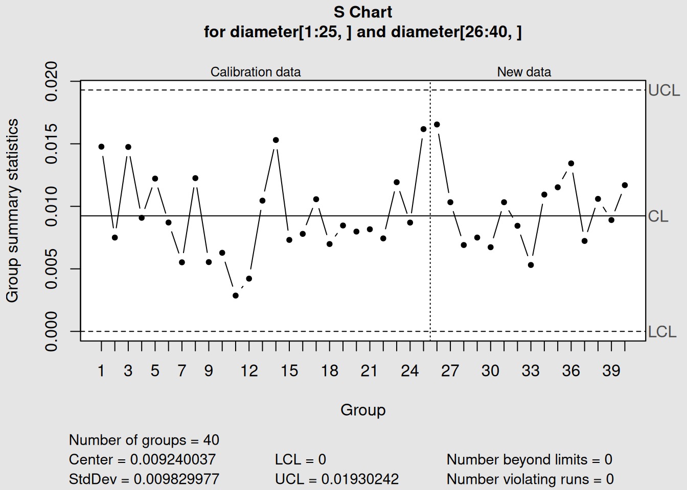
Figure 3.12: S Chart: Using Sample Standard Deviations
plot(s_comparison, main = "S Chart: Using Sample Standard Deviations")3.3.3 Comparing R and S Chart Performance
3.3.3.1 Key Differences in Our Example
R Chart Results:
- Center line (average range): 0.0213 mm
- Upper control limit: 0.0451 mm
- Uses only highest and lowest values per sample
S Chart Results:
- Center line (average std dev): 0.0098 mm
- Upper control limit: 0.0207 mm
- Uses all five values per sample
3.3.3.2 Which Chart Detected What?
In our piston ring example, both charts show the process in control, but notice:
1. Different Scale
- S chart values are smaller (standard deviation < range)
- This is mathematically expected7
2. Sensitivity Differences
- S charts might detect subtle changes that R charts miss
- Both charts show similar patterns but different magnitudes
3. Control Limit Differences
- S chart limits are based on all data variability
- R chart limits are based on extreme value variability
Practical Recommendation
For sample sizes ≤ 8: Use R charts (simpler, traditional)
For sample sizes > 8: Use S charts (more efficient, sensitive)
For our piston ring data (n=5): Either chart works well, but R charts are more common in manufacturing
3.4 When to Use Each Chart Type
3.4.1 Chart Selection Decision Framework
Choosing the right control chart depends on several factors. Here’s a systematic approach:
3.4.1.1 1. Data Type Classification
First Question: What type of data do you have?
# Example of different data types we might encounter

# Continuous/Variable data (use X-bar, R, or S charts)
continuous_data <- c(74.02, 73.99, 74.01, 74.00, 73.98)
print("Continuous data example:")
## [1] "Continuous data example:"
print(continuous_data)## [1] 74.02 73.99 74.01 74.00 73.98
# Attribute data (use p, np, c, or u charts - covered in next chapter)
attribute_data <- c("Pass", "Fail", "Pass", "Pass", "Fail")
print("Attribute data example:")
## [1] "Attribute data example:"
print(attribute_data)## [1] "Pass" "Fail" "Pass" "Pass" "Fail"For Variable/Continuous Data → Use X-bar with R or S charts
3.4.1.2 2. Sample Size Considerations
| Sample Size (n) | Recommended Charts | Reason |
|---|---|---|
| n = 1 | X-bar.one (Individual-X) | Cannot calculate ranges or std dev |
| 2 ≤ n ≤ 8 | X-bar + R charts | R charts work well, easy calculation |
| 9 ≤ n ≤ 10 | X-bar + R or X-bar + S | Either works, S slightly better |
| n > 10 | X-bar + S charts | S charts more efficient and sensitive |
3.4.1.3 3. Practical Considerations
Choose R Charts when:
- Manual calculations are needed
- Operators will be calculating by hand
- Following traditional SPC methods
- Simple interpretation is important
Choose S Charts when:
- Using computer software (like R!)
- Want maximum sensitivity to variation changes
- Working with larger sample sizes
- Need precise process capability studies
3.4.1.4 4. Implementation Examples
Let’s see how sample size affects our choice:
Let’s examine how sample size affects chart selection:
# Simulate different sample sizes using our piston ring data

# Small sample size (n=2): Use R charts
small_samples <- diameter[1:10, 1:2]  # First 2 measurements from each group
print("Small sample data (n=2):")
## [1] "Small sample data (n=2):"
head(small_samples)## [,1] [,2]
## 1 74.030 74.002
## 2 73.995 73.992
## 3 73.988 74.024
## 4 74.002 73.996
## 5 73.992 74.007
## 6 74.009 73.994
# Medium sample size (n=5): Either R or S charts work
medium_samples <- diameter[1:10, 1:5]  # All 5 measurements (our current data)

# For demonstration, let's create a larger sample size dataset
set.seed(123)
large_samples <- matrix(rnorm(10*12, mean=74.001, sd=0.01), ncol=12)
print("Large sample data (n=12) - first few rows:")
## [1] "Large sample data (n=12) - first few rows:"
head(large_samples)## [,1] [,2] [,3] [,4] [,5] [,6] [,7] [,8]
## [1,] 73.99540 74.01324 73.99032 74.00526 73.99405 74.00353 74.00480 73.99609
## [2,] 73.99870 74.00460 73.99882 73.99805 73.99892 74.00071 73.99598 73.97791
## [3,] 74.01659 74.00501 73.99074 74.00995 73.98835 74.00057 73.99767 74.01106
## [4,] 74.00171 74.00211 73.99371 74.00978 74.02269 74.01469 73.99081 73.99391
## [5,] 74.00229 73.99544 73.99475 74.00922 74.01308 73.99874 73.99028 73.99412
## [6,] 74.01815 74.01887 73.98413 74.00789 73.98977 74.01616 74.00404 74.01126
## [,9] [,10] [,11] [,12]
## [1,] 74.00106 74.01094 73.99390 73.99525
## [2,] 74.00485 74.00648 74.00357 74.00708
## [3,] 73.99729 74.00339 73.99853 73.98482
## [4,] 74.00744 73.99472 73.99752 74.00044
## [5,] 73.99880 74.01461 73.99148 74.00619
## [6,] 74.00432 73.99500 74.00055 74.00401
# Small sample: R chart
qcc_small_R <- qcc(small_samples, type="R")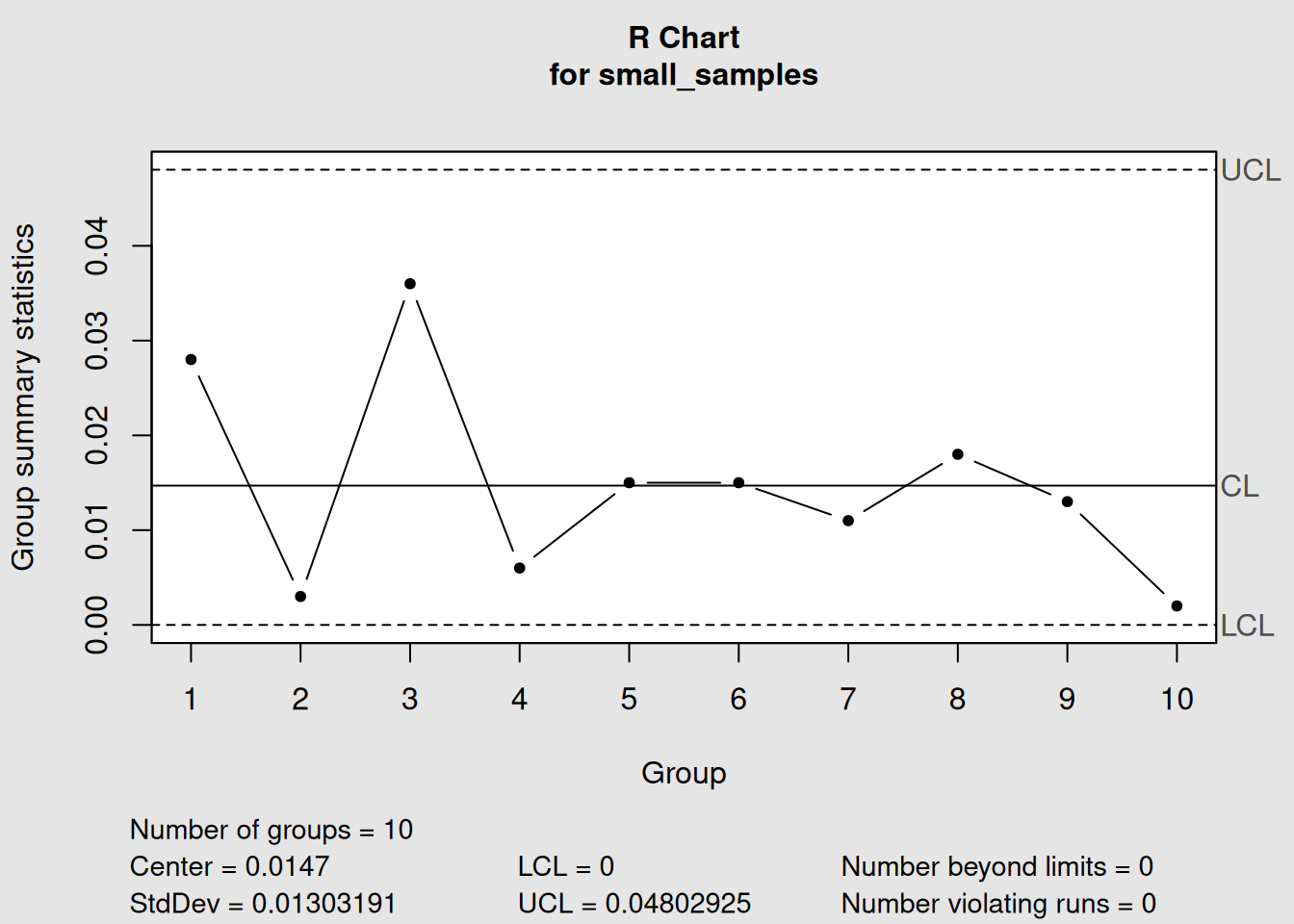
Figure 3.13: Small Sample (n=2): R Chart Recommended
plot(qcc_small_R, main="Small Sample (n=2): R Chart Recommended")
# Medium sample: R chart (traditional)
qcc_medium_R <- qcc(medium_samples, type="R")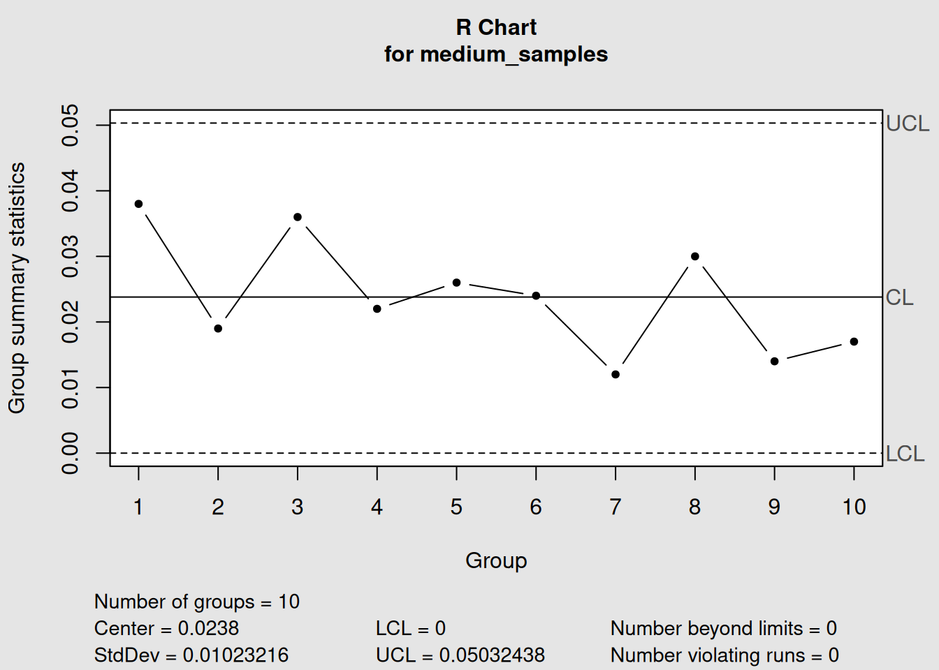
Figure 3.14: Medium Sample (n=5): R Chart (Traditional Choice)
plot(qcc_medium_R, main="Medium Sample (n=5): R Chart (Traditional Choice)")
# Large sample: S chart
qcc_large_S <- qcc(large_samples, type="S") 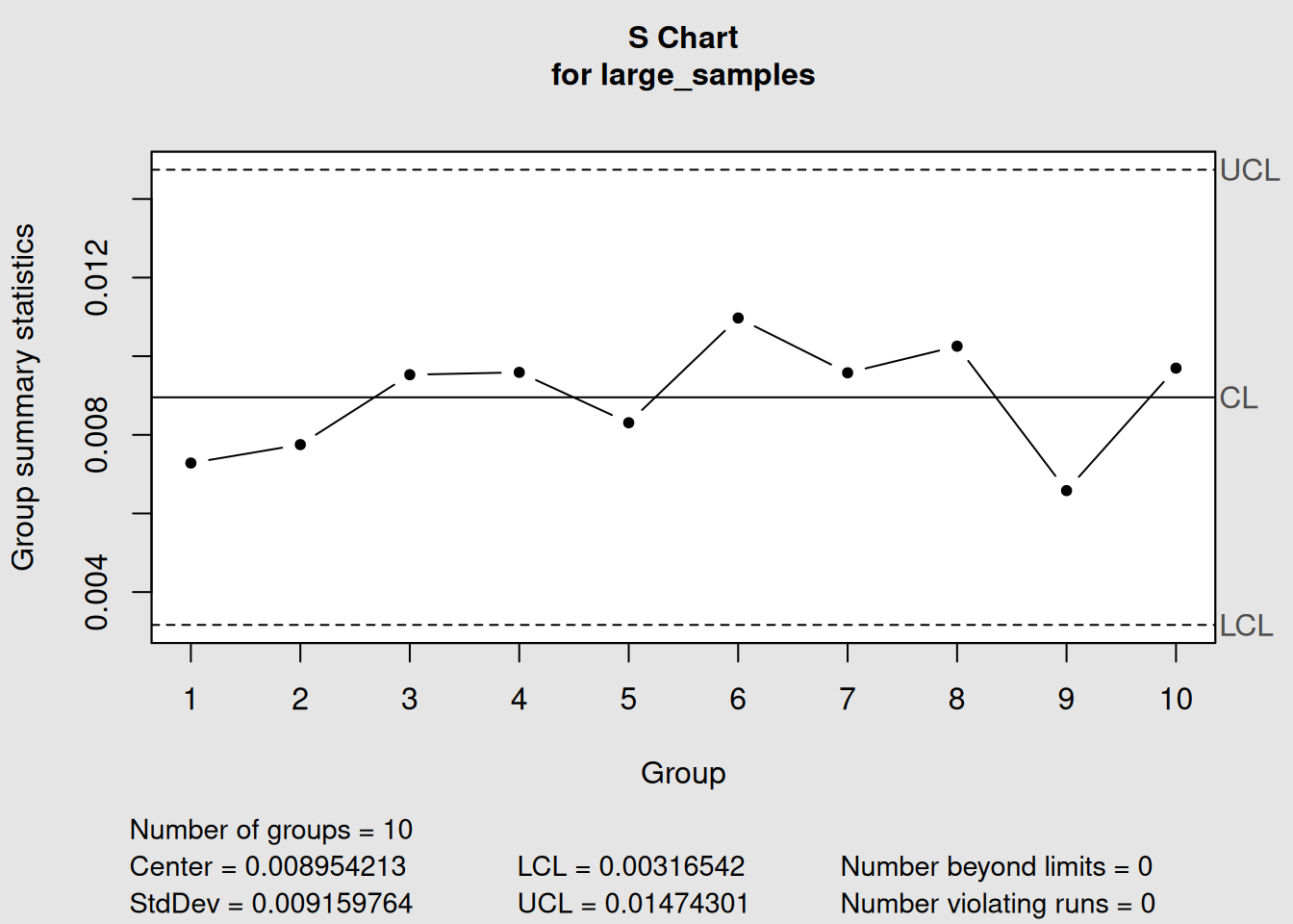
Figure 3.15: Large Sample (n=12): S Chart Recommended
plot(qcc_large_S, main="Large Sample (n=12): S Chart Recommended")3.4.2 Decision Tree for Chart Selection
Here’s a practical decision-making process:
Chart Selection Process
Step 1: Is your data continuous and measurable?
- Yes → Continue to Step 2
- No → Use attribute charts (Chapter 4)
Step 2: What’s your sample size per group?
- n = 1 → Use Individual-X chart (X-bar.one)
- 2 ≤ n ≤ 8 → Use X-bar + R charts
- n > 8 → Use X-bar + S charts
Step 3: Consider practical factors
- Manual calculation needed? → Prefer R charts
- Maximum sensitivity required? → Prefer S charts
- Following company standards? → Use specified method
3.4.3 Real-World Application Guidelines
3.4.3.1 Manufacturing Environments
Machining Operations:
- Typically n = 3-5 consecutive parts
- Recommendation: X-bar + R charts
- Frequency: Every hour or shift
Assembly Operations:
- Typically n = 5-10 items per batch
- Recommendation: X-bar + R or X-bar + S charts
- Frequency: Per batch or daily
Chemical Processes:
- Often n = 1 (continuous monitoring)
- Recommendation: Individual-X charts
- Frequency: Real-time or hourly
3.5 Phase I vs Phase II Analysis
3.5.1 Understanding the Two Phases
Statistical process control operates in two distinct phases, each with different objectives and methods:
3.5.1.1 Phase I: Establishing Control (Historical Analysis)
Purpose:
Establish control limits and assess process stability
What you do:
- Collect historical data from a stable period
- Calculate control limits from this baseline data
- Remove special causes and recalculate if necessary
- Validate that the process was in control during this period
Key Questions:
- Was the process stable during our baseline period?
- Are our control limits based on good data?
- Do we need to remove any outlier periods?
3.5.1.2 Phase II: Ongoing Monitoring (Real-time Control)
Purpose:
Monitor new production using established control limits
What you do:
- Use fixed control limits from Phase I
- Plot new data against these limits
- Detect and react to out-of-control signals
- Maintain the control system
Key Questions:
- Is the current process in control?
- When should we investigate signals?
- Do we need to update our control limits?
3.5.2 Mathematical Differences
3.5.2.1 Phase I Calculations
In Phase I, everything is calculated from the same dataset:
\[\begin{equation} \bar{\bar{X}}_{Phase I} = \frac{\sum_{i=1}^{k} \bar{X}_i}{k} \tag{3.13} \end{equation}\]
\[\begin{equation} \bar{R}_{Phase I} = \frac{\sum_{i=1}^{k} R_i}{k} \tag{3.14} \end{equation}\]
Where \(k\) = number of historical sample groups
3.5.3 Practical Implementation in R
Let’s demonstrate both phases using our piston ring data:
####- Phase I: Establishing Control
# Phase I: Use first 20 samples to establish control
phase1_data <- diameter[1:20,]

# Create X-bar chart for Phase I
phase1_xbar <- qcc(phase1_data, type = "xbar")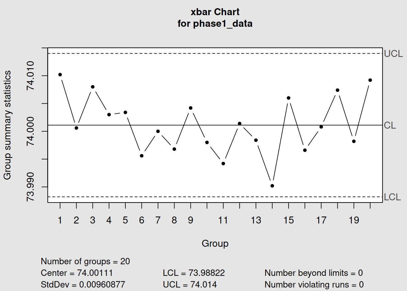
Figure 3.16: Phase I Analysis: Establishing Control Limits
print("Phase I X-bar Chart:")## [1] "Phase I X-bar Chart:"
phase1_xbar## List of 11
## $ call : language qcc(data = phase1_data, type = "xbar")
## $ type : chr "xbar"
## $ data.name : chr "phase1_data"
## $ data : num [1:20, 1:5] 74 74 74 74 74 ...
## ..- attr(*, "dimnames")=List of 2
## $ statistics: Named num [1:20] 74 74 74 74 74 ...
## ..- attr(*, "names")= chr [1:20] "1" "2" "3" "4" ...
## $ sizes : Named int [1:20] 5 5 5 5 5 5 5 5 5 5 ...
## ..- attr(*, "names")= chr [1:20] "1" "2" "3" "4" ...
## $ center : num 74
## $ std.dev : num 0.00961
## $ nsigmas : num 3
## $ limits : num [1, 1:2] 74 74
## ..- attr(*, "dimnames")=List of 2
## $ violations:List of 2
## - attr(*, "class")= chr "qcc"
# Create R chart for Phase I
phase1_R <- qcc(phase1_data, type = "R") 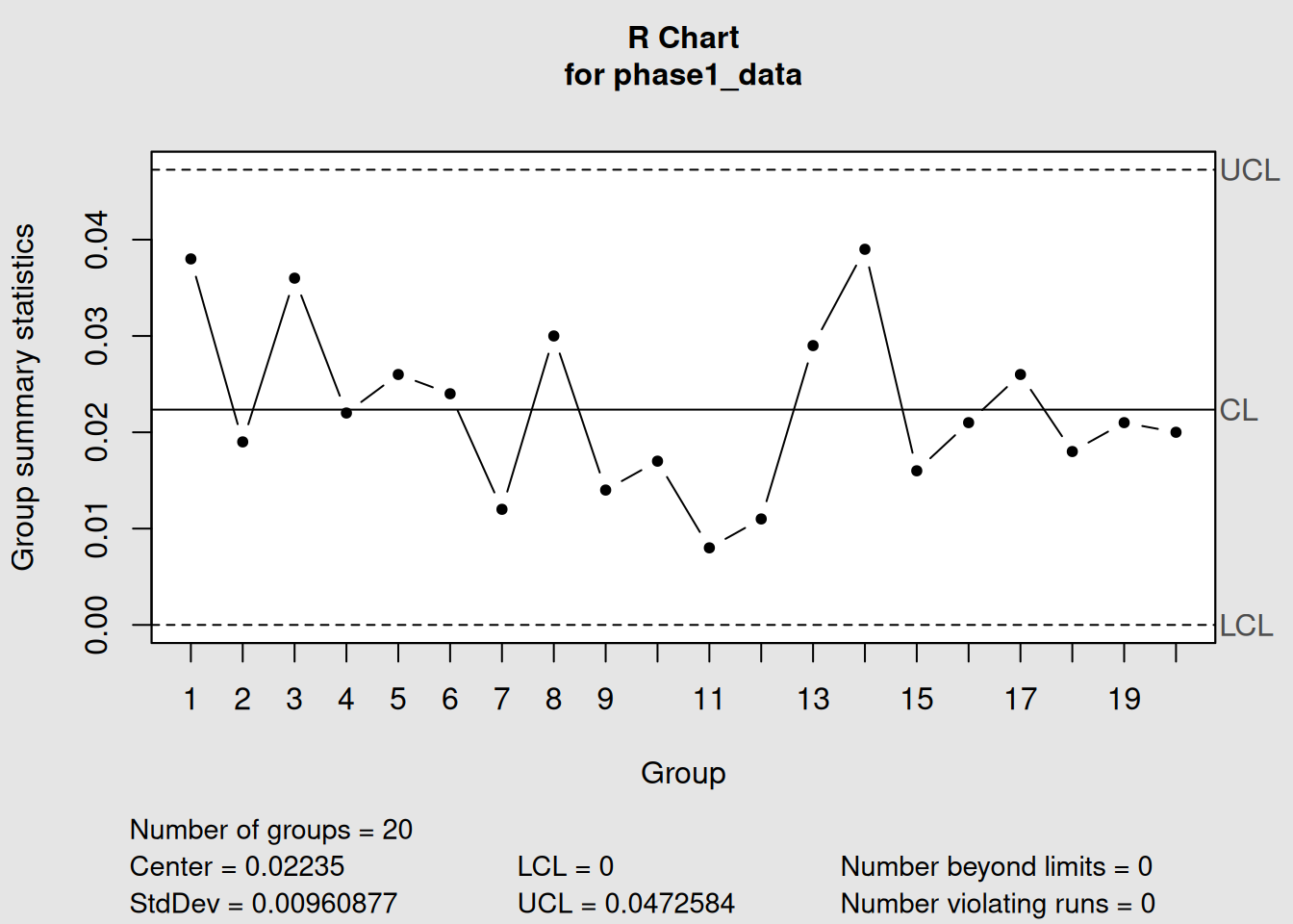
Figure 3.17: Phase I Analysis: Establishing Control Limits
print("Phase I R Chart:")## [1] "Phase I R Chart:"
phase1_R## List of 11
## $ call : language qcc(data = phase1_data, type = "R")
## $ type : chr "R"
## $ data.name : chr "phase1_data"
## $ data : num [1:20, 1:5] 74 74 74 74 74 ...
## ..- attr(*, "dimnames")=List of 2
## $ statistics: Named num [1:20] 0.038 0.019 0.036 0.022 0.026 ...
## ..- attr(*, "names")= chr [1:20] "1" "2" "3" "4" ...
## $ sizes : Named int [1:20] 5 5 5 5 5 5 5 5 5 5 ...
## ..- attr(*, "names")= chr [1:20] "1" "2" "3" "4" ...
## $ center : num 0.0224
## $ std.dev : num 0.00961
## $ nsigmas : num 3
## $ limits : num [1, 1:2] 0 0.0473
## ..- attr(*, "dimnames")=List of 2
## $ violations:List of 2
## - attr(*, "class")= chr "qcc"
# Plot Phase I charts separately for better visibility
plot(phase1_xbar, main = "Phase I: X-bar Chart (Establishing Control)")
Figure 3.18: Phase I Analysis: Establishing Control Limits
plot(phase1_R, main = "Phase I: R Chart (Establishing Control)")
Figure 3.19: Phase I R Chart: Establishing Variability Control
3.5.3.1 Checking for Control in Phase I
# Check if any points are out of control in Phase I
print("Phase I X-bar - Out of control points:")
## [1] "Phase I X-bar - Out of control points:"
if(length(phase1_xbar$violations) > 0) {
  print(phase1_xbar$violations)
} else {
  print("No out-of-control points detected")
}
## $beyond.limits
## integer(0)
##
## $violating.runs
## numeric(0)
print("Phase I R chart - Out of control points:") ## [1] "Phase I R chart - Out of control points:"
if(length(phase1_R$violations) > 0) {
  print(phase1_R$violations)
} else {
  print("No out-of-control points detected")
}
## $beyond.limits
## integer(0)
##
## $violating.runs
## numeric(0)####- Phase II: Ongoing Monitoring
# Phase II: Monitor new production (samples 21-40) using Phase I limits
phase2_data <- diameter[21:40,]

# Apply Phase I control limits to new data
phase2_xbar <- qcc(phase1_data, type = "xbar", newdata = phase2_data)
Figure 3.20: Phase II Analysis: Monitoring New Production
phase2_R <- qcc(phase1_data, type = "R", newdata = phase2_data)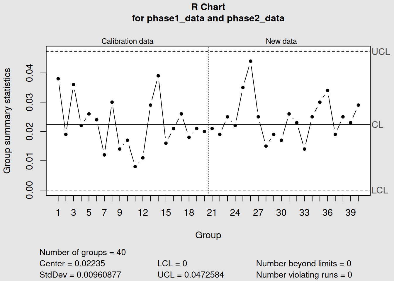
Figure 3.21: Phase II Analysis: Monitoring New Production
print("Phase II Monitoring Results:")## [1] "Phase II Monitoring Results:"
print("X-bar Chart:")## [1] "X-bar Chart:"
phase2_xbar## List of 15
## $ call : language qcc(data = phase1_data, type = "xbar", newdata = phase2_data)
## $ type : chr "xbar"
## $ data.name : chr "phase1_data"
## $ data : num [1:20, 1:5] 74 74 74 74 74 ...
## ..- attr(*, "dimnames")=List of 2
## $ statistics : Named num [1:20] 74 74 74 74 74 ...
## ..- attr(*, "names")= chr [1:20] "1" "2" "3" "4" ...
## $ sizes : Named int [1:20] 5 5 5 5 5 5 5 5 5 5 ...
## ..- attr(*, "names")= chr [1:20] "1" "2" "3" "4" ...
## $ center : num 74
## $ std.dev : num 0.00961
## $ newstats : Named num [1:20] 74 74 74 74 74 ...
## ..- attr(*, "names")= chr [1:20] "21" "22" "23" "24" ...
## $ newdata : num [1:20, 1:5] 74 74 74 74 74 ...
## ..- attr(*, "dimnames")=List of 2
## $ newsizes : Named int [1:20] 5 5 5 5 5 5 5 5 5 5 ...
## ..- attr(*, "names")= chr [1:20] "21" "22" "23" "24" ...
## $ newdata.name: chr "phase2_data"
## $ nsigmas : num 3
## $ limits : num [1, 1:2] 74 74
## ..- attr(*, "dimnames")=List of 2
## $ violations :List of 2
## - attr(*, "class")= chr "qcc"
print("R Chart:") ## [1] "R Chart:"
phase2_R## List of 15
## $ call : language qcc(data = phase1_data, type = "R", newdata = phase2_data)
## $ type : chr "R"
## $ data.name : chr "phase1_data"
## $ data : num [1:20, 1:5] 74 74 74 74 74 ...
## ..- attr(*, "dimnames")=List of 2
## $ statistics : Named num [1:20] 0.038 0.019 0.036 0.022 0.026 ...
## ..- attr(*, "names")= chr [1:20] "1" "2" "3" "4" ...
## $ sizes : Named int [1:20] 5 5 5 5 5 5 5 5 5 5 ...
## ..- attr(*, "names")= chr [1:20] "1" "2" "3" "4" ...
## $ center : num 0.0224
## $ std.dev : num 0.00961
## $ newstats : Named num [1:20] 0.021 0.019 0.025 0.022 0.035 ...
## ..- attr(*, "names")= chr [1:20] "21" "22" "23" "24" ...
## $ newdata : num [1:20, 1:5] 74 74 74 74 74 ...
## ..- attr(*, "dimnames")=List of 2
## $ newsizes : Named int [1:20] 5 5 5 5 5 5 5 5 5 5 ...
## ..- attr(*, "names")= chr [1:20] "21" "22" "23" "24" ...
## $ newdata.name: chr "phase2_data"
## $ nsigmas : num 3
## $ limits : num [1, 1:2] 0 0.0473
## ..- attr(*, "dimnames")=List of 2
## $ violations :List of 2
## - attr(*, "class")= chr "qcc"
# Plot Phase II monitoring charts separately
plot(phase2_xbar, main = "Phase II: X-bar Monitoring with Fixed Limits")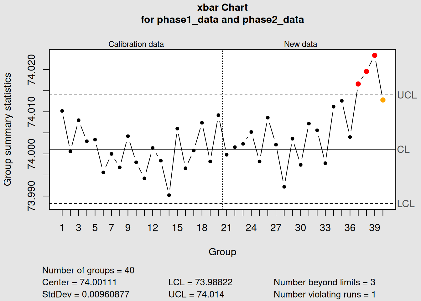
Figure 3.22: Phase II Analysis: Monitoring New Production
plot(phase2_R, main = "Phase II: R Monitoring with Fixed Limits")
Figure 3.23: Phase II R Monitoring: Using Fixed Limits
3.5.4 Interpreting the Two Phases
3.5.4.1 What Our Example Shows
Phase I Results (Samples 1-20):
- X-bar process appears stable (no out-of-control points)
- R chart shows stable variation
- Control limits established: X-bar UCL = 74.014, LCL = 73.988
- Conclusion: Good baseline for monitoring
Phase II Results (Samples 21-40):
- All new points within established control limits
- No concerning patterns
- Process continues to operate at established level
- Conclusion: Process remains in control
3.5.4.2 Decision Points in Each Phase
Phase I Decisions:
- If unstable: Remove special causes, recalculate limits
- If stable: Proceed to Phase II with current limits
- If insufficient data: Collect more baseline data
Phase II Decisions:
- If in control: Continue monitoring
- If out of control: Investigate and correct
- If consistent shifts: Consider updating limits
3.5.5 Common Pitfalls and Best Practices
3.5.5.1 Phase I : Pitfalls
Common Phase I Mistakes
-
Using unstable data: Including periods with known problems
-
Too little data: Using < 20-25 sample groups
-
Mixed conditions: Combining different operators, materials, or settings
-
Ignoring patterns: Accepting limits when obvious trends exist
3.5.5.2 Phase II Pitfalls
Common Phase II Mistakes
- Updating limits too frequently: Chasing every small change
- Ignoring out-of-control signals: Not investigating problems
- Using old limits: Not updating when fundamental process changes occur
- Poor documentation: Not recording what actions were taken
3.5.5.3 Best Practices
Recommended Practices
Phase I:
- Use 20-25 sample groups minimum
- Ensure data represents normal operation
- Remove assignable causes and recalculate
- Validate stability before proceeding
Phase II:
- Investigate all out-of-control signals
- Document all actions taken
- Review and update limits periodically (quarterly/annually)
- Train operators on proper interpretation
3.5.6 When to Update Control Limits
Control limits should be updated when:
- Fundamental process changes: New equipment, materials, procedures
-
Sustained improvement: Process has been permanently improved
- Seasonal effects: Regular, predictable changes in process
- Accumulated data: After collecting substantial new in-control data
Example of limit updating:
# Simulate a process improvement at sample 30
set.seed(456)
improved_data <- matrix(rnorm(10*5, mean=74.005, sd=0.008), ncol=5)

# Show old limits vs new process
old_limits_chart <- qcc(phase1_data, type = "xbar", newdata = improved_data)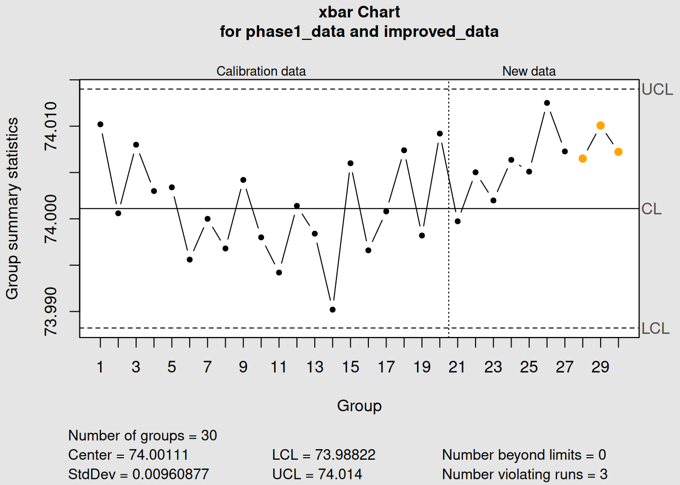
Figure 3.24: Example: When to Update Control Limits
plot(old_limits_chart, main = "Process Improvement: Old Limits May Be Too Wide")

# Recalculate limits including improvement
new_baseline <- rbind(diameter[21:30,], improved_data)
new_limits_chart <- qcc(new_baseline, type = "xbar")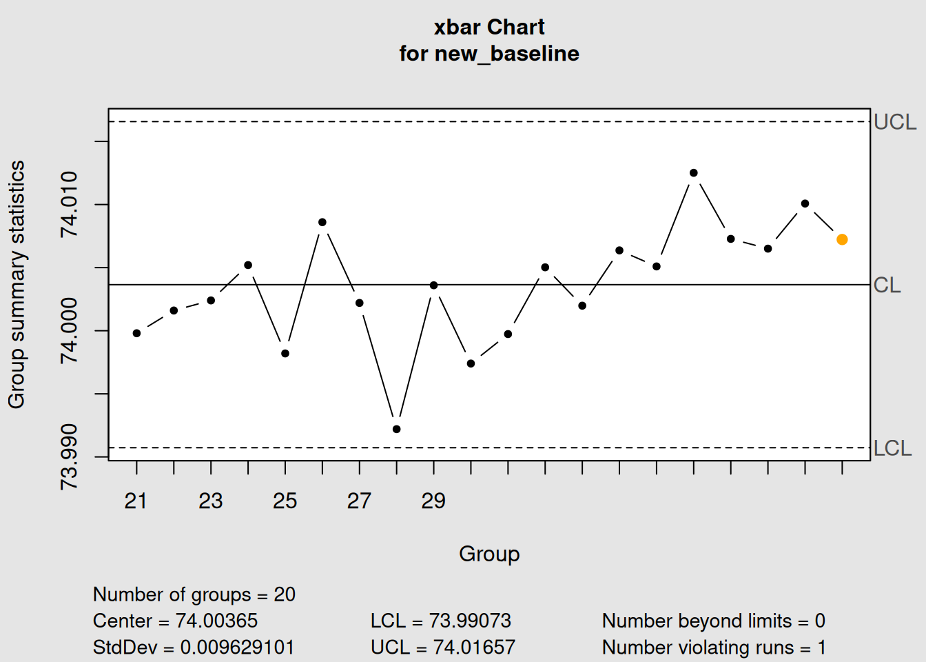
Figure 3.25: Example: When to Update Control Limits
plot(new_limits_chart, main = "Updated Limits After Process Improvement")3.6 Chapter Summary
This chapter covered the fundamental building blocks of statistical process control - variable control charts for monitoring continuous data.
3.6.1 Key Concepts Mastered
1. X-bar Charts (Process Average)
- Monitor the central tendency of your process
- Detect shifts in the process mean
- Based on sample averages rather than individual values
- Most important chart in SPC
2. R Charts (Process Variability)
- Monitor the consistency of your process
- Use ranges (max - min) for sample sizes ≤ 8
- Always analyze before X-bar charts
- Essential for complete process understanding
3. S Charts (Alternative Variability)
- Use standard deviation instead of range
- More efficient for larger sample sizes (n > 8)
- More sensitive to variation changes
- Preferred in modern SPC applications
4. Phase I vs Phase II - Phase I: Establish control limits from stable historical data - Phase II: Monitor ongoing production with fixed limits - Different objectives and decision criteria - Critical for proper SPC implementation
3.6.2 Chart Selection Guidelines
| Situation | Recommended Charts | Why |
|---|---|---|
| Individual measurements | X-bar.one | Cannot calculate variation from single points |
| Sample size 2-8 | X-bar + R | Traditional, simple calculation |
| Sample size 9-10 | X-bar + R or X-bar + S | Either works well |
| Sample size > 10 | X-bar + S | More efficient, sensitive |
| Manual calculation | X-bar + R | Easier for operators |
| Computer analysis | X-bar + S | More statistically efficient |
3.6.3 Practical Applications
Manufacturing:
- Machining: Dimensional control of parts
- Assembly: Torque, fit, alignment measurements
- Chemical: Concentration, temperature, pressure
Service Industries: - Call centers: Response times, call duration - Healthcare: Patient wait times, procedure times - Financial: Transaction processing times
3.6.4 What’s Next?
In Chapter 4, we’ll explore attribute control charts for situations where you can’t measure continuous values but instead count defects, nonconformities, or pass/fail results. These charts use completely different mathematics but follow the same logical framework you’ve learned here.
3.6.5 Quick Reference: R Code for Basic Charts
# Essential workflow for variable control charts

# 1. Load and prepare data
library(qcc)
data(your_dataset)
grouped_data <- # organize into matrix format

# 2. Phase I analysis
xbar_phase1 <- qcc(grouped_data[1:25,], type = "xbar")
r_phase1 <- qcc(grouped_data[1:25,], type = "R")

# 3. Check for control in Phase I
plot(xbar_phase1)
plot(r_phase1)

# 4. Phase II monitoring
xbar_phase2 <- qcc(grouped_data[1:25,], type = "xbar",
                   newdata = grouped_data[26:40,])
r_phase2 <- qcc(grouped_data[1:25,], type = "R",
                newdata = grouped_data[26:40,])

# 5. Apply control rules
with_rules <- qcc(grouped_data[1:25,], type = "xbar",
                  newdata = grouped_data[26:40,], rules = 1:4)
You now have the tools to implement the most important control charts in statistical process control!