2 Getting Started with QCC
Learning Objectives
After completing this chapter, you will be able to:
- Install the qcc package and all necessary dependencies
- Set up your R environment for quality control analysis
- Load and explore built-in qcc datasets
- Understand data structure requirements for qcc functions
- Interpret basic qcc function results and output format
- Navigate R basics if you’re completely new to the language
This chapter provides a gentle, step-by-step introduction to using the qcc package in R. Even if you’ve never used R before, we’ll guide you through everything you need to know to get started with statistical process control.
2.1 Installation and Setup
2.1.1 If You’re Completely New to R
If you’ve never used R before, don’t worry! R is a powerful statistical programming language that’s perfect for quality control analysis. Think of R as a sophisticated calculator that can handle complex statistical operations and create professional charts.
What is R?
R is like Excel, but much more powerful for statistics. Instead of clicking buttons, you type commands. This might seem scary at first, but it’s actually more efficient once you learn the basics!
2.1.1.1 Installing R and RStudio
Before we can use the qcc package, you need to install R and RStudio:
- Install R (the engine): Go to https://cran.r-project.org/
- Install RStudio (the user-friendly interface): Go to https://posit.co/download/rstudio-desktop/
Important Order
Always install R first, then RStudio. RStudio needs R to work, but R can work without RStudio.
2.1.2 Installing the QCC Package
Once you have R and RStudio installed, you need to install the qcc package. Think of packages as “add-ons” that give R new capabilities.
2.1.2.1 Method 1: From CRAN (Recommended for Beginners)
CRAN is like an “app store” for R packages. It contains tested, stable versions:
# Install the qcc package from CRAN
install.packages("qcc")
How to Run This Code
- Open RStudio
- Look for the Console (usually bottom-left panel)
- Type the command exactly as shown
- Press Enter
- Wait for installation to complete (you’ll see messages scrolling by)
2.1.2.2 Method 2: From GitHub (Latest Development Version)
If you want the very latest features, you can install from GitHub:
# First, install the devtools package if you don't have it
install.packages("devtools")

# Then install qcc from GitHub
devtools::install_github("luca-scr/qcc", build = TRUE,
                         build_opts = c("--no-resave-data", "--no-manual"))
2.1.3 Installing Additional Helpful Packages
While qcc is our main tool, these additional packages will make your life easier:
# Install packages for data manipulation and visualization
install.packages(c("dplyr", "ggplot2", "knitr", "rmarkdown"))
What These Packages Do
- dplyr: Makes data manipulation easier (think “Excel formulas made simple”)
- ggplot2: Creates beautiful graphs
- knitr: Helps create reports
- rmarkdown: Combines R code with text (like this tutorial!)
2.1.4 Loading the QCC Package
Installing a package is like buying a tool and putting it in your toolbox. Loading a package is like taking the tool out to use it:
# Load the qcc package
library(qcc)

# Load additional helpful packages for data manipulation
suppressPackageStartupMessages({
  library(dplyr)
  library(ggplot2)
})
You need to load packages every time you start a new R session. Think of it like turning on your tools each day.
Package Loading vs. Installation
-
Install once:
install.packages("qcc")(like buying a tool) -
Load every session:
library(qcc)(like taking the tool out of the toolbox)
2.1.5 Verifying Your Installation
Let’s check that everything is working correctly:
# Check qcc version
packageVersion("qcc")
## [1] '2.7'
# View basic information about qcc
citation("qcc")
## To cite qcc in publications use:
##
## Scrucca, L. (2004). qcc: an R package for quality control charting
## and statistical process control. R News 4/1, 11-17.
##
## A BibTeX entry for LaTeX users is
##
## @Article{,
## title = {qcc: an R package for quality control charting and statistical process control},
## author = {Luca Scrucca},
## journal = {R News},
## year = {2004},
## pages = {11--17},
## volume = {4/1},
## url = {https://cran.r-project.org/doc/Rnews/},
## }If you see version information and citation details, congratulations! Your installation is successful.
2.2 Loading Datasets and Basic Functions
2.2.1 Understanding R Basics for Complete Beginners
Before we dive into qcc-specific functions, let’s cover some R basics:
2.2.1.1 The Assignment Operator
In R, we use <- to store things in variables (think of variables as named boxes):
# Store a number in a variable called 'my_number'
my_number <- 42

# Display what's in the variable
my_number
## [1] 422.2.1.2 Basic R Data Types
R works with different types of data:
# Numbers
temperature <- 23.5

# Text (called "character" in R)
machine_name <- "Machine A"

# True/False values (called "logical" in R)
is_in_control <- TRUE

# Lists of numbers (called "vectors" in R)
measurements <- c(23.1, 23.5, 23.2, 23.8, 23.3)2.2.2 Exploring Built-in QCC Datasets
The qcc package comes with several real-world datasets that are perfect for learning. Let’s explore them:
2.2.2.1 Loading a Dataset
##   diameter sample trial
## 1   74.030      1  TRUE
## 2   74.002      1  TRUE
## 3   74.019      1  TRUE
## 4   73.992      1  TRUE
## 5   74.008      1  TRUE
## 6   73.995      2  TRUE
2.2.2.2 Understanding What We’re Looking At
Let’s break down this dataset:
# Get basic information about the dataset
str(pistonrings)
## 'data.frame': 200 obs. of 3 variables:
## $ diameter: num 74 74 74 74 74 ...
## $ sample : int 1 1 1 1 1 2 2 2 2 2 ...
## $ trial : logi TRUE TRUE TRUE TRUE TRUE TRUE ...
# Get summary statistics
summary(pistonrings)
## diameter sample trial
## Min. :73.97 Min. : 1.00 Mode :logical
## 1st Qu.:74.00 1st Qu.:10.75 FALSE:75
## Median :74.00 Median :20.50 TRUE :125
## Mean :74.00 Mean :20.50
## 3rd Qu.:74.01 3rd Qu.:30.25
## Max. :74.04 Max. :40.00Understanding the Output
- str() shows the structure: 200 observations, 3 variables
- diameter: The measurement we’re tracking (continuous data)
- sample: Which sample group each measurement belongs to
- trial: TRUE/FALSE indicating if this is training data
2.2.2.3 Other Useful Datasets in QCC
Let’s explore more datasets to understand different types of quality control data:
##   sample  D size trial
## 1      1 12   50  TRUE
## 2      2 15   50  TRUE
## 3      3  8   50  TRUE
## 4      4 10   50  TRUE
## 5      5  4   50  TRUE
## 6      6  7   50  TRUE
# Let's explore the structure and summary
str(orangejuice)
## 'data.frame': 54 obs. of 4 variables:
## $ sample: int 1 2 3 4 5 6 7 8 9 10 ...
## $ D : int 12 15 8 10 4 7 16 9 14 10 ...
## $ size : int 50 50 50 50 50 50 50 50 50 50 ...
## $ trial : logi TRUE TRUE TRUE TRUE TRUE TRUE ...
summary(orangejuice)## sample D size trial
## Min. : 1.00 Min. : 2.000 Min. :50 Mode :logical
## 1st Qu.:14.25 1st Qu.: 5.000 1st Qu.:50 FALSE:24
## Median :27.50 Median : 7.000 Median :50 TRUE :30
## Mean :27.50 Mean : 8.889 Mean :50
## 3rd Qu.:40.75 3rd Qu.:12.000 3rd Qu.:50
## Max. :54.00 Max. :24.000 Max. :50## x size trial
## 1 21 100 TRUE
## 2 24 100 TRUE
## 3 16 100 TRUE
## 4 12 100 TRUE
## 5 15 100 TRUE
## 6 5 100 TRUE
# Explore the structure and summary
str(circuit)
## 'data.frame': 46 obs. of 3 variables:
## $ x : int 21 24 16 12 15 5 28 20 31 25 ...
## $ size : int 100 100 100 100 100 100 100 100 100 100 ...
## $ trial: logi TRUE TRUE TRUE TRUE TRUE TRUE ...
summary(circuit)## x size trial
## Min. : 5.00 Min. :100 Mode :logical
## 1st Qu.:16.00 1st Qu.:100 FALSE:20
## Median :19.00 Median :100 TRUE :26
## Mean :19.17 Mean :100
## 3rd Qu.:22.00 3rd Qu.:100
## Max. :39.00 Max. :100## t1 t2 t3 t4 t5 t6 t7 t8
## 1 507 516 527 516 499 512 472 477
## 2 512 513 533 518 502 510 476 475
## 3 520 512 537 518 503 512 480 477
## 4 520 514 538 516 504 517 480 479
## 5 530 515 542 525 504 512 481 477
## 6 528 516 541 524 505 514 482 480
# Explore the structure and summary
str(boiler)
## 'data.frame': 25 obs. of 8 variables:
## $ t1: int 507 512 520 520 530 528 522 527 533 530 ...
## $ t2: int 516 513 512 514 515 516 513 509 514 512 ...
## $ t3: int 527 533 537 538 542 541 537 537 528 538 ...
## $ t4: int 516 518 518 516 525 524 518 521 529 524 ...
## $ t5: int 499 502 503 504 504 505 503 504 508 507 ...
## $ t6: int 512 510 512 517 512 514 512 508 512 512 ...
## $ t7: int 472 476 480 480 481 482 479 478 482 482 ...
## $ t8: int 477 475 477 479 477 480 477 472 477 477 ...
summary(boiler)## t1 t2 t3 t4 t5
## Min. :507 Min. :509.0 Min. :527.0 Min. :512.0 Min. :497.0
## 1st Qu.:520 1st Qu.:512.0 1st Qu.:537.0 1st Qu.:518.0 1st Qu.:502.0
## Median :527 Median :514.0 Median :540.0 Median :523.0 Median :504.0
## Mean :525 Mean :513.6 Mean :538.9 Mean :521.7 Mean :503.8
## 3rd Qu.:530 3rd Qu.:515.0 3rd Qu.:542.0 3rd Qu.:525.0 3rd Qu.:507.0
## Max. :536 Max. :518.0 Max. :546.0 Max. :530.0 Max. :509.0
## t6 t7 t8
## Min. :508.0 Min. :471.0 Min. :472.0
## 1st Qu.:511.0 1st Qu.:476.0 1st Qu.:476.0
## Median :512.0 Median :480.0 Median :477.0
## Mean :512.4 Mean :478.7 Mean :477.2
## 3rd Qu.:514.0 3rd Qu.:482.0 3rd Qu.:478.0
## Max. :517.0 Max. :483.0 Max. :481.0
# Example of individual measurements (like antifreeze water content from Context7)
# This represents individual measurements taken one at a time
antifreeze_water_content <- c(2.23, 2.53, 2.62, 2.63, 2.58, 2.44, 2.49, 2.34, 2.95, 2.54,
                             2.60, 2.45, 2.17, 2.58, 2.57, 2.44, 2.38, 2.23, 2.23, 2.54,
                             2.66, 2.84, 2.81, 2.39, 2.56, 2.70, 3.00, 2.81, 2.77, 2.89,
                             2.54, 2.98, 2.35, 2.53)

# Look at the first few values
head(antifreeze_water_content)
## [1] 2.23 2.53 2.62 2.63 2.58 2.44
# Get summary statistics
summary(antifreeze_water_content)
## Min. 1st Qu. Median Mean 3rd Qu. Max.
## 2.17 2.44 2.55 2.57 2.69 3.002.2.3 Exploring Data by Groups
Understanding your data structure is crucial for quality control. Let’s learn to explore data by different groups:
# Basic summary of all data
summary(pistonrings)
## diameter sample trial
## Min. :73.97 Min. : 1.00 Mode :logical
## 1st Qu.:74.00 1st Qu.:10.75 FALSE:75
## Median :74.00 Median :20.50 TRUE :125
## Mean :74.00 Mean :20.50
## 3rd Qu.:74.01 3rd Qu.:30.25
## Max. :74.04 Max. :40.00
# Look at data by trial groups using aggregate
aggregate(diameter ~ trial, data = pistonrings, FUN = function(x) c(
  n = length(x),
  mean = mean(x),
  sd = sd(x),
  min = min(x),
  max = max(x)
))
## trial diameter.n diameter.mean diameter.sd diameter.min diameter.max
## 1 FALSE 75.00000000 74.00765333 0.01241130 73.98500000 74.03600000
## 2 TRUE 125.00000000 74.00117600 0.01006997 73.96700000 74.03000000Understanding Data Summary
- n: Number of observations
- mean: Average value
- sd: Standard deviation (measure of spread)
- min: Smallest value
- max: Largest value
This grouped analysis helps us understand if there are differences between trial and production data.
2.2.4 Data Preparation - Organizing into Groups
Many quality control charts require data to be organized in groups (subgroups).
The qccGroups() function helps with this:
# Organize piston ring data by sample groups
# Since qccGroups may not be available in all versions, we'll use base R
# Create a matrix where each row is a sample group and columns are measurements

# First, let's see the structure
head(pistonrings, 10)
## diameter sample trial
## 1 74.030 1 TRUE
## 2 74.002 1 TRUE
## 3 74.019 1 TRUE
## 4 73.992 1 TRUE
## 5 74.008 1 TRUE
## 6 73.995 2 TRUE
## 7 73.992 2 TRUE
## 8 74.001 2 TRUE
## 9 74.011 2 TRUE
## 10 74.004 2 TRUE
# Group the data manually using base R functions
diameter_list <- split(pistonrings$diameter, pistonrings$sample)
max_obs <- max(lengths(diameter_list))
diameter <- t(sapply(diameter_list, function(x) c(x, rep(NA, max_obs - length(x)))))

# Look at the result
head(diameter)
## [,1] [,2] [,3] [,4] [,5]
## 1 74.030 74.002 74.019 73.992 74.008
## 2 73.995 73.992 74.001 74.011 74.004
## 3 73.988 74.024 74.021 74.005 74.002
## 4 74.002 73.996 73.993 74.015 74.009
## 5 73.992 74.007 74.015 73.989 74.014
## 6 74.009 73.994 73.997 73.985 73.993What Data Grouping Does
This process takes individual measurements and organizes them into groups (subgroups). Each row represents one sample group, and each column represents one measurement within that group. This is exactly what we need for X-bar and R charts! We’re essentially converting from long format (one measurement per row) to wide format (multiple measurements per row).
# Check the dimensions
dim(diameter)
## [1] 40 5
# This means we have 40 sample groups, each with 5 measurements2.3 Understanding the QCC Output Format
Now let’s create our first control chart and understand what qcc tells us:
2.3.1 Creating Your First Control Chart
# Create an X-bar chart using the first 25 groups for training
q1 <- qcc(diameter[1:25,], type = "xbar")
Figure 2.1: Your First QCC Control Chart
# Display the chart information
q1
## List of 11
## $ call : language qcc(data = diameter[1:25, ], type = "xbar")
## $ type : chr "xbar"
## $ data.name : chr "diameter[1:25, ]"
## $ data : num [1:25, 1:5] 74 74 74 74 74 ...
## ..- attr(*, "dimnames")=List of 2
## $ statistics: Named num [1:25] 74 74 74 74 74 ...
## ..- attr(*, "names")= chr [1:25] "1" "2" "3" "4" ...
## $ sizes : Named int [1:25] 5 5 5 5 5 5 5 5 5 5 ...
## ..- attr(*, "names")= chr [1:25] "1" "2" "3" "4" ...
## $ center : num 74
## $ std.dev : num 0.00979
## $ nsigmas : num 3
## $ limits : num [1, 1:2] 74 74
## ..- attr(*, "dimnames")=List of 2
## $ violations:List of 2
## - attr(*, "class")= chr "qcc"2.3.2 Breaking Down the QCC Output
Let’s understand every piece of information qcc gives us:
Understanding QCC Output
- Chart type: “xbar” means we’re monitoring the average of each group
- Data (phase I): The training data used to establish control limits
- Number of groups: How many sample groups we used (25)
- Group sample size: How many measurements in each group (5)
- Center of group statistics: The overall average (target value)
- Standard deviation: Measure of process variation
- Control limits: The boundaries for normal variation
2.3.3 Plotting Your Chart
# Plot the control chart
plot(q1)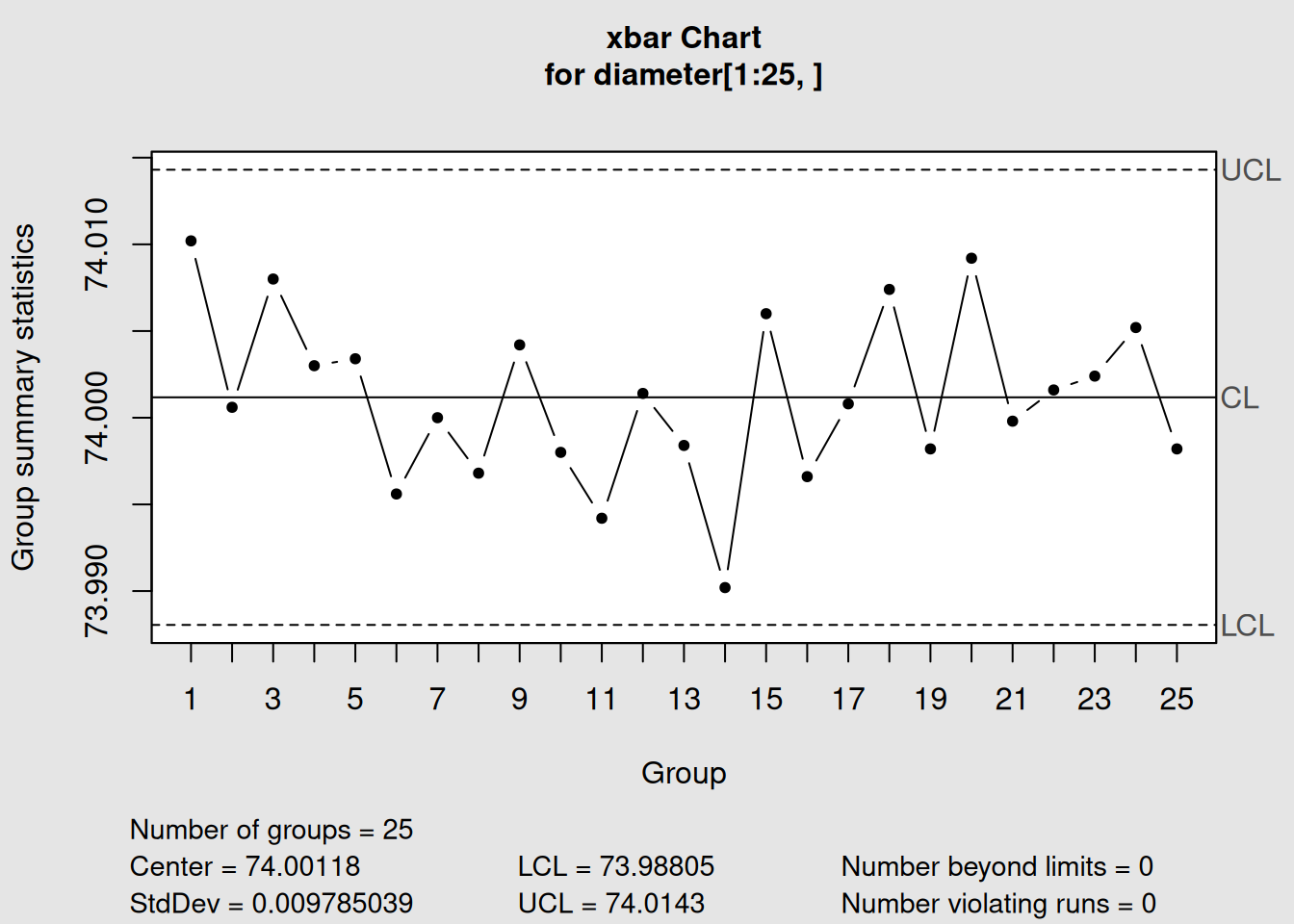
Figure 2.2: X-bar Control Chart for Piston Ring Diameter
2.3.4 Understanding Chart Components
Every qcc chart has these key components:
- Center Line (CL): The process average
-
Upper Control Limit (UCL): Upper boundary for normal variation
- Lower Control Limit (LCL): Lower boundary for normal variation
- Data Points: Each sample group’s average
- Control Zones: Areas between center line and control limits
Points Outside Control Limits
If any points fall outside the control limits, this suggests the process may be out of control. This doesn’t necessarily mean defective products - it means something has changed!
2.3.5 Adding New Data (Phase II Monitoring)
Once we’ve established control limits, we can monitor new data:
# Use the remaining data as "new" data for monitoring
q2 <- qcc(diameter[1:25,], type = "xbar", newdata = diameter[26:40,])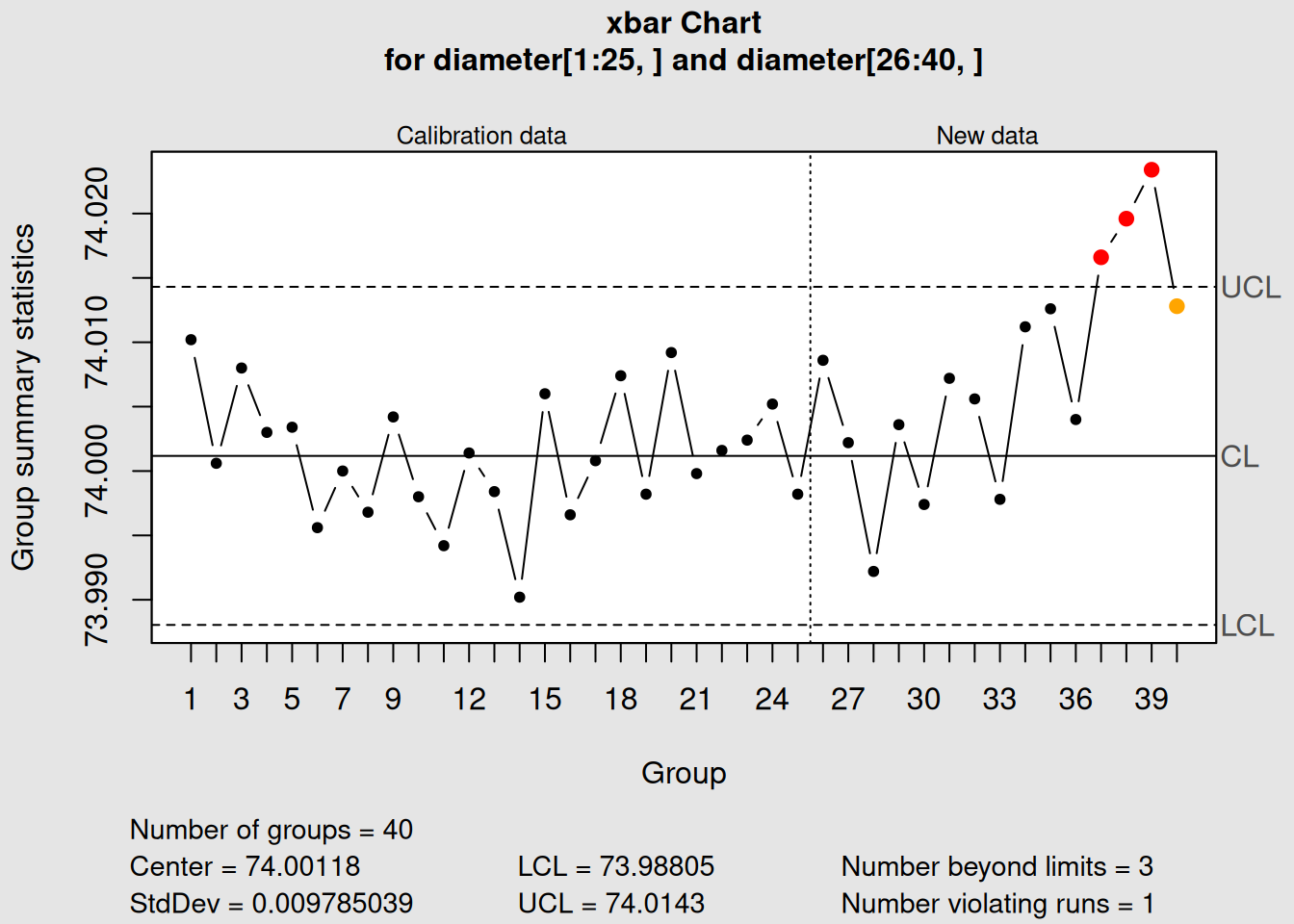
Figure 2.3: X-bar Chart with Phase II Data
# Plot with both phases
plot(q2)
2.3.6 Extracting Information from QCC Objects
QCC objects contain lots of useful information you can extract:
# Control limits
q2$limits
## LCL UCL
## 73.98805 74.0143
# Center line
q2$center## [1] 74.00118
# Standard deviation
q2$std.dev## [1] 0.009785039
# Statistics for each group
head(q2$statistics)## 1 2 3 4 5 6
## 74.0102 74.0006 74.0080 74.0030 74.0034 73.99562.3.7 Summary Statistics
Get a comprehensive summary of your control chart:
# Detailed summary
summary(q2)##
## Call:
## qcc(data = diameter[1:25, ], type = "xbar", newdata = diameter[26:40, ])
##
## xbar chart for diameter[1:25, ]
##
## Summary of group statistics:
## Min. 1st Qu. Median Mean 3rd Qu. Max.
## 73.99020 73.99820 74.00080 74.00118 74.00420 74.01020
##
## Group sample size: 5
## Number of groups: 25
## Center of group statistics: 74.00118
## Standard deviation: 0.009785039
##
## Summary of group statistics in diameter[26:40, ]:
## Min. 1st Qu. Median Mean 3rd Qu. Max.
## 73.99220 74.00290 74.00720 74.00765 74.01270 74.02340
##
## Group sample size: 5
## Number of groups: 15
##
## Control limits:
##       LCL     UCL
## 73.98805 74.01432.3.8 Working with Different Chart Types
Let’s see how the output format changes for different chart types:
2.3.8.1 Attribute Data Example (p-chart)
# Create a p-chart for proportion defective
data(orangejuice)
p_chart <- with(orangejuice, qcc(D[trial], sizes = size[trial], type = "p"))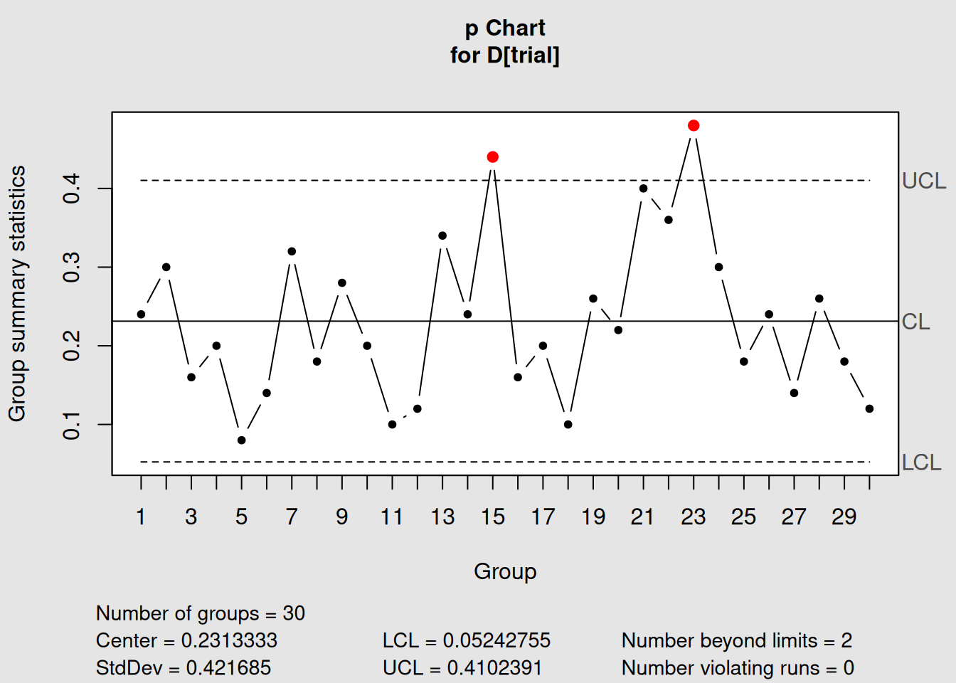
Figure 2.4: P-chart for Orange Juice Defects
# Display information
p_chart
## List of 11
## $ call : language qcc(data = D[trial], type = "p", sizes = size[trial])
## $ type : chr "p"
## $ data.name : chr "D[trial]"
## $ data : int [1:30, 1] 12 15 8 10 4 7 16 9 14 10 ...
## ..- attr(*, "dimnames")=List of 2
## $ statistics: Named num [1:30] 0.24 0.3 0.16 0.2 0.08 0.14 0.32 0.18 0.28 0.2 ...
## ..- attr(*, "names")= chr [1:30] "1" "2" "3" "4" ...
## $ sizes : int [1:30] 50 50 50 50 50 50 50 50 50 50 ...
## $ center : num 0.231
## $ std.dev : num 0.422
## $ nsigmas : num 3
## $ limits : num [1:30, 1:2] 0.0524 0.0524 0.0524 0.0524 0.0524 ...
## ..- attr(*, "dimnames")=List of 2
## $ violations:List of 2
## - attr(*, "class")= chr "qcc"
# Plot the chart
plot(p_chart)
2.3.8.2 Count Data Example (c-chart)
# Create a c-chart for defect counts
data(circuit)
c_chart <- with(circuit, qcc(x[trial], sizes = size[trial], type = "c"))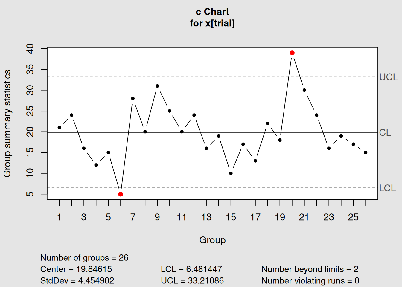
Figure 2.5: C-chart for Circuit Board Defects
# Display information
c_chart
## List of 11
## $ call : language qcc(data = x[trial], type = "c", sizes = size[trial])
## $ type : chr "c"
## $ data.name : chr "x[trial]"
## $ data : int [1:26, 1] 21 24 16 12 15 5 28 20 31 25 ...
## ..- attr(*, "dimnames")=List of 2
## $ statistics: Named int [1:26] 21 24 16 12 15 5 28 20 31 25 ...
## ..- attr(*, "names")= chr [1:26] "1" "2" "3" "4" ...
## $ sizes : int [1:26] 100 100 100 100 100 100 100 100 100 100 ...
## $ center : num 19.8
## $ std.dev : num 4.45
## $ nsigmas : num 3
## $ limits : num [1, 1:2] 6.48 33.21
## ..- attr(*, "dimnames")=List of 2
## $ violations:List of 2
## - attr(*, "class")= chr "qcc"
# Plot the chart
plot(c_chart)
2.3.9 Customizing Chart Appearance
You can customize how your charts look:
# Create a chart with custom title and labels
plot(q2,
     title = "Piston Ring Diameter Control Chart",
     xlab = "Sample Number",
     ylab = "Average Diameter (mm)")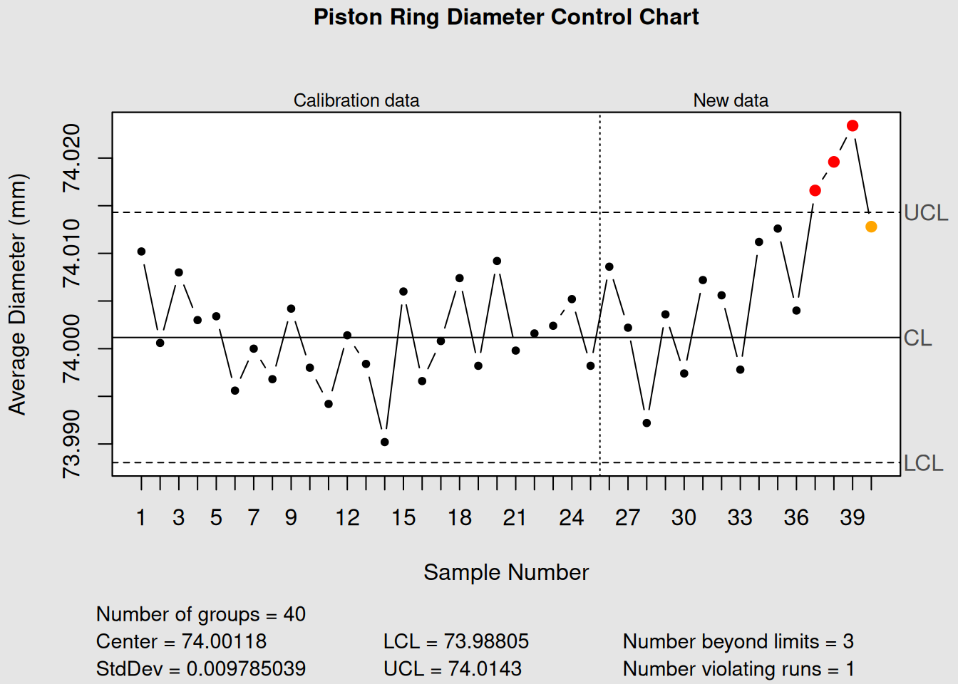
Figure 2.6: Customized Control Chart
2.3.10 Getting Help in R
If you ever get stuck, R has excellent built-in help:
# Get help on the qcc function
?qcc

# Get help on any function
?plot

# Search for help on a topic
??control

# View the qcc package documentation
help(package = "qcc")

# View examples and detailed guide
vignette("qcc")
R Help Tips
- Use
?function_namefor specific function help - Use
??topicto search for functions related to a topic - Examples in help files are great for learning!
2.4 Chapter Summary
Congratulations! You’ve taken your first steps into statistical process control with R and qcc. Here’s what you’ve learned:
2.4.1 Key Concepts Covered
- Installation and Setup: How to install R, RStudio, and the qcc package
- R Basics: Variables, data types, and basic operations for complete beginners
- Data Loading: How to load and explore built-in qcc datasets
-
Data Preparation: Using
qccGroups()to organize data for control charts - QCC Output: Understanding what qcc tells you about your process
- Chart Creation: Creating and interpreting your first control charts
2.4.2 Essential Functions You’ve Learned
| Function | Purpose | Example |
|---|---|---|
library() |
Load a package | library(qcc) |
data() |
Load a dataset | data(pistonrings) |
head() |
View first few rows | head(pistonrings) |
str() |
View data structure | str(pistonrings) |
summary() |
Get summary statistics | summary(pistonrings) |
split() |
Group data by factor | split(data$variable, data$group) |
qcc() |
Create control chart | qcc(data, type="xbar") |
plot() |
Display chart | plot(chart_object) |
2.4.3 Data Types in Quality Control
You’ve learned about different types of quality control data:
- Variable Data: Continuous measurements (diameter, temperature, weight)
-
Attribute Data: Pass/fail, good/bad (proportion defective)
- Count Data: Number of defects or nonconformities
2.4.4 What’s Next?
In the next chapter, we’ll dive deeper into creating and interpreting basic control charts, starting with X-bar and R charts for variable data. You’ll learn:
- How to choose the right chart type
- Phase I vs. Phase II analysis
- Interpreting out-of-control signals
- Real-world examples from manufacturing
2.4.5 Quick Reference
Keep these commands handy as you continue your SPC journey:
# Essential qcc workflow
library(qcc)                              # Load package
data(dataset_name)                        # Load data
head(data)                                # Explore data
describe(data)                            # Get statistics
chart <- qcc(data, type="chart_type")     # Create chart
plot(chart)                               # Display chart
summary(chart)                            # Get details
You’re now ready to create professional quality control charts and begin implementing statistical process control in your work!