6 Root Cause Analysis with Control Charts
6.1 Learning Objectives
By the end of this chapter, you will:
- Identify non-random patterns in control charts (trends, cycles, shifts)
- Distinguish between common cause and special cause variation
- Apply Western Electric rules for enhanced signal detection
- Connect chart signals to process events for root cause investigation
- Verify the effectiveness of corrective actions using control charts
6.2 Introduction to Root Cause Analysis
Control charts are not just monitoring tools—they are powerful diagnostic instruments for root cause analysis21. When a control chart signals an out-of-control condition, it’s telling us that something has changed in our process. The key to effective quality improvement is not just detecting these signals, but understanding what they mean and taking appropriate action.
6.3 Pattern Recognition in Control Charts
6.3.1 Understanding Process Patterns
Real processes rarely produce purely random data. Instead, they often exhibit patterns that can provide valuable insights into underlying causes of variation. Let’s explore the most common patterns and what they tell us about our process.
6.3.2 1. Trends: Gradual Process Drift
A trend22 represents a gradual, systematic change in the process over time. This pattern suggests that something is slowly changing in our process.
Common causes of trends:
- Tool wear in manufacturing
- Gradual degradation of equipment
- Environmental changes (temperature, humidity)
- Training effects (workers getting better or worse over time)
- Raw material deterioration
Let’s create an example of trend detection using the qcc package:
# Simulate data with a linear trend
mu <- 100
sigma_W <- 10
epsilon <- rnorm(500)
W <- rep(0.2 * 1:100, rep(5, 100))  # Linear trend component
x <- mu + W + sigma_W * epsilon
x <- matrix(x, ncol = 10, byrow = TRUE)

# Create X-bar chart with trend
trend_chart <- qcc(x, type = "xbar", rules = 1:4)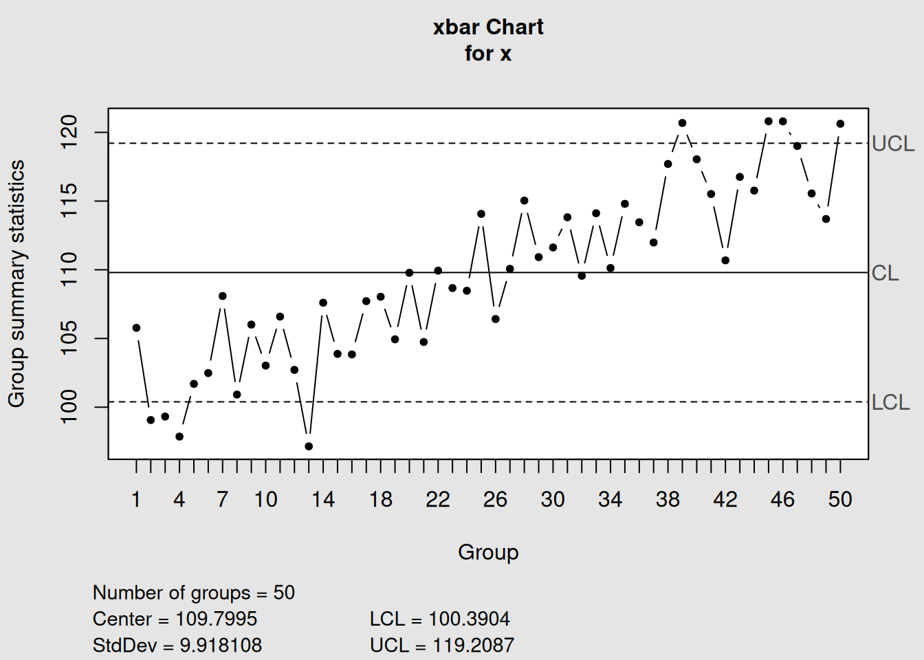
plot(trend_chart, title = "X-bar Chart Showing Linear Trend")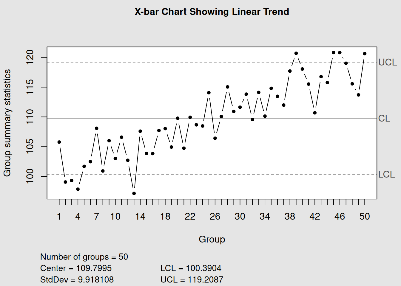
In this example, we can see how the process mean gradually increases over time. The control chart helps us visualize this trend clearly, even when it might be subtle in the raw data.
6.3.3 2. Cycles: Recurring Patterns
Cycles23 are recurring patterns that repeat at regular intervals. These patterns often reflect systematic variations in process conditions.
Common causes of cycles:
- Shift changes (different operators, different skill levels)
- Seasonal variations
- Machine maintenance schedules
- Raw material batch changes
- Environmental cycles (daily temperature variations)
# Simulate data with recurring cyclical patterns
mu <- 100
sigma_W <- 10
epsilon <- rnorm(120, sd = 0.3)
W <- c(-4, 0, 1, 2, 4, 2, 0, -2)  # Worker shift cycle
W <- rep(rep(W, rep(5, 8)), 3)    # Repeat the pattern
x <- mu + W + sigma_W * epsilon
x <- matrix(x, ncol = 5, byrow = TRUE)

# Create X-bar chart with cycles
cycle_chart <- qcc(x, type = "xbar", rules = 1:4)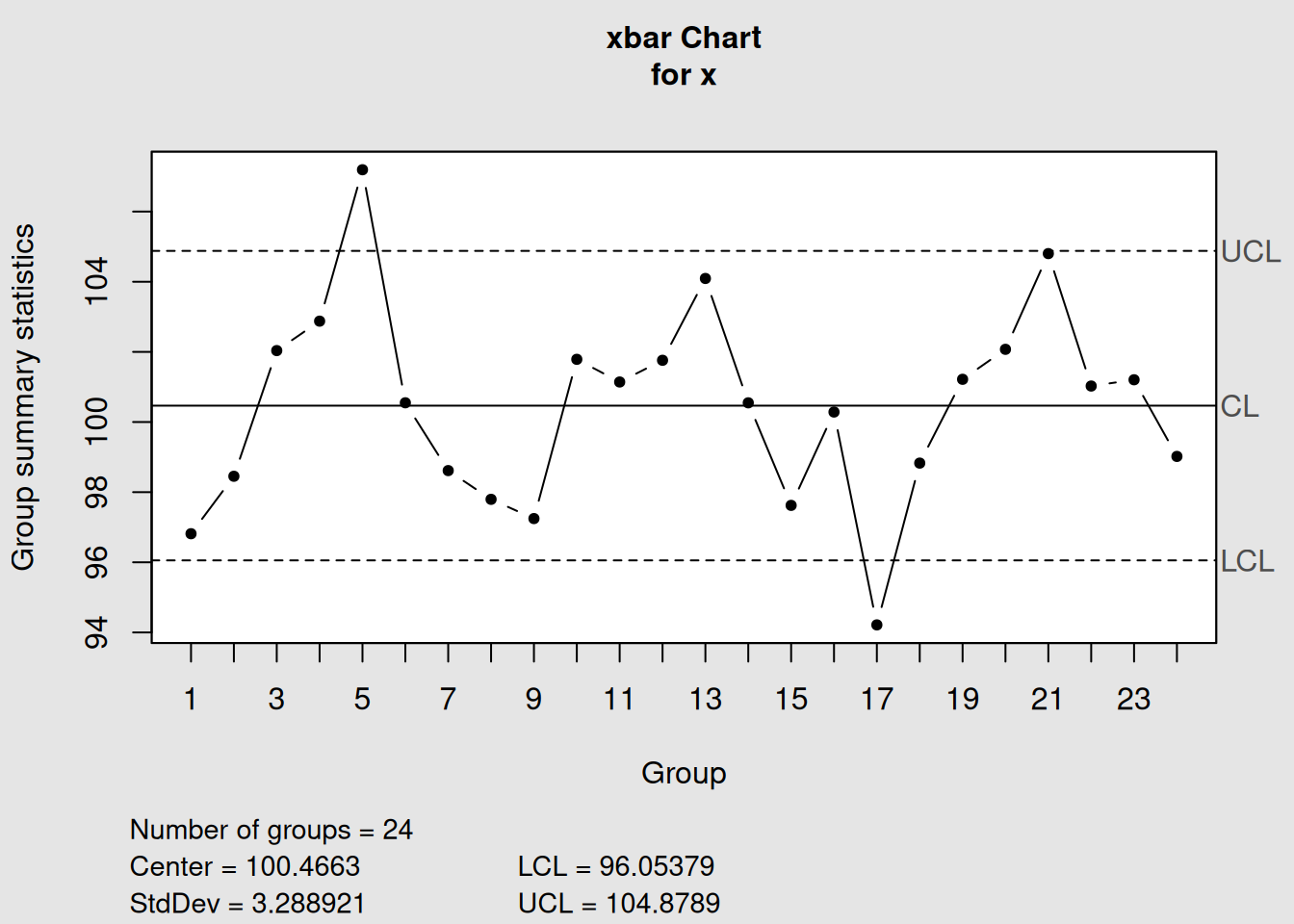
plot(cycle_chart, title = "X-bar Chart Showing Cyclical Pattern")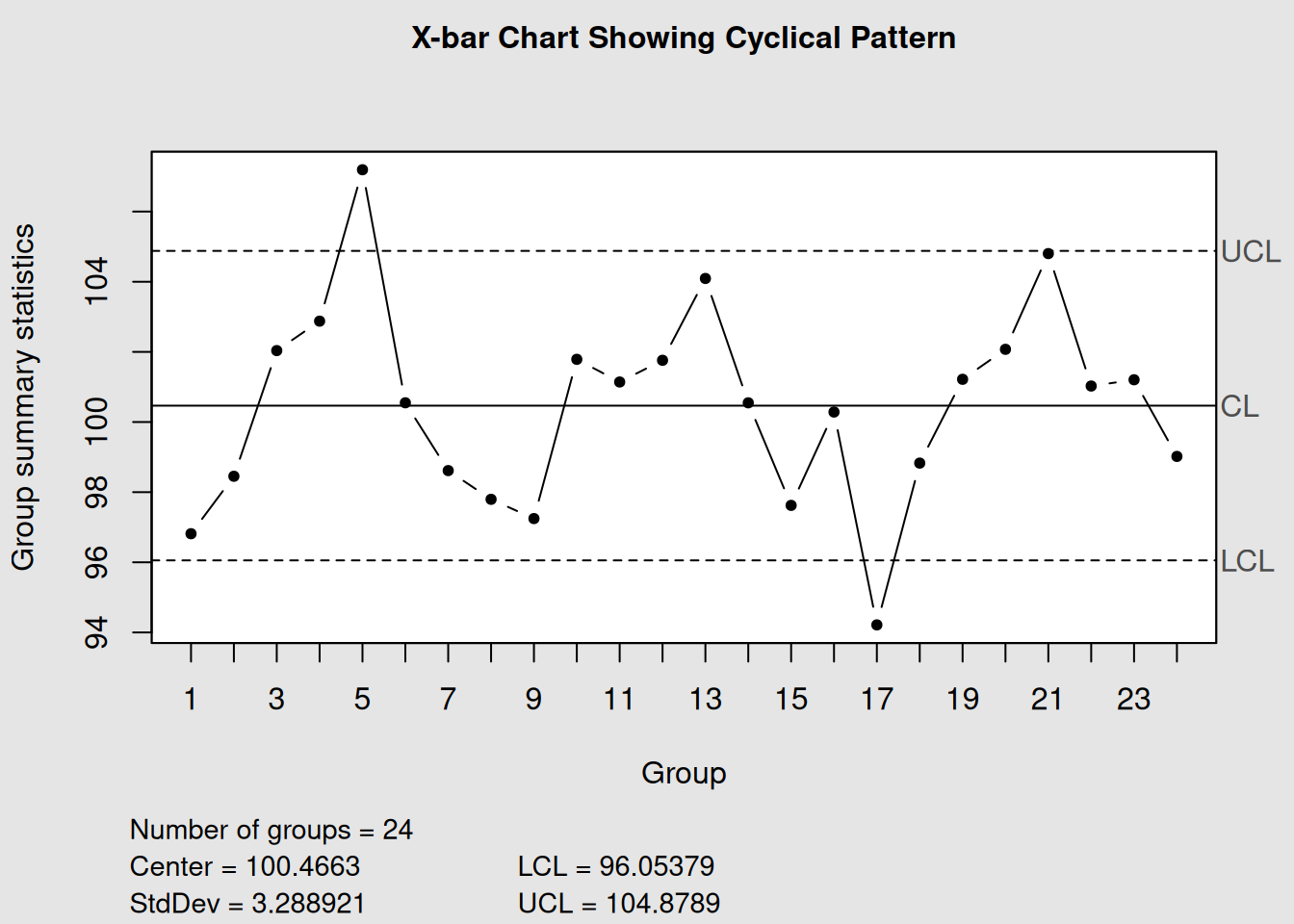
This chart shows how performance varies in a predictable pattern, possibly reflecting different shift performance or regular process variations.
6.3.4 3. Level Shifts: Sudden Process Changes
A level shift24 represents a sudden, sustained change in the process level. This pattern indicates that something significant changed in our process at a specific point in time.
Common causes of level shifts:
- New equipment installation
- Process parameter changes
- New raw material supplier
- Operator changes
- Environmental changes (new facility, season change)
# Simulate data with a level shift at point 40
n_points <- 80
x_before <- rnorm(40, mean = 100, sd = 2)  # Before shift
x_after <- rnorm(40, mean = 105, sd = 2)   # After shift (mean increased by 5)
x_combined <- c(x_before, x_after)

# Create individual chart to show level shift
shift_chart <- qcc(x_combined, type = "xbar.one")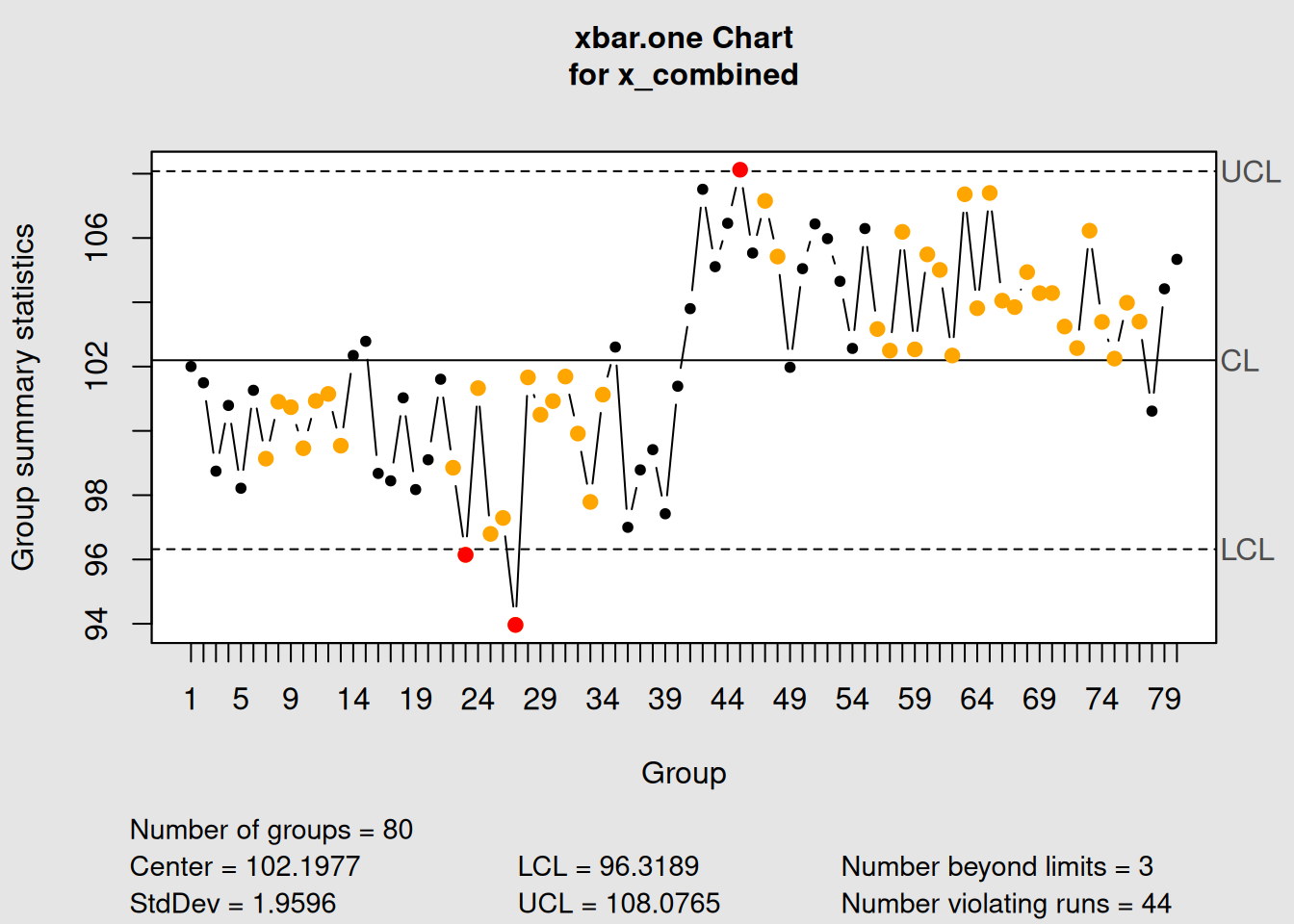
plot(shift_chart, title = "Individual Chart Showing Level Shift at Point 40")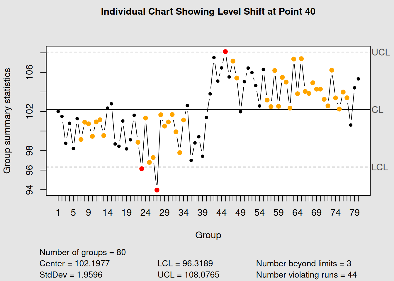
6.4 Pattern Recognition Table
The following table summarizes the key patterns and their typical causes:
| Pattern | Description | Typical Causes | Investigation Focus |
|---|---|---|---|
| Trend | Gradual systematic change | Tool wear, environmental drift, training effects | Time correlation, equipment logs, environmental data |
| Cycle | Regular recurring pattern | Shift changes, seasonal effects, batch variations | Cycle timing, operator schedules, material batches |
| Level Shift | Sudden sustained change | Equipment changes, new suppliers, process adjustments | Change logs, maintenance records, material receipts |
| Mixture | Points avoiding center line | Multiple process streams, measurement inconsistency | Process segregation, measurement system analysis |
| Systematic | Alternating pattern | Over-adjustment, measurement bias, sampling issues | Control strategy review, measurement validation |
6.5 Common Cause vs Special Cause Variation
Understanding the difference between common cause25 and special cause26 variation is fundamental to effective process improvement.
6.5.1 Common Cause Variation (Natural Variation)
- Definition: The natural, inherent variation that exists in all processes
-
Characteristics:
- Random, unpredictable in individual instances
- Follows a stable pattern over time
- Forms the “voice of the process”
- Random, unpredictable in individual instances
- Action: Improve the system (requires management action)
6.5.2 Special Cause Variation (Assignable Cause)
- Definition: Variation that is not part of the normal process
-
Characteristics:
- Not random, has an identifiable source
- Causes shifts, trends, or unusual patterns
- Indicates the process has changed
- Not random, has an identifiable source
- Action: Investigate and eliminate the specific cause
# Create data showing both types of variation
set.seed(123)

# Common cause only (stable process)
stable_data <- rnorm(50, mean = 100, sd = 2)

# Special cause introduced (outlier at point 25, shift at point 35)
unstable_data <- stable_data
unstable_data[25] <- 110  # Special cause outlier
unstable_data[35:50] <- unstable_data[35:50] + 3  # Special cause shift

# Create charts
par(mfrow = c(1, 2))
stable_chart <- qcc(stable_data, type = "xbar.one",
                   title = "Common Cause Only\n(Stable Process)")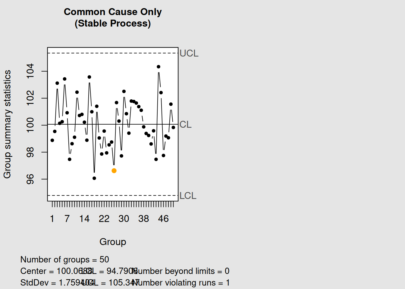
plot(stable_chart)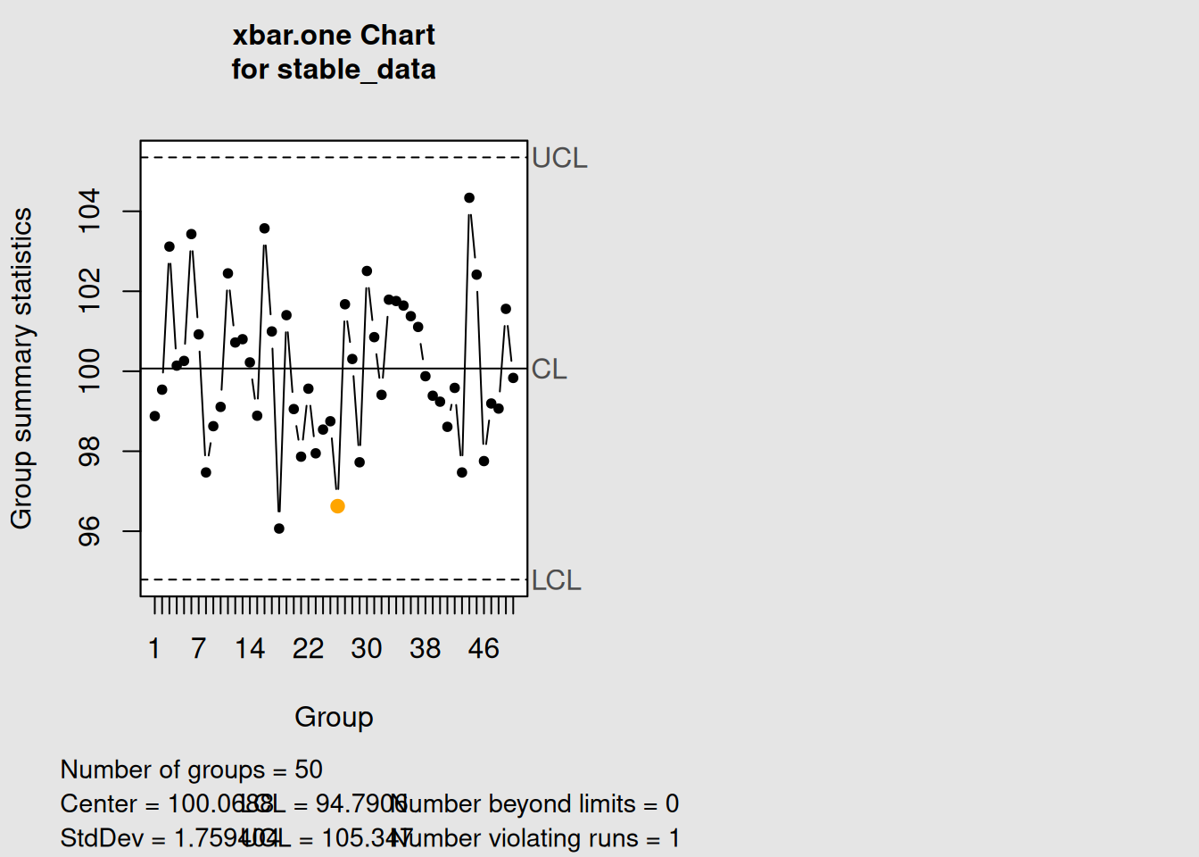
unstable_chart <- qcc(unstable_data, type = "xbar.one",
                     title = "Common + Special Cause\n(Unstable Process)")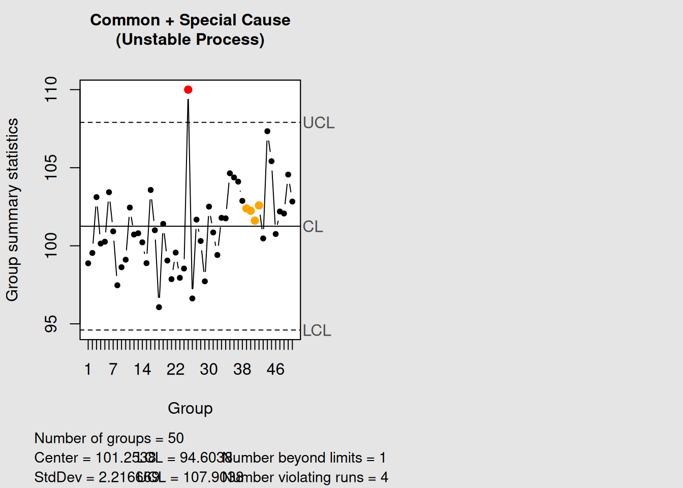
plot(unstable_chart)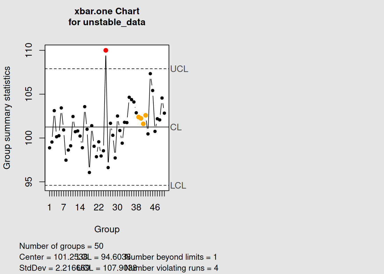
6.5.3 The Danger of Tampering
Tampering27 occurs when we treat common cause variation as if it were special cause variation. This leads to:
- Increased overall process variation
- Reduced process predictability
- Wasted resources on unnecessary investigations
- Demoralized operators who are blamed for random variation
Key Principle: Only react to signals that indicate special causes. Don’t adjust a process that is in statistical control.
6.6 Western Electric Rules for Enhanced Detection
The basic control chart rule (points outside control limits) detects only the most obvious special causes. The Western Electric Rules28 provide additional sensitivity to detect more subtle process changes.
6.6.1 The Eight Western Electric Rules
-
Rule 1: One point beyond the control limits
-
Rule 2: Nine points in a row on one side of the center line
-
Rule 3: Six points in a row steadily increasing or decreasing
-
Rule 4: Fourteen points in a row alternating up and down
-
Rule 5: Two out of three consecutive points beyond 2σ limits (same side)
-
Rule 6: Four out of five consecutive points beyond 1σ limits (same side)
-
Rule 7: Fifteen points in a row within 1σ limits (both sides)
- Rule 8: Eight points in a row beyond 1σ limits (both sides)
Let’s demonstrate how to apply these rules using the qcc package:
# Create sample data for demonstration
data(pistonrings)
diameter_data <- with(pistonrings,
                     split(diameter, sample))[1:25]
diameter_matrix <- do.call(rbind, diameter_data)

# Apply Western Electric rules (rules 1-4 are most commonly used)
we_chart <- qcc(diameter_matrix, type = "xbar", rules = 1:4)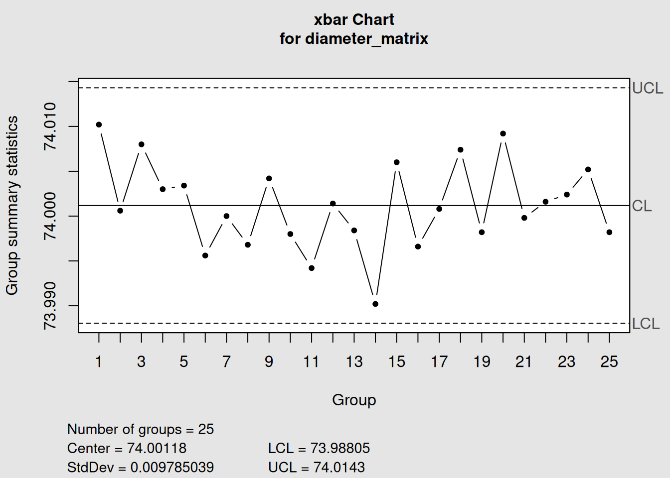
plot(we_chart, title = "X-bar Chart with Western Electric Rules 1-4")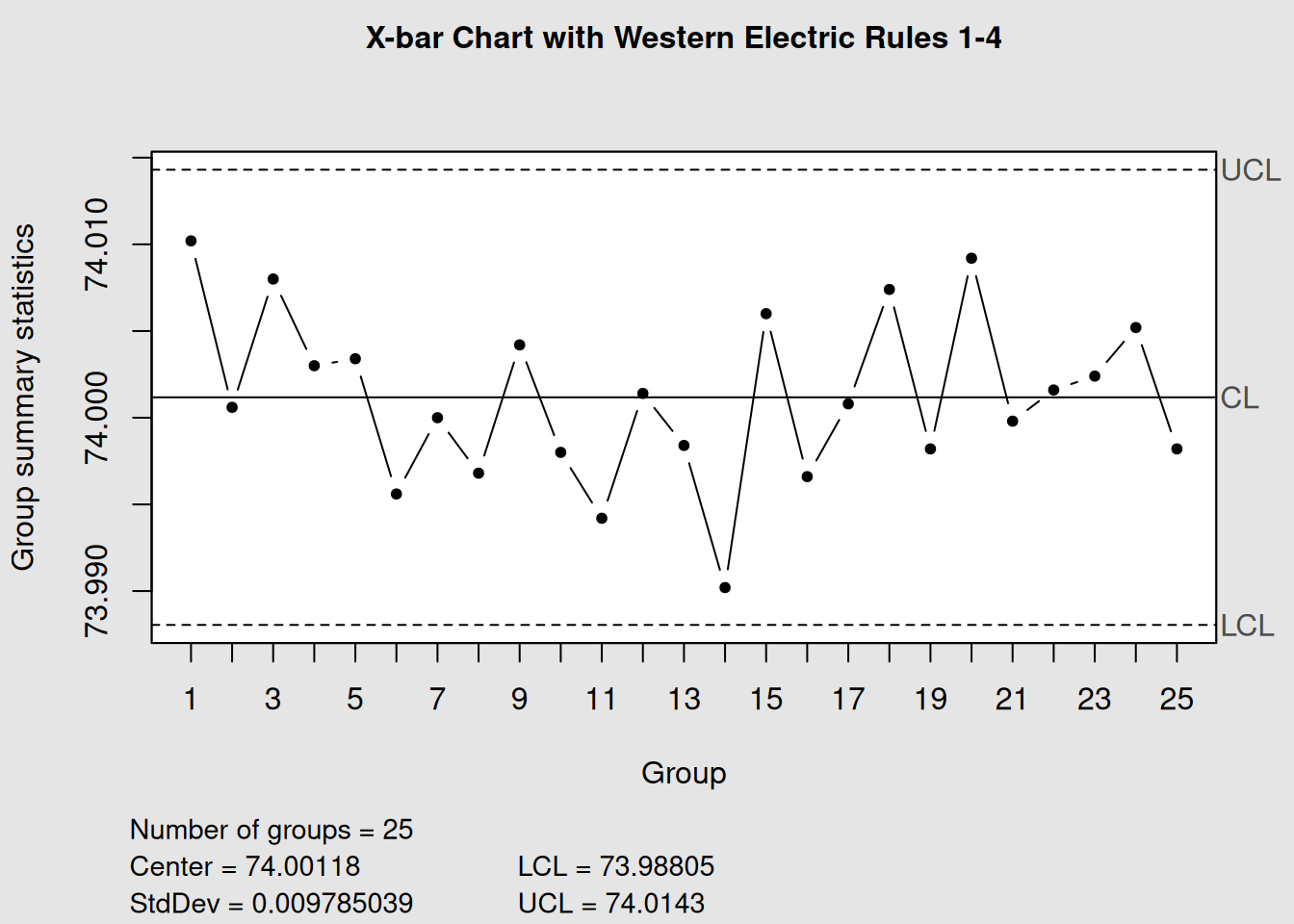
# The summary shows which rules were violated
summary(we_chart)
##
## Call:
## qcc(data = diameter_matrix, type = "xbar", rules = 1:4)
##
## xbar chart for diameter_matrix
##
## Summary of group statistics:
## Min. 1st Qu. Median Mean 3rd Qu. Max.
## 73.99020 73.99820 74.00080 74.00118 74.00420 74.01020
##
## Group sample size: 5
## Number of groups: 25
## Center of group statistics: 74.00118
## Standard deviation: 0.009785039
##
## Control limits:
## LCL UCL
## 73.98805 74.01436.6.2 Rule Interpretation and Actions
| Rule | Pattern Detected | Typical Cause | Recommended Action |
|---|---|---|---|
| 1 | Extreme variation | Special cause event | Immediate investigation |
| 2 | Process shift | Level change in process | Check for process changes |
| 3 | Trend | Gradual deterioration | Look for wearing components |
| 4 | Over-adjustment | Excessive tampering | Review control strategy |
| 5-6 | Moderate shifts | Small process changes | Monitor closely |
| 7 | Reduced variation | Improved process or stratification | Verify positive change |
| 8 | Increased variation | Loss of control | Check process stability |
6.7 Time-Series Correlation with Process Events
The power of control charts increases dramatically when we correlate signals with actual process events. This requires good process documentation29 and timestamp correlation.
6.7.1 Creating Event-Correlated Charts
# Simulate process data with known events
dates <- seq(from = as.Date("2024-01-01"),
             by = "day",
             length.out = 50)

# Simulate measurements with events at specific dates
set.seed(456)
measurements <- rnorm(50, mean = 100, sd = 2)

# Introduce events:
# Equipment maintenance on day 15 (temporary improvement)
measurements[15:20] <- measurements[15:20] - 1

# New operator training on day 30 (gradual improvement)
measurements[30:50] <- measurements[30:50] + seq(0, 2, length.out = 21)

# Create the control chart with time axis
time_chart <- qcc(measurements, type = "xbar.one")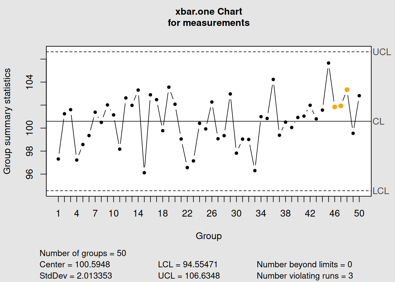
plot(time_chart, xtime = dates, add.stats = FALSE,
     title = "Process Control Chart with Time Events") +
  scale_x_date(date_breaks = "1 week", date_labels = "%b %d") +
  geom_vline(xintercept = as.Date("2024-01-15"),
             color = "blue", linetype = "dashed", alpha = 0.7) +
  geom_vline(xintercept = as.Date("2024-01-30"),
             color = "green", linetype = "dashed", alpha = 0.7) +
  annotate("text", x = as.Date("2024-01-15"), y = 105,
           label = "Equipment\nMaintenance", color = "blue", size = 3) +
  annotate("text", x = as.Date("2024-01-30"), y = 105,
           label = "Operator\nTraining", color = "green", size = 3)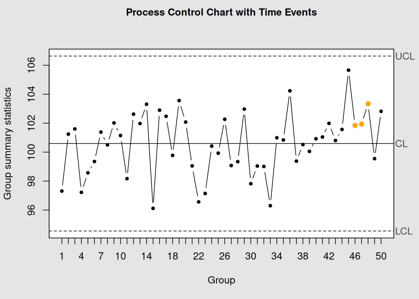
## NULL6.7.2 Event Documentation Best Practices
- Real-time Recording: Document events as they happen
-
Precise Timestamps: Include date and time for all events
-
Event Categories:
- Equipment changes/maintenance
- Personnel changes
- Material changes
- Environmental changes
- Process parameter adjustments
- Equipment changes/maintenance
- Impact Assessment: Rate the potential impact of each event
- Follow-up: Track whether events correlate with chart signals
6.8 Corrective Action Verification
Control charts are excellent tools for verifying that corrective actions have been effective. The process involves:
6.8.1 1. Pre-Action Analysis
- Identify the problem pattern
- Understand the root cause
- Predict the expected improvement
6.8.2 2. Implementation
- Document when the action was taken
- Continue monitoring during implementation
- Watch for immediate effects
6.8.3 3. Post-Action Verification
- Confirm the pattern has changed
- Verify process stability
- Establish new control limits if necessary
Let’s demonstrate corrective action verification:
# Simulate a process with a problem and subsequent correction
set.seed(789)

# Phase 1: Process with trend (days 1-30)
phase1 <- 100 + 0.1 * (1:30) + rnorm(30, sd = 1.5)

# Phase 2: Corrective action taken, trend eliminated (days 31-60)
phase2 <- rnorm(30, mean = 100, sd = 1.5)

combined_data <- c(phase1, phase2)

# Create control chart
correction_chart <- qcc(combined_data, type = "xbar.one")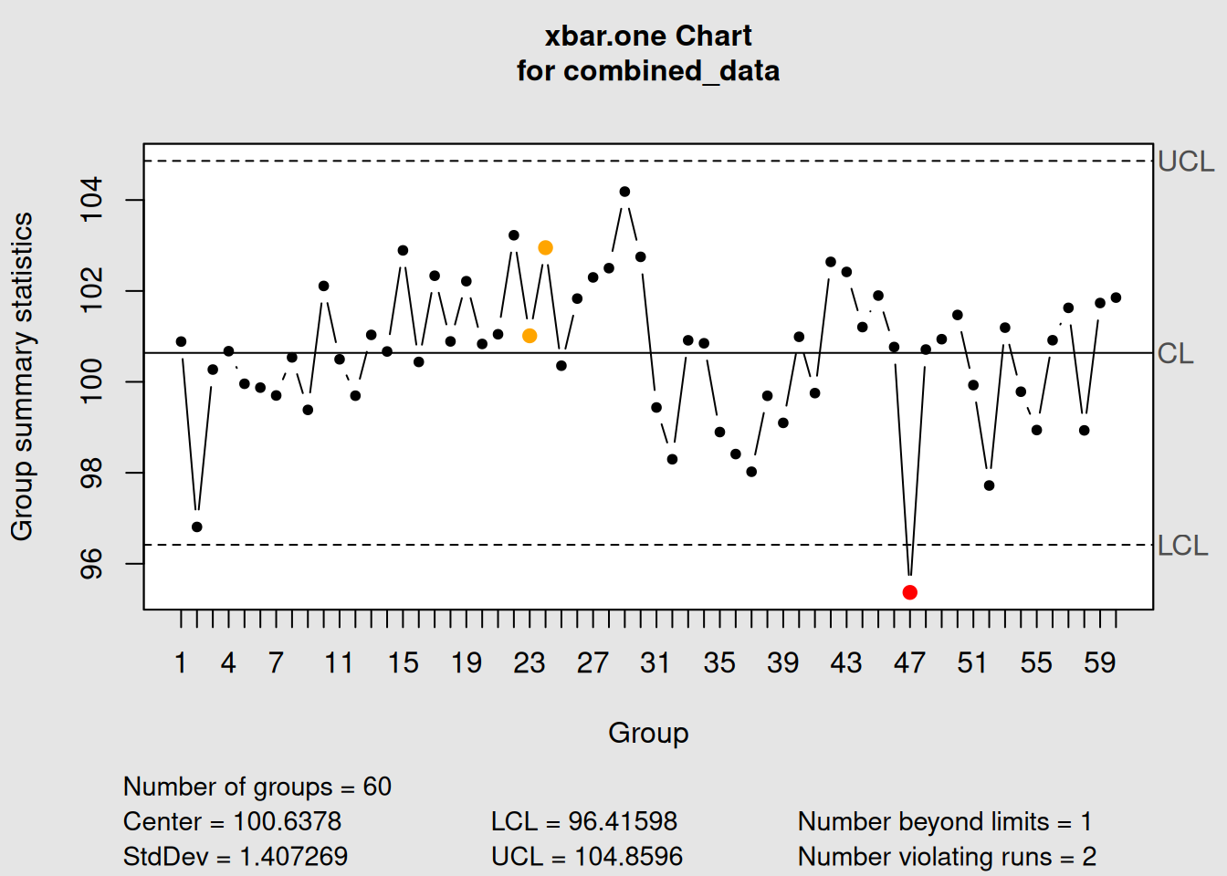
plot(correction_chart,
     title = "Process Before and After Corrective Action")

# Add vertical line to show when action was taken
abline(v = 30.5, col = "red", lwd = 2, lty = 2)
text(30.5, 105, "Corrective\nAction", col = "red", pos = 4)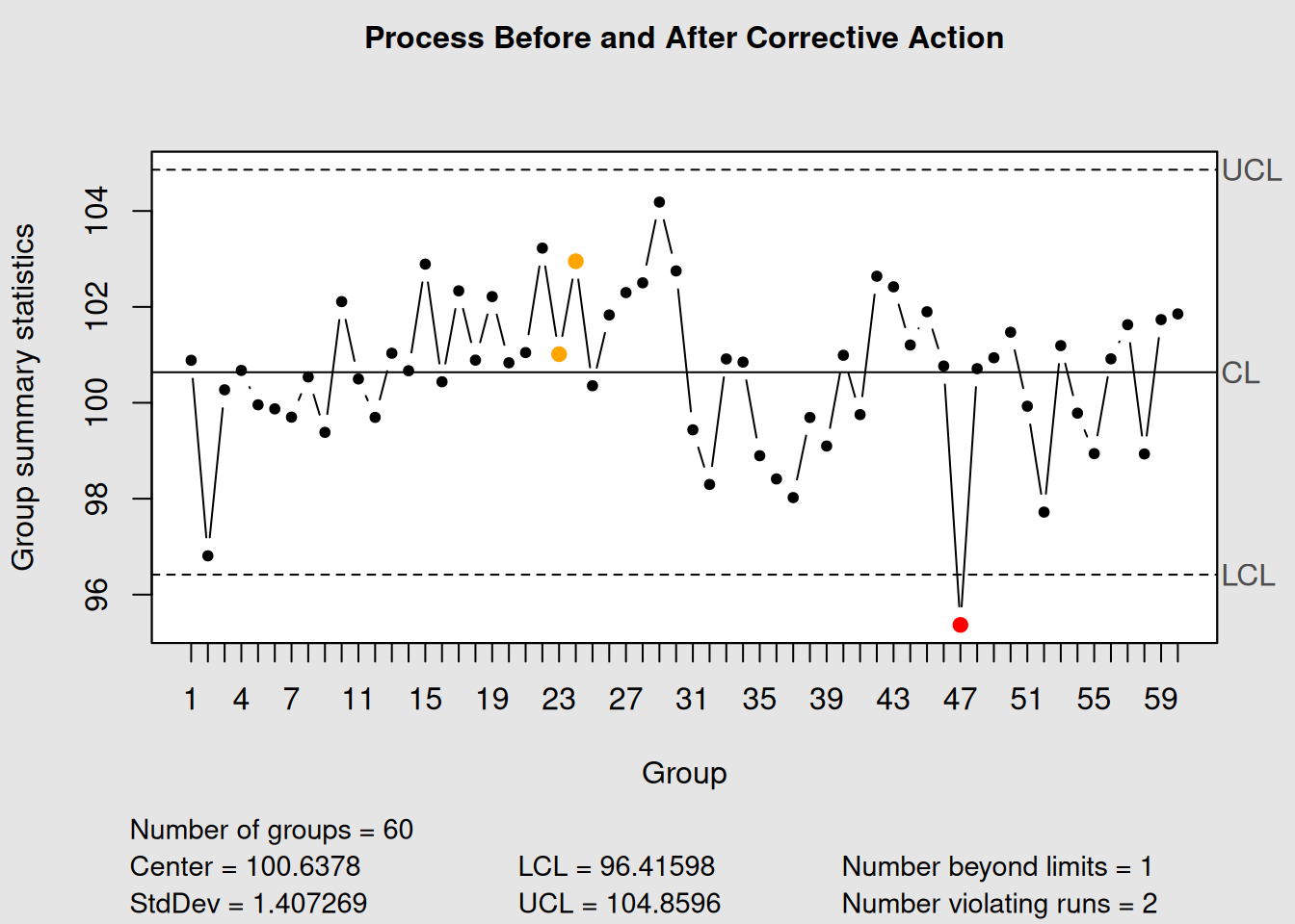
# Calculate process statistics before and after
cat("Before Correction (Points 1-30):\n")
## Before Correction (Points 1-30):## Mean: 101.13## Std Dev: 1.46
cat("After Correction (Points 31-60):\n")## After Correction (Points 31-60):## Mean: 100.15## Std Dev: 1.626.8.4 Establishing New Control Limits
When a corrective action significantly changes the process, you may need to establish new control limits:
# If the corrective action was successful, establish new limits
# using only the post-correction data
new_limits_chart <- qcc(phase2, type = "xbar.one",
                       title = "New Control Chart After Correction")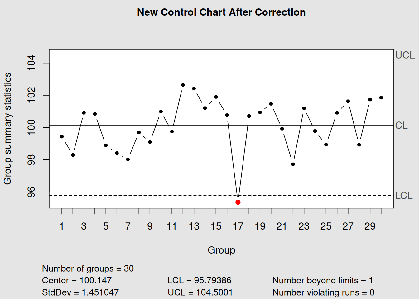
plot(new_limits_chart)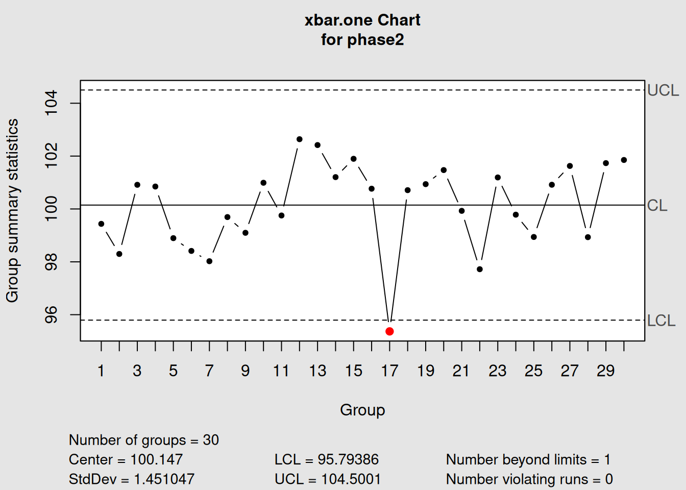
6.9 Root Cause Analysis Workflow
Here’s a systematic approach to root cause analysis using control charts:
6.9.1 Step 1: Signal Detection
- Monitor charts regularly
- Apply appropriate detection rules
- Document all signals immediately
6.9.2 Step 2: Initial Assessment
- Determine signal type (outlier, trend, shift, etc.)
- Review recent process events
- Assess potential impact and urgency
6.9.3 Step 3: Investigation
- Gather relevant data and documentation
- Interview process operators and supervisors
- Examine physical evidence
- Use problem-solving tools (fishbone diagrams, 5-why analysis)
6.9.4 Step 4: Root Cause Identification
- Identify the fundamental cause
- Verify cause-and-effect relationship
- Distinguish symptoms from root causes
6.10 Process Event Investigation Checklist
When investigating control chart signals, systematically check these areas:
6.10.1 Equipment & Machinery
- Recent maintenance activities
- Equipment settings and calibration
- Tool wear or replacement
- Mechanical problems or breakdowns
6.10.2 Materials & Supplies
- Supplier changes
- Batch or lot variations
- Material storage conditions
- Raw material specifications
6.10.3 Personnel & Methods
- Operator changes or training
- Procedure modifications
- Work instruction updates
- Skill level variations
6.11 Advanced Pattern Analysis
6.11.1 Multi-Chart Analysis
Sometimes, patterns become clearer when viewing multiple chart types together:
# Create sample data
data(pistonrings)
diameter_groups <- with(pistonrings,
                       split(diameter, sample))[1:25]
diameter_matrix <- do.call(rbind, diameter_groups)

# Create X-bar and R charts
xbar_chart <- qcc(diameter_matrix, type = "xbar", plot = FALSE)
r_chart <- qcc(diameter_matrix, type = "R", plot = FALSE)

# Plot both charts
par(mfrow = c(2, 1))
plot(xbar_chart, title = "X-bar Chart: Process Center")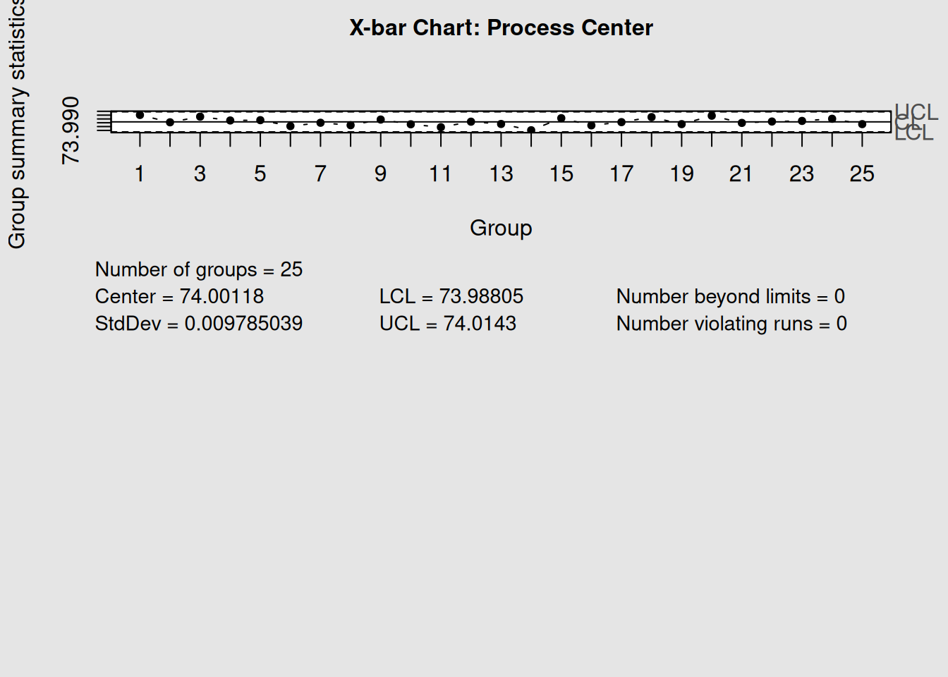
plot(r_chart, title = "R Chart: Process Variability")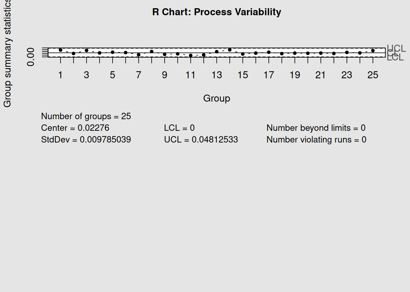
par(mfrow = c(1, 1))

# Analyze both together
cat("X-bar Chart Signals:", length(xbar_chart$violations), "\n")
## X-bar Chart Signals: 2## R Chart Signals: 2When both mean and range charts show signals simultaneously, it often indicates:
- Mean shift with increased variation: Major process disruption
- Mean stable, range unstable: Inconsistent process conditions
- Both stable: Process in statistical control
6.12 Key Takeaways
-
Pattern Recognition: Learn to identify trends, cycles, and shifts in your control charts
-
Variation Types: Always distinguish between common cause and special cause variation
-
Enhanced Detection: Use Western Electric rules to catch subtle process changes
-
Event Correlation: Link chart signals to actual process events for faster root cause identification
-
Action Verification: Use control charts to confirm that corrective actions are effective
- Systematic Approach: Follow a structured workflow for investigating and resolving process issues
Remember: Control charts don’t solve problems—they point you toward the problems that need solving. The real value comes from your systematic investigation and corrective action process.
6.13 Chapter Summary
Root cause analysis with control charts transforms reactive quality control into proactive process improvement. By learning to read the patterns in your data, understanding the difference between common and special causes, and systematically investigating signals, you can maintain better process control and drive continuous improvement.
The combination of statistical signals and process knowledge creates a powerful system for maintaining and improving quality. In our next chapter, we’ll explore how Pareto analysis complements control charts to help prioritize improvement efforts effectively.